What is Niseko Powder?
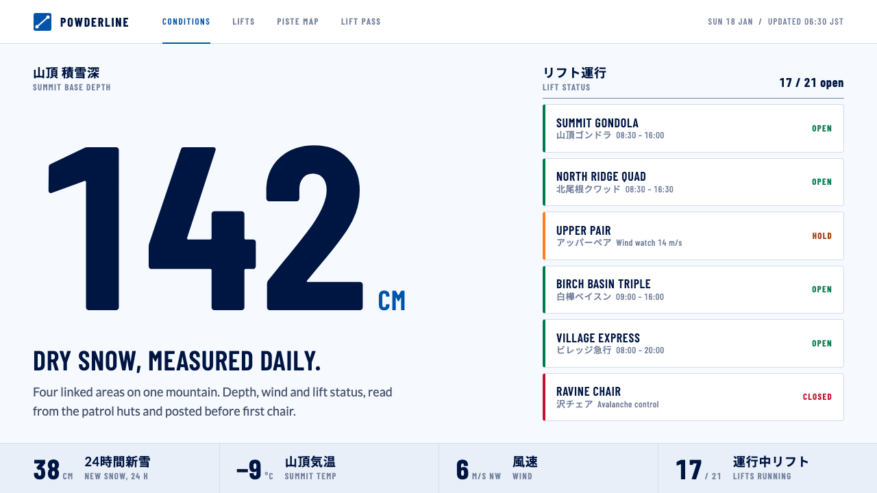
Niseko Powder treats snow as data rather than scenery: a powder-white ground, resort blue for action, condensed figures, and the working look of piste maps and lift boards.
Niseko Powder in brief
Niseko Powder is a design style built from the working surfaces of Niseko United, the four linked ski areas on Mount Niseko-Annupuri in Hokkaido: piste maps, lift timetables, gondola status boards and bilingual signs. It does not borrow the postcard image of a mountain. It borrows the objects that skiers and staff actually read every morning to decide what to do with the day.
The page is a bluish powder white, sunlit and slightly cool, with resort blue for actions and deep navy for text. Condensed type carries run names and timetable columns, a humanist sans handles running copy, and Japanese sits directly above the Latin line for line. Everything is flat and printed in feeling, with no gloss, no photographic mood and no decorative snow effects.
The idea behind the look is that snow depth, wind and lift status do the work a scenic photograph would normally do. A big centimetre figure for fresh snow is more persuasive to someone planning a ski trip than any panorama, and the style turns that conviction into a coherent grammar of numbers, status colours and bilingual labels.

Where does Niseko Powder come from?
The style comes from Niseko and Kutchan in the Shiribeshi region of Hokkaido, Japan. The mountain area is known for dry powder snow that arrives on cold winds from Siberia, and the resorts around it, Niseko Grand Hirafu, Hanazono Niseko, Niseko Village and Niseko Annupuri, grew up along the slopes of Mount Niseko-Annupuri. Their joint promotion as Niseko United turned four separately run ski areas into one destination that a visitor can read as a single map.
The source dates the origins in layers. The first lifts at Hirafu and Annupuri appeared in the 1960s and 1970s. An international boom followed in the late 1990s, bringing visitors who did not read Japanese and who needed signs, timetables and status boards that worked in two languages at once. Joint marketing under the Niseko United name developed through the 2000s and 2010s, and the current web surface dates from roughly 2018 to 2024. Each layer left a visible trace in the style: wayfinding for strangers, a shared brand across rival operators, and a web interface that behaves like a printed board.
Three design traditions are named in the source material. The first is Japanese resort signage and pictogram systems, the plain, durable language that tells people where a lift goes and whether a run is open. The second is bilingual wayfinding, in which Japanese and English are given equal visual weight and set in strict correspondence, one line over the other. The third is piste-map cartography, the discipline of reducing a mountain to coloured lines, numbered lifts and legible labels without losing the sense of terrain.
The key figures listed are the places and bodies that produced those surfaces: Niseko Grand Hirafu, Hanazono Niseko, Niseko Village, Niseko Annupuri and the Niseko Promotion Board. The unusual feature of this lineage is that it has no famous individual designer. The look is the product of operations, hundreds of small practical decisions made by resorts that needed visitors to understand a mountain quickly. That anonymous, utilitarian origin is exactly what gives the style its credibility.
What defines the Niseko Powder look?
Powder-white ground
The page background is not neutral white but a sunlit, bluish snow tone, taken from the winter colour of an actual resort website. It reads as cold and clean without turning clinical. Panels and cards sit on it with only slight separation, so the whole page feels like one sheet of fresh snow.
Resort blue and navy
Actions use a clear resort blue, and text uses a deep navy that stays readable against the pale ground. The two blues form a disciplined pair: one invites a tap, the other carries information. Nothing else competes with them except status colours on the lift and run edges.
Condensed figures
Snow depth, temperature and wind appear as very large condensed numerals, the way a scoreboard shows a result. The narrow letterforms fit many columns into a timetable and keep run names legible at small sizes. The numbers are the hero of the page, which is the main way the style replaces photography.
Lift-status edges
Operating state is shown by a coloured mark on the left edge of a row or card, so open, delayed and closed can be scanned down a list in a second. The mark is a status signal and not decoration, and it is the only place where colour is allowed to carry urgency.
Bilingual lines
Japanese sits directly above the Latin text, line for line, in the manner of resort signage. Neither language is a footnote to the other. This pairing governs headings, buttons and timetable labels alike, and it makes the layout feel built for travellers rather than translated for them afterwards.
Flat and printed
Surfaces are flat and dry, with fine rules rather than heavy shadows, much like a piste map on paper. There is no glossy depth and no animated snowfall. The restraint keeps attention on figures and status, and it keeps the page fast and readable on a phone held in a cold glove.

Who shaped Niseko Powder?
One of the four linked ski areas of Niseko United, and the source of the winter ground tone used as the page colour of this style.
A linked ski area named in the source as part of the group whose timetables and signage inform the style.
The remaining areas of the four-resort network on Mount Niseko-Annupuri, each contributing lifts, boards and bilingual signs to the shared look.
The body listed in the source as a key figure behind joint promotion, helping turn separate resorts into one readable destination.
How do you use Niseko Powder today?
For slides, this style suits a cover that behaves like a conditions board: a pale ground, one very large condensed figure and a short bilingual title beneath it. Content slides can follow a timetable logic, with narrow columns and fine rules. Data slides are where it excels, because the large condensed numerals and the lift-status edge marks give a ready-made way to show progress, availability or risk without charts that look decorative.
For web and app interfaces, the obvious fit is anything that reports live conditions: travel and transport status, weather, event schedules, booking availability, operations dashboards. Use the blue only for actions, put status colour on the left edge of rows, and show the key number first and largest. A pricing page can borrow the timetable grid, with each plan as a column and the differences read straight across the rows.
For editorial and marketing pages, the style gives destinations, outdoor brands and seasonal campaigns an honest, informational voice. Lead with real figures such as depth, temperature and opening hours instead of a hero photograph, and let bilingual headings signal that visitors from several countries are expected. Long guides read well when organised like a piste map: a few clear categories, consistent labels and no ornament.
The style also works for any product that has to be understood quickly by a mixed-language audience, such as transit, events, university campuses or international services. The central lesson of the source material is that when the audience is under time pressure, plain structure and honest numbers beat atmosphere.
The most common mistake is to add what the style deliberately leaves out: full-bleed mountain photography, glossy gradients, falling-snow animations or decorative script type. These bring back the scenic postcard and cancel the data-first idea. A second mistake is using status colours as decoration; once green, amber and red appear everywhere, the left-edge signal stops meaning anything. Finally, do not drop the Japanese line when you localise, since the paired layout is the heart of the style.

Niseko Powder — FAQ
What is the Niseko Powder design style?
It is a design style drawn from the piste maps, lift timetables, gondola status boards and bilingual signs of Niseko United in Hokkaido. It uses a powder-white ground, resort blue for actions, deep navy text, condensed figures and status marks on the edges of rows.
Why does it use data instead of photography?
Because for the people it serves, snow depth, wind and lift status matter more than a panorama. The style lets those facts do the persuading that a scenic photograph usually does, which also keeps pages light, flat and quick to read.
How is the bilingual layout organised?
Japanese sits directly above the Latin text, line for line, as on resort signage. Neither language is treated as a footnote, and the same pairing applies to headings, buttons and timetable labels. Removing one line weakens the character of the style.
What products is it good for?
Anything that reports live conditions or schedules to a mixed-language audience: travel and transport status, events, booking availability, weather and operations dashboards. It is also good for destination and outdoor-brand pages that prefer honest figures to hero images.
Where does the style come from historically?
It grows out of Niseko and Kutchan in Hokkaido: lifts built in the 1960s and 1970s, an international boom in the late 1990s, joint Niseko United marketing in the 2000s and 2010s, and a current web surface from around 2018 to 2024. It draws on Japanese resort signage, bilingual wayfinding and piste-map cartography.
Related design styles
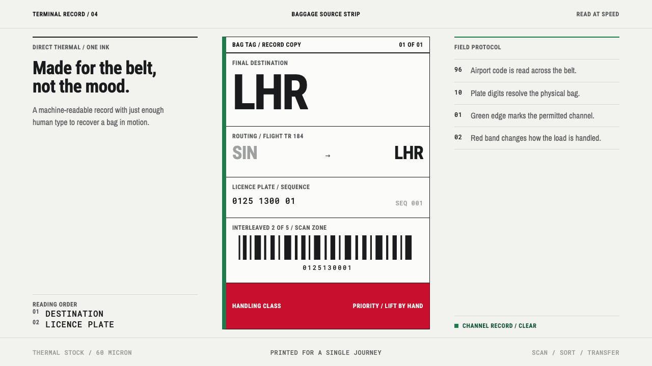 Airport Baggage TagBuilt to be read in motion. Burned-black codes, hard rules and functional cha…
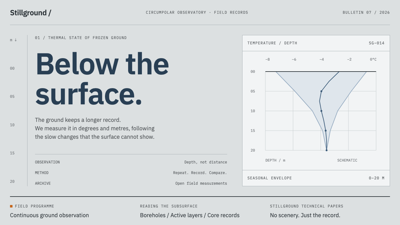 Permafrost Monitoring NetworkDepth sets the order. Overcast greys, slate profiles and hairline rules keep…
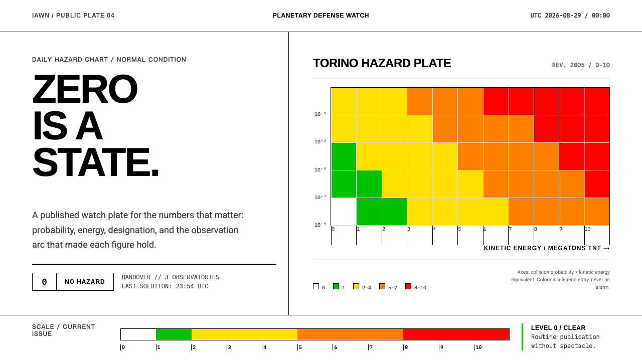 Planetary Defense WatchNothing to report is the point. Torino bands and monospace columns make risk…
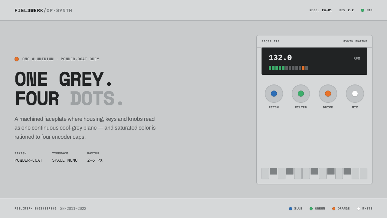 Teenage Engineering OP-1One grey, four dots. Machined aluminium in Space Mono, color rationed to tiny…
 Tokyo Metro SignageChaos becomes code. Charcoal panels, white-keyed rings, and bilingual grids s…
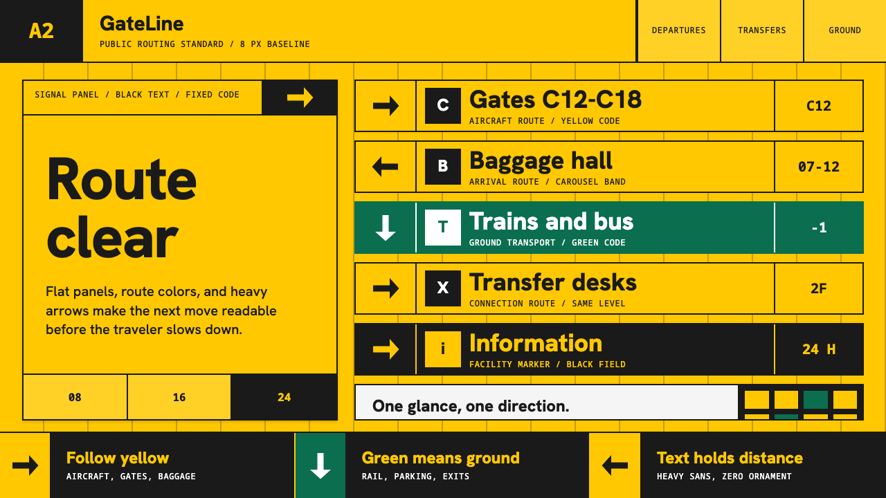 Airport Wayfinding GeometricLegibility becomes command. Signal yellow, black sans, and green route bands…