What is Pounamu Greenstone Mono?
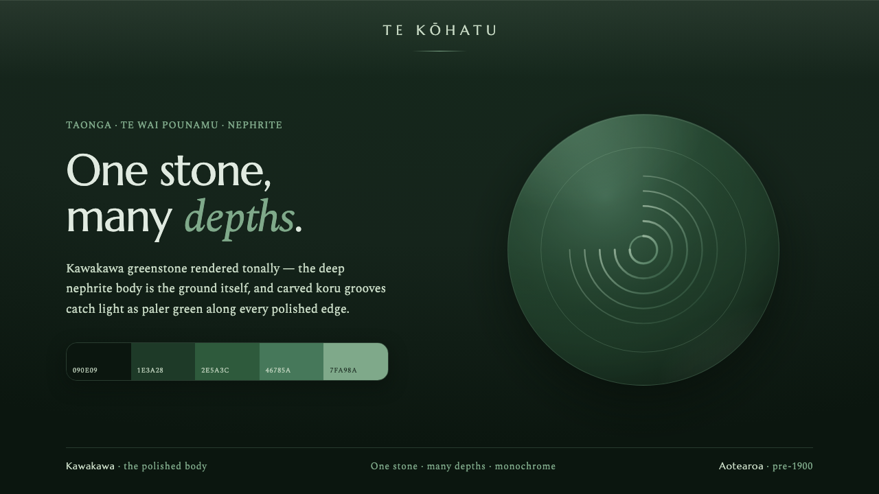
Pounamu Greenstone Mono treats a sacred stone as a complete visual world: dark kawakawa depth, polished translucency, and carved koru grooves revealing light from within.
Pounamu Greenstone Mono in brief
Pounamu Greenstone Mono is a dark, monochrome design system inspired by pounamu, the greenstone of New Zealand’s South Island. Pounamu is sacred nephrite, traditionally carved by Maori into hei-tiki pendants, toki adzes, and mere clubs, then treasured across generations as taonga. The system does not borrow this heritage as a decorative pattern bank. It begins with the material character named by pounamu itself: a dense, near-black kawakawa green body whose apparent darkness contains depth, translucency, and a glass-like polished sheen.
Its central idea is simple: one stone, many depths. The dark kawakawa surface is not merely a background behind content. It is the visual ground from which every other element must emerge. Lighter green is used as if it were caught by a carved edge or revealed through a shallow groove; pale highlights should feel like a change in the stone’s face rather than a separate layer placed on top of it. The result is quiet, concentrated, and materially unified.
The system’s most distinctive motif is the carved koru spiral and the groove. Rather than treating the koru as loose ornament scattered across a layout, it treats it as an incision in a continuous surface. A curve may guide attention, hold a title, frame an image, or mark a transition, but it should retain the sense that it has been worked into the stone. This keeps the visual language monochrome and tactile: depth comes from carving, polish, and reflected light rather than from a crowded palette or competing effects.
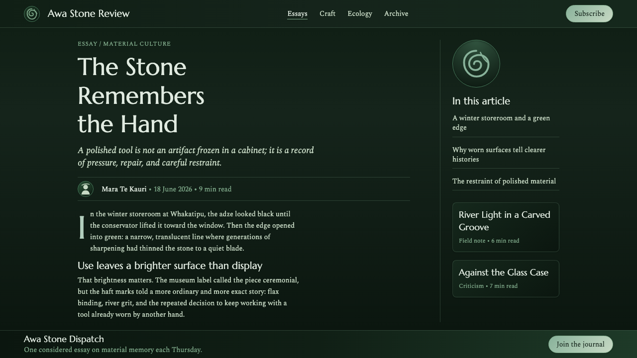
Where does Pounamu Greenstone Mono come from?
The source of this system is pounamu, the sacred nephrite of Te Wai Pounamu, the South Island of Aotearoa New Zealand. Before it became a design reference, it was a living material of cultural value: a stone shaped into objects of adornment, work, and significance, and kept as taonga through generations. Any contemporary visual use should begin from that fact. Pounamu Greenstone Mono is therefore best understood as a material-inspired interpretation, not as a replacement for Maori carving practice or a claim to reproduce it.
Traditional Maori stone-carving provides the cultural setting for the system’s carved visual logic. Hei-tiki pendant craft, toki adze forms, and mere club forms establish pounamu as something shaped through care and held for enduring value. Their relevance here is not a license to turn sacred forms into generic decoration. It is a reminder that the stone’s presence is inseparable from carving, continuity, and the significance carried by an object over time.
The key custodians named in this material are Maori carvers and iwi, including Ngai Tahu and Ngati Waewae. Their presence matters because pounamu belongs to a specific regional and cultural context rather than an abstract category of luxury stone. A respectful design adaptation should keep that context visible in its language and editorial framing, avoid presenting the motif as ownerless, and resist reducing cultural reference to a surface trend.
Within that context, kawakawa pounamu supplies the system’s visual direction. Its dominant character is a near-black dark green with deep translucency and a polished, glassy sheen. Pounamu Greenstone Mono translates this description into interface and editorial terms: darkness becomes mass, tonal variation becomes internal depth, and carved koru grooves become the places where paler light appears. The visual system is deliberately narrow because the stone itself is the subject.
What defines the Pounamu Greenstone Mono look?
Tonal Kawakawa
The palette stays within a cool greenstone family, led by the near-black depth of kawakawa. Dark values establish the continuous stone body; progressively paler greens are reserved for exposed planes, polished ridges, selected type, and carved details. Contrast should feel geological rather than graphic. A pale element is not an accent color competing with the dark field; it is light finding a different depth within the same material.
Carved Koru
Koru spirals and grooves are structural marks. They should appear as channels, incisions, or relief-like paths in the greenstone surface, with paler light gathering along their turning edges. Their purpose is to guide, frame, and create a sense of carved continuity. They are strongest when used sparingly at large scale, where a single controlled curve can shape an entire composition without becoming a repeated decorative stamp.
Polished Translucency
The finish should suggest polished nephrite rather than glossy digital plastic. Light appears contained beneath or just across the surface, never sprayed outward as a theatrical glow. Gentle shifts in tonal density can imply depth, while the brightest areas remain precise and limited. This produces a surface that feels cool, dense, and luminous at once: not transparent like glass, but inwardly alive.
Monolithic Ground
The dark field is the object, not empty canvas around the object. Cards, panels, and content regions should read as cut, carved, or gently lifted from one shared stone mass. Boundaries are best communicated through tonal separation, incised lines, and restrained highlight rather than unrelated surfaces. This monolithic approach makes complex information feel collected within one durable body.
Quiet Hierarchy
Typography and data need to remain exceptionally legible against the dark stone. Hierarchy comes from tonal lift, scale, placement, and generous breathing room, not from a growing collection of colors, badges, or ornamental dividers. The primary reading path should be calm and unmistakable, while secondary information recedes into deeper green. The system favors considered attention over visual urgency.
Material Restraint
Every visible effect should be accountable to the stone metaphor. A groove can clarify grouping; a highlight can identify an active edge; a polished plane can establish focus. Effects that do not deepen the sense of carved nephrite weaken the system, especially bright unrelated colors, busy textures, or broad decorative shine. The discipline is what allows the design to feel like one stone rather than a dark interface with green styling.

Who shaped Pounamu Greenstone Mono?
Maori carvers and iwi are the collective custodians named by this material’s origin. Their stone-carving tradition gives pounamu its cultural setting and establishes carving as more than a visual treatment. In a design context, their significance is a reason for specificity and restraint: the reference should acknowledge a living cultural inheritance rather than treat greenstone forms as anonymous luxury motifs.
Ngai Tahu is identified here among the iwi connected to the pounamu context of Te Wai Pounamu. Its inclusion anchors the material to the South Island rather than allowing the system to float free as a generalized global stone aesthetic. Editorial copy, provenance notes, and product narratives can use this specificity to make the origin legible without claiming authority over practices not represented in the source material.
Ngati Waewae is likewise named among the iwi associated with the source context. In this system, that association should prompt care around the koru and around pounamu’s sacred status. The design can be inspired by the stone’s dark translucency and carved qualities while keeping cultural forms purposeful, contextualized, and free from casual repetition.
How do you use Pounamu Greenstone Mono today?
For presentation covers, let the stone carry the opening gesture. Use a nearly black kawakawa field as the full visual ground, then allow one broad carved koru path or groove to reveal a paler green turn near the title. The title should feel engraved into, or carefully held by, the surface rather than pasted over it. Content slides need more restraint: establish a clear reading field, use tonal separation to organize sections, and let only selected headings or rules catch the brighter stone light.
For content and data slides, treat information as an arrangement within a single carved object. Tables, charts, and comparisons should remain clean and high-contrast, with deeper tones carrying context and paler tones reserved for the active series, key figure, or decisive annotation. A koru curve can guide the eye between related ideas, but it should never cross labels or turn a chart into illustration. The objective is contemplative legibility: data should look settled into the material, not illuminated by a separate dashboard palette.
For web interfaces, the style is particularly effective for focused dashboards, analytical tools, member areas, and premium settings pages. A dark kawakawa shell can contain navigation and dense information without feeling empty if panels are differentiated like facets of the same stone. Active controls should brighten with restrained greenstone light, while inactive controls remain quiet and recessed. Pricing pages can use polished highlighted planes to distinguish a chosen path, but the page should retain the sense of one continuous material rather than becoming a stack of unrelated promotional cards.
For editorial and marketing work, use the system to tell a material-led story. A long-form page can alternate between deep text fields and lighter carved callouts, with provenance and cultural context given enough visual space to be read rather than treated as a footnote. Product storytelling works best when it emphasizes restraint, continuity, and the relationship between surface and depth. Image treatment, if included, should preserve the sense of a dark, cool, polished world instead of importing bright, unrelated moods.
The common mistake is to reduce the style to black-green luxury branding or to scatter koru forms wherever an empty corner appears. That loses both the material logic and the cultural specificity. Do not make every boundary glow, do not introduce unrelated accent colors merely to create excitement, and do not use a koru as generic trim. Lead with the dark stone body, reveal light only where the carved surface earns it, and keep references to pounamu grounded in their Te Wai Pounamu and Maori context.
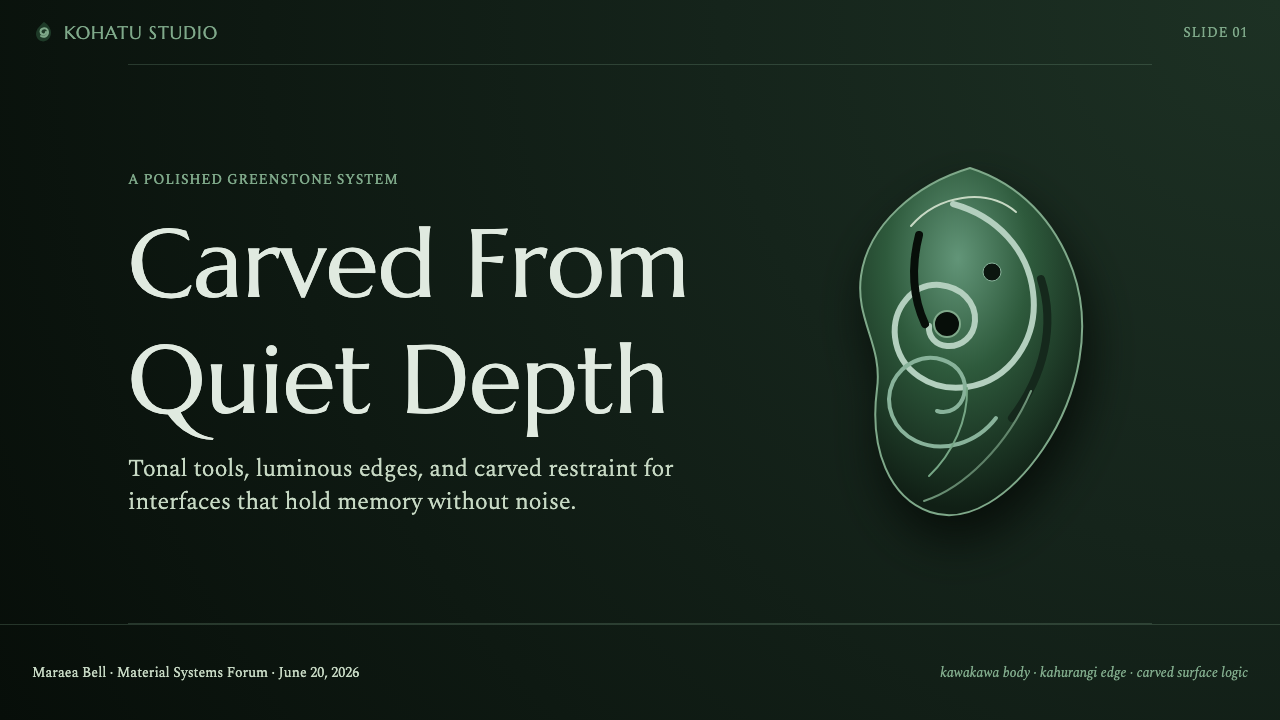
Pounamu Greenstone Mono — FAQ
Is Pounamu Greenstone Mono simply a green luxury style?
No. Its visual richness comes from a specific material idea: kawakawa pounamu as a dark, translucent, polished stone, with light revealed by carving. Treating it as generic luxury styling removes the relationship between the near-black ground, tonal depth, and incised koru grooves. The system is most convincing when its restraint makes the stone feel present.
Can koru be used as a repeated decorative pattern?
The supplied material frames koru as carved spirals and grooves catching lighter greenstone light. In this system, use them as purposeful structural marks: a guiding curve, a carved boundary, or a focal incision in a shared surface. Casual repetition weakens the carved-material logic and risks detaching the form from its Maori and pounamu context.
How should text remain readable on such a dark surface?
Build hierarchy through carefully controlled tonal contrast, placement, and whitespace. Important text may take on the paler light of an exposed or polished stone plane, while secondary information recedes into deeper green. Do not compensate for a dark ground by adding many bright colors or persistent glow; this system depends on a calm, clear reading path.
Where does this style work best in a product?
It works best where focus, depth, and a considered sense of value support the content: dashboards, analytical views, member spaces, settings areas, presentations, and editorial storytelling. It is less suited to interfaces that need a loud, playful, multi-colored atmosphere. Its strength is concentration within one material world, not visual variety for its own sake.
How can a design reference pounamu respectfully?
Name the source clearly: pounamu is sacred nephrite of Te Wai Pounamu in Aotearoa New Zealand, associated here with Maori carvers and iwi including Ngai Tahu and Ngati Waewae. Keep cultural context in the surrounding copy, avoid claiming to reproduce traditions beyond the supplied material, and use the stone’s tonal and carved qualities with restraint rather than extracting motifs as generic decoration.
Related design styles
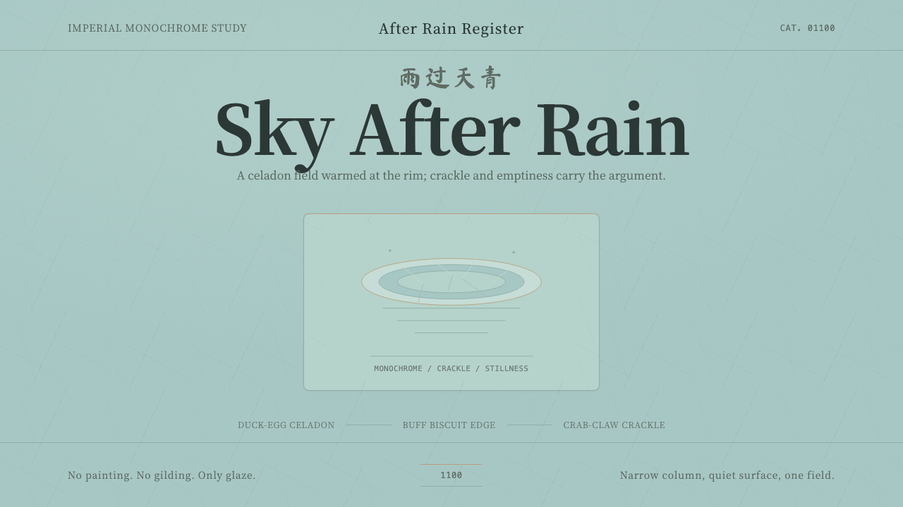 Song Ru Ware 宋汝窑Stillness made visible. Celadon ground, crab-claw crackle, one vessel in narr…
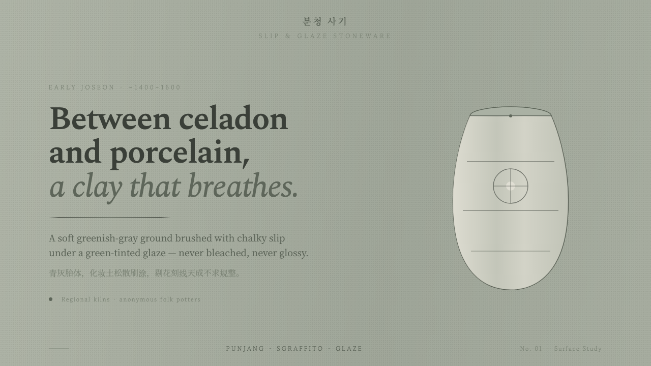 Buncheong Gray Slip WareBetween celadon and porcelain. Greenish-gray clay, chalky slip brushwork, dar…
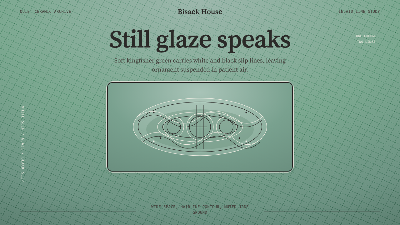 Goryeo Celadon 高麗青瓷Stillness carries ornament. Bisaek jade ground holds white and black hairline…
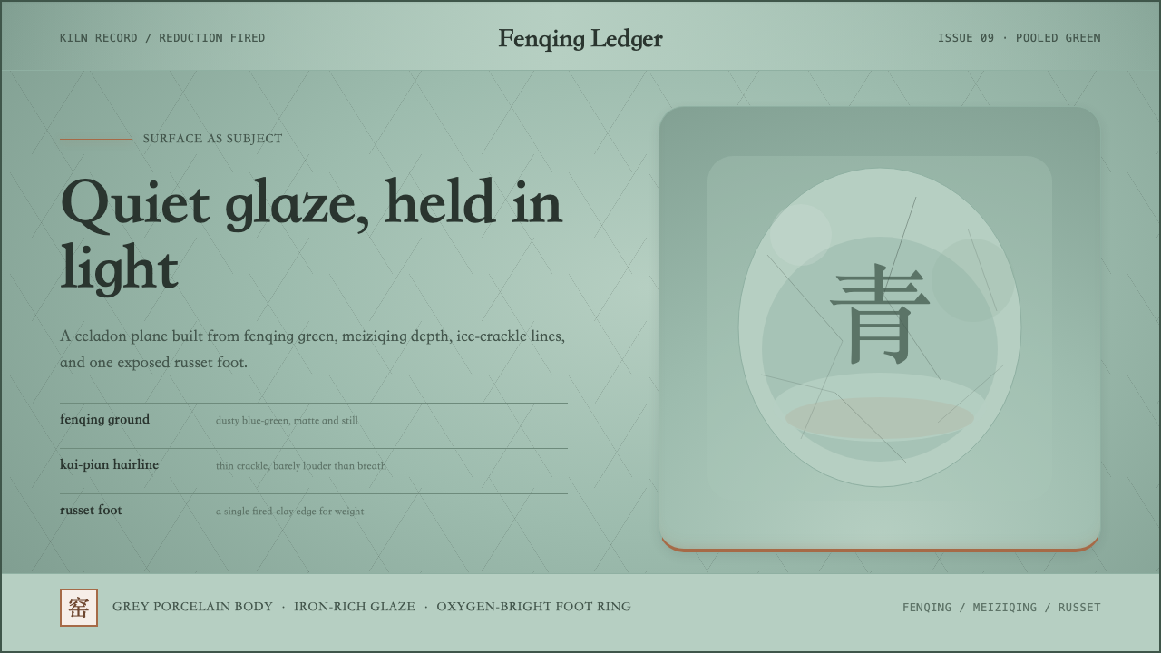 Longquan CeladonQuiet glaze carries the page. Fenqing green, crackle hairlines, and one russe…
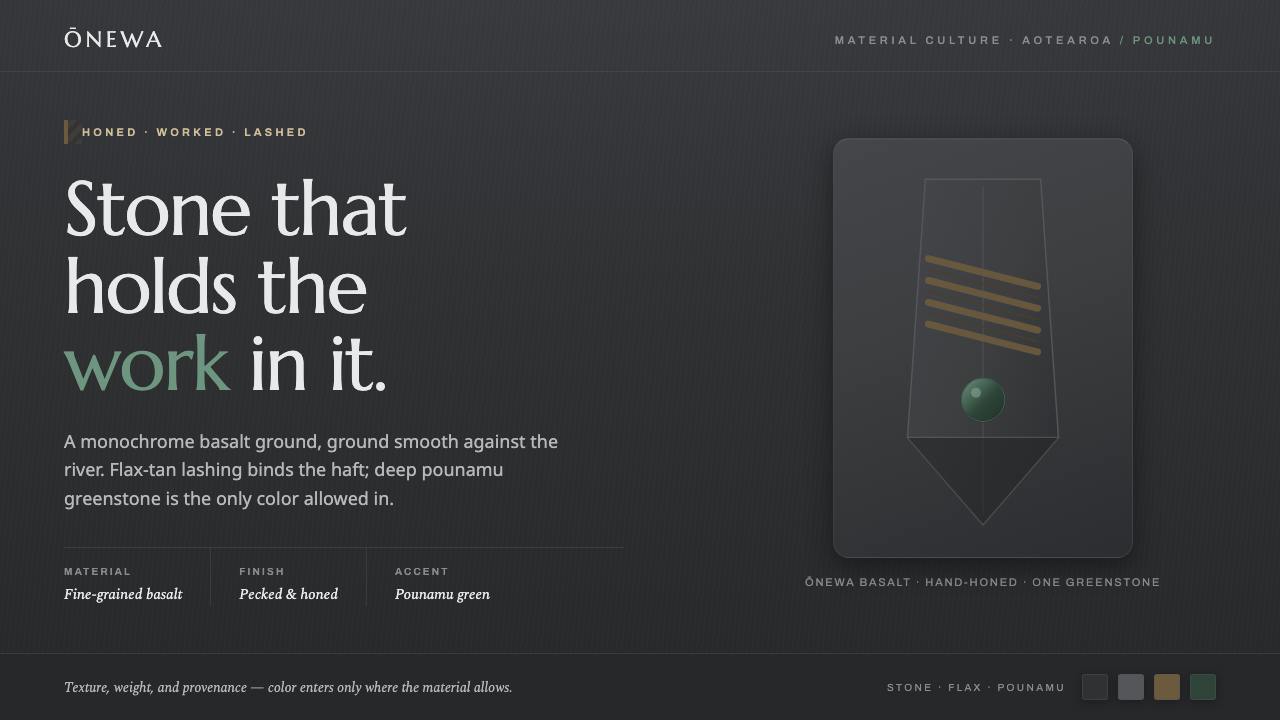 Māori Volcanic StoneColor enters only where the stone allows. Honed charcoal basalt, flax lashing…
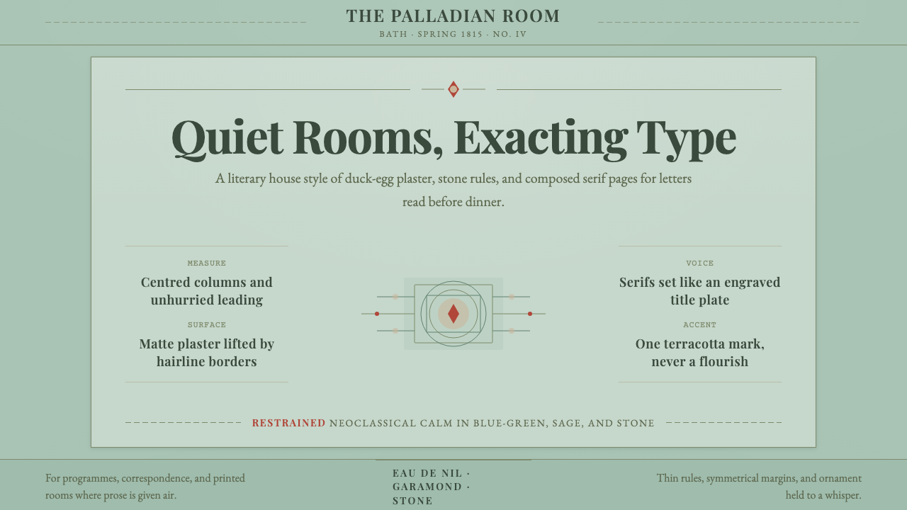 Regency EnglandCalm has authority. Duck-egg plaster, Garamond serifs, and hairline borders.