What is Nauru Phosphate Works?
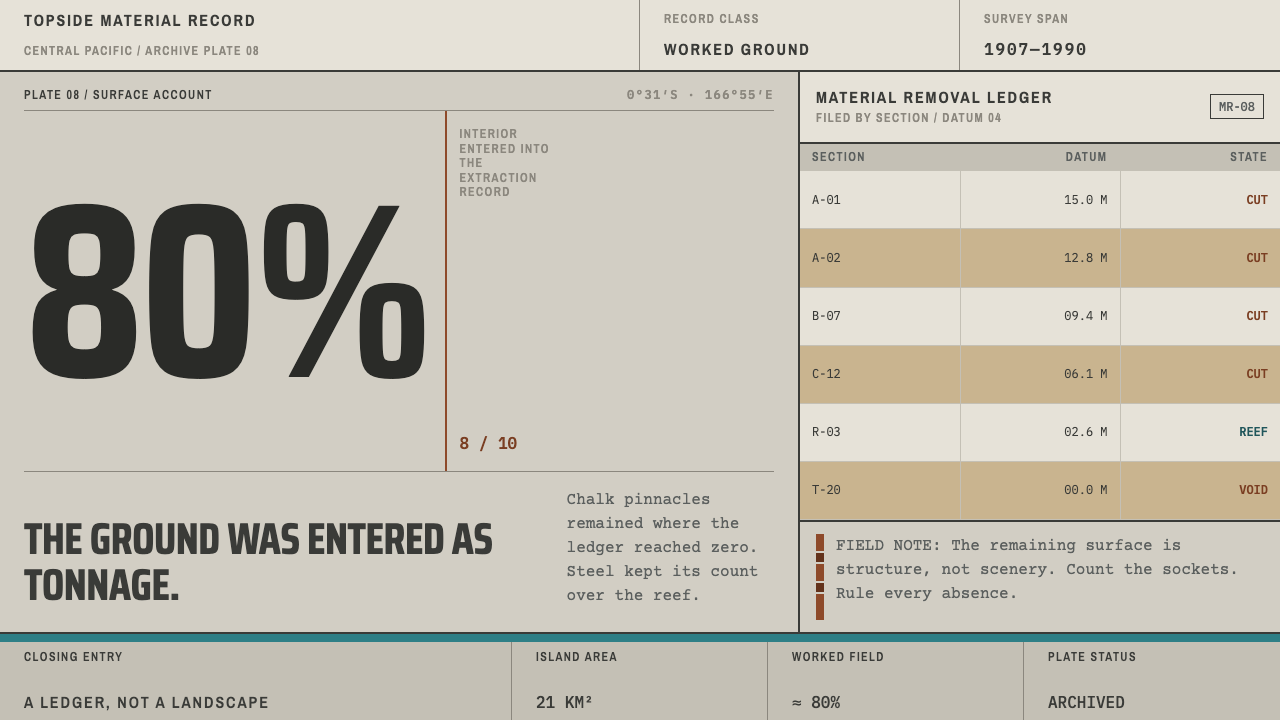
Nauru Phosphate Works takes its look from the paperwork of an island mined down to its coral skeleton: chalk grey, oxide rust, one band of reef teal, everything ruled and counted.
Nauru Phosphate Works in brief
Nauru Phosphate Works is a visual system drawn from the paper trail of phosphate extraction on Nauru, the small Central Pacific island whose interior was cut away over most of the twentieth century. It is not a design movement and it has no manifesto. Its look comes from the working documents of a mining industry: survey plates, condensed signwriting, tonnage ledgers, typewritten manifests and hull stencils. What those documents share is a narrow palette, a chalky grey ground, oxide rust and a single band of reef teal, and a layout habit in which everything is aligned hard left, divided by rules and counted.
The style takes both its subject and its logic from an absence. Around four-fifths of the island is known as Topside, a field of bleached limestone pinnacles left standing after the phosphate between them was removed. Down on the reef at Aiwo, the steel cantilever loaders that once swung cargo out over the water are still there, scaled with oxide and still bolted to their trusses. Pale stone spires, rust-eaten steel and a strip of turquoise sea behind them: that is the whole colour story, and the style adds nothing to it.
In practice the result reads like a ledger rather than a poster. Type is functional and compressed, columns are ruled, numbers carry more weight than adjectives, and nothing is centred, softened or decorated. It suits projects that need to convey weight, record and accountability: reports, audits, archives, infrastructure and supply-chain material, or any work whose subject is what something cost to produce.
Where does Nauru Phosphate Works come from?
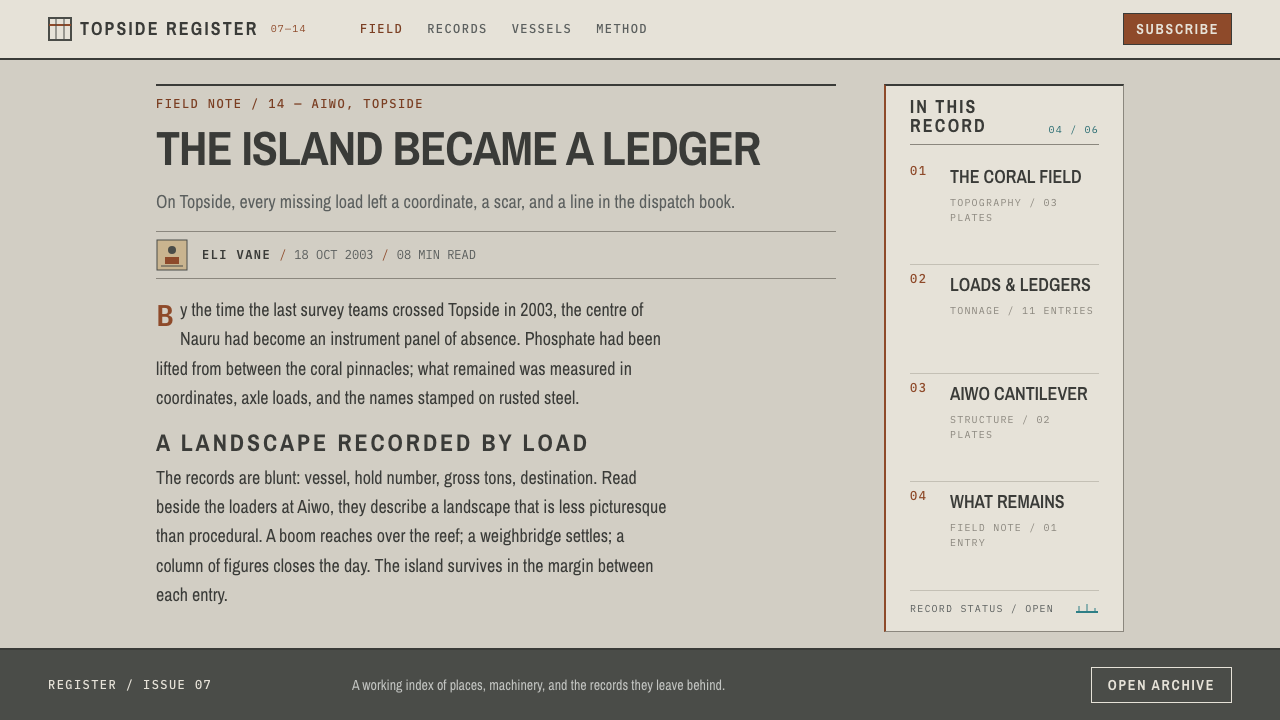
The industrial record behind the style runs from about 1907 into the 1990s, and its geography explains its look. Nauru's phosphate lay in the hollows between ancient coral limestone pinnacles, so it could be dug out only by working around the columns. The cleared ground does not resemble a flat pit. It resembles a petrified forest, countless pale uprights standing on a floor that has been removed from beneath them. The equatorial sun bleaches the rock further, which is why chalk grey, not black or brown, anchors the palette.
The name conventionally attached to the beginning of the story is Albert Fuller Ellis, the prospector credited with recognising, around the start of the twentieth century, that the island's rock was phosphate. Phosphate mattered because it was fertiliser, and the extraction that followed was organised as an export industry: dig, dry, load, weigh, ship. Each of those steps produced paper, a survey plate for the ground, a ledger line for the weight, a manifest for the cargo, and that paper is the raw material of this style.
From 1919 to 1967 the work was run by the British Phosphate Commissioners, an administrative body acting for Britain, Australia and New Zealand. Their era left the most durable physical and documentary evidence: the steel loaders on the reef at Aiwo, and an archival convention of engineering drawings, shipping lists, stencilled markings and typed correspondence. The source of this style is that convention taken literally, the way an engineering office laid out a page when the only goals were to be accurate, to be traceable and to be filed.
Nauru became independent in 1968, and the Nauru Phosphate Corporation, the island's own enterprise, took over the operation. Peak extraction came after independence, so the ledger did not close with the colonial administration. The same habits of ruling, counting and plain stencilled lettering carried on under local ownership into the 1990s. What the style preserves is therefore not a single moment but a long industrial register, together with the landscape it left behind, which is why the grey, the rust and the teal still read together as a portrait of removal.
What defines the Nauru Phosphate Works look?
Chalk-grey ground
The base is a pale, chalky, matte grey, the colour of limestone bleached by equatorial sun and of aged survey paper. It is a ground, not an accent: large areas sit in this single tone, with dark ink for type and rules. White is not the default, because a clean white page would belong to a different story.
Oxide rust
Rust is the working colour, taken from the steel of the cantilever loaders. It marks emphasis, structure and warning, such as a ruled heading bar, a figure that needs attention or a stencilled label, and it carries the weight of an actual material rather than the sparkle of a highlight. Its job is to look corroded and still in service, not decorative.
One band of reef teal
Teal appears as a single band, the strip of reef water that sits behind every photograph of the loaders. One band per composition is the discipline. It works like a horizon, a data stripe or a status line, and spread across a whole page it would stop meaning anything.
Condensed signwriting and stencil lettering
Display lettering follows industrial signwriting: narrow, upright, compact capitals that fit many letters into a small space, together with the cut-bridge lettering of hull and crate stencils for names and identifiers. These letters were made to be read at a distance on steel, not to be admired.
Typewritten voice
Manifests and correspondence supply the second voice: a typewriter-style monospaced face for lists, references and notes, with the even rhythm of mechanical typing. Set against the compressed display lettering, it separates the headline from the record and gives the page its documentary tone.
Ledger layout
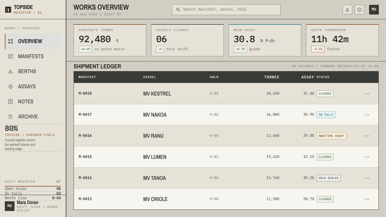
Everything is aligned hard left. Columns are divided by ruled lines, rows are counted, and tabular data is allowed to dominate the page. There is no centring and no decorative framing; structure is built from rules alone, in the manner of a tonnage ledger or an engineering title block.
Counting as content
Quantities are the content: tonnages, ship names, plate numbers, survey references. Numerals are set deliberately and aligned in columns so the eye can total them, and a figure is allowed to be the largest thing on the page. The style would rather give you a count than an adjective.
Who shaped Nauru Phosphate Works?
Ellis is the name associated with the opening of Nauru's phosphate story, as the prospector credited with identifying the island's rock as a commercial deposit around the start of the twentieth century. He stands for the moment at which a landscape became a resource, after which the survey plate and the ledger line began to define how the island was seen. The style inherits that way of seeing: the ground is described by what can be taken out of it.
The BPC, active from 1919 to 1967 and acting for Britain, Australia and New Zealand, ran the extraction through the long colonial middle of the island's phosphate era. Its engineers and clerks produced the archival convention this style borrows from, hull stencils, tonnage lists, typed manifests and survey photographs, and left behind the steel cantilever loaders at Aiwo that remain the style's most recognisable image.
Set up as the island's own operator after independence in 1968, the corporation presided over the period of peak extraction. Its place in the record shows that the ledger aesthetic outlived the colonial administration: the same ruled, counted and stencilled habits of documentation continued under local ownership into the 1990s.
How do you use Nauru Phosphate Works today?
Nauru Phosphate Works is best used when the subject has weight: when a document needs to show what was taken, counted, shipped or lost. Its power comes from restraint and from its association with industrial record-keeping, so it works least well as a mood-board skin and best when the layout itself behaves like an archive, with columns, rules, references and numbers doing real work.
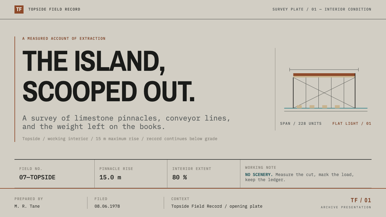
For presentation slides, treat the cover as a survey plate or a ship's manifest: a chalk-grey field, a left-aligned title in condensed capitals, a rust rule beneath it and a small reference line in typewritten type, perhaps with a single teal band across the foot. Content slides should be ledgers, a heading, a ruled table and a few counted rows, with no decorative dividers and no centred text. Data slides are where the style shines: bar and column charts in rust against grey, one teal series for comparison, labels set flush left, and the numbers printed large enough to total by eye.
For web interfaces the style suits audit trails, reporting dashboards, logistics and inventory tools, and any product where users read tables more than they click cards. Use a strictly left-aligned single or multi-column layout, ruled row separators in place of card containers, rust for status and emphasis, and teal for the one active or positive indicator on the screen. Navigation should be plain text labels in condensed capitals. Pricing or comparison pages work as a tariff schedule, rows and columns rather than boxes.
For editorial and marketing work, Nauru Phosphate Works gives long-form reporting, annual reports, environmental and infrastructure documentation and exhibition material an authoritative, document-like voice. A page can open with a stencilled title and a short typewritten abstract, then run in ruled columns with figure captions keyed by number. Photography should look like archival survey work, pale and flat, with the teal band as a real horizon rather than a graphic effect.
The most common mistake is to treat the palette as a trendy industrial look: scattering rust across buttons and cards, adding teal as a general accent, or centring the headline for drama. The style depends on scarcity, one rust, one teal band, one alignment, and on respect for the subject. Because the source is a real island and a real extractive history, avoid using it for light consumer branding where the associations would feel flippant.
Nauru Phosphate Works — FAQ
Is Nauru Phosphate Works a historical design movement?
No. It has no manifesto, no school and no named designers. It is a documentary style: it reconstructs the visual habits of a mining industry's paperwork, survey plates, signwriting, ledgers, manifests and stencils, from a period running from 1907 into the 1990s. Its authority comes from the fact that these documents were made to be accurate and filed, not to look designed.
Why does the palette have only three colours?
Because the source offers only three: the bleached limestone of Topside, the rust of the cantilever loaders and the reef water behind them. Keeping to those three means every colour carries a physical meaning, ground, working steel and horizon, rather than decoration. Adding a fourth hue would turn a documentary palette into a brand palette.
How is it different from generic industrial or brutalist design?
Industrial and brutalist looks usually lean on heavy black type, raw concrete texture and large blocks of mass. This style is lighter and more bureaucratic: a pale ground, thin ruling, condensed signwriting and typewritten notes. Its authority comes from documentation rather than from weight, and its subject is a specific place and a specific record, not a general attitude.
Can it work on a dark background?
The reference is a pale, chalky ground, and the style is built around that bleached tone, so a light base is the right default. A dark version would lose the connection to limestone and survey paper, and the rust and teal would need to be rebalanced. If you try it, keep the ledger structure intact and use flat colour sparingly.
What kinds of products and content suit it?
Audit and reporting tools, logistics and inventory dashboards, annual and environmental reports, archives, museum or documentary projects and supply-chain explainers. It struggles with playful or lifestyle-oriented consumer branding, where its history of extraction would make the tone feel wrong. The best test is whether the content is about records, quantities or consequences.
Related design styles
 Modern Arabic Type SpecimenDry proof-sheet gravity. Black naskh grids on aged grey-beige, cut by red fol…
 Everest Expedition (1953)Quiet heroism, precisely measured. Ice-blue contours and mono data cross a sn…
 Feynman Diagram QEDMeaning reduced to strokes. Pale QED lines and TeX serif type float on blue-b…
 Shark Jaw & DentitionForensic and strictly greyscale. Bone-white serrated dentition floats on a co…
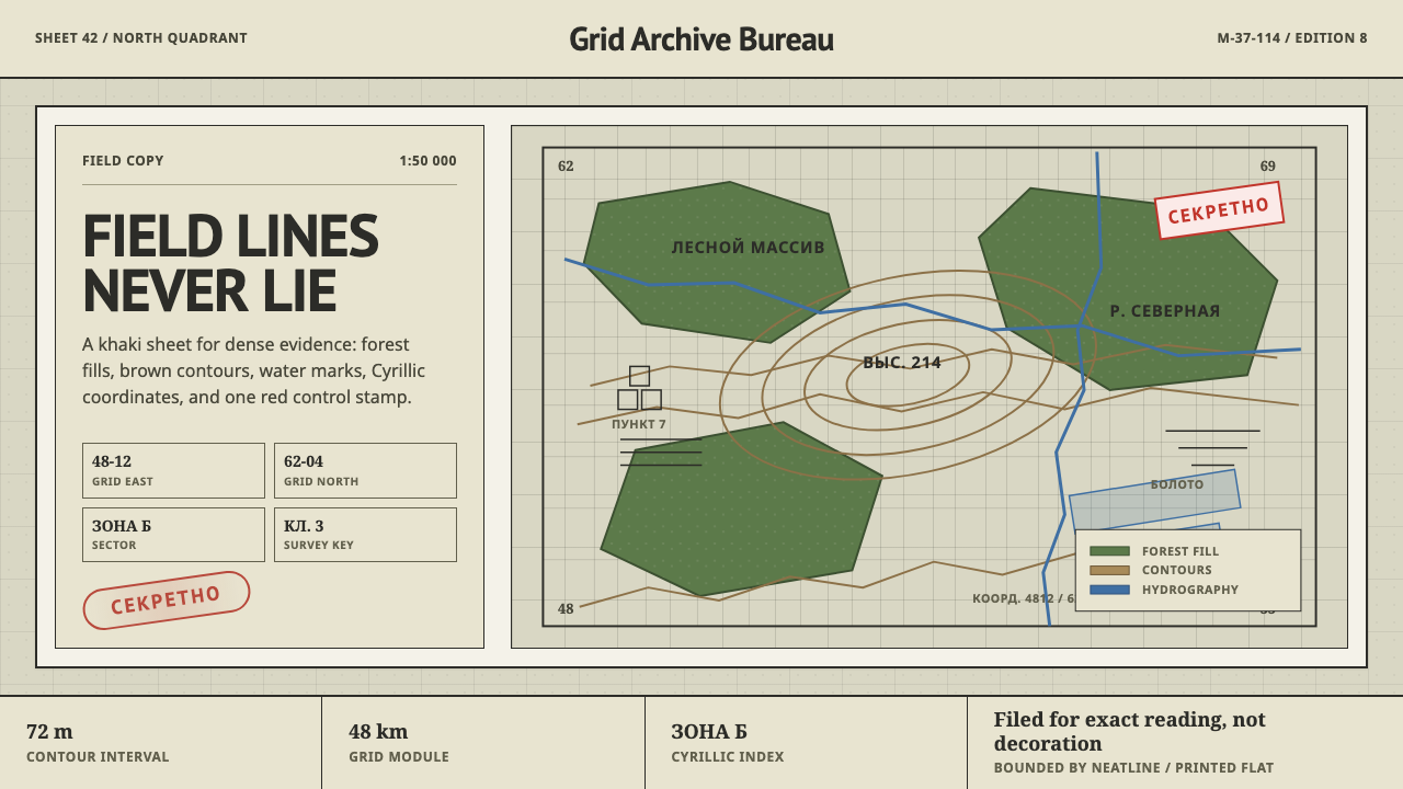 Soviet Classified MapAustere field intelligence. Khaki grid, forest green fills, brown contours, r…
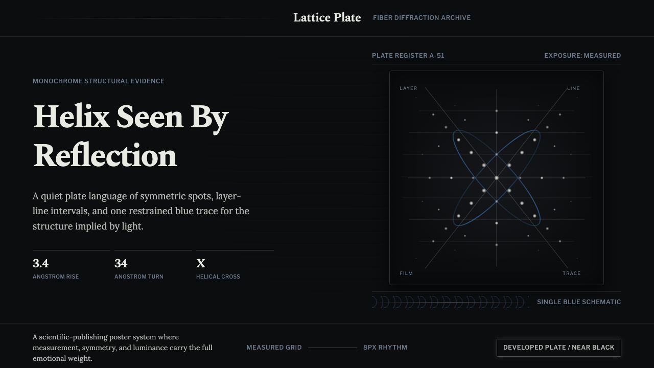 X-Ray CrystallographyQuiet evidence glows. Near-black film, Spectral serifs, and an X-cross spot l…