What is Michael Graves Postmodern?
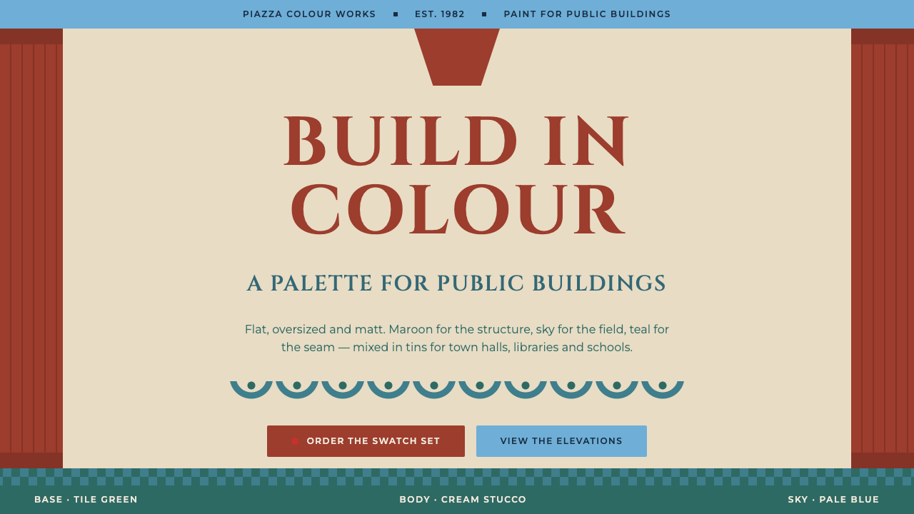
Michael Graves took classical architecture, flattened it, enlarged it and painted it, and a building became a picture you could walk into.
Michael Graves Postmodern in brief
The Michael Graves postmodern style is built from the facade of the Portland Building: a cream stucco body, two giant terracotta-maroon pilasters, a keystone over the entrance, teal swags, a blue-green tiled base and a pale sky band on top. Every piece of classical vocabulary is flattened, enlarged and painted. The building does not hide its references; it displays them as graphic signs.
The same logic runs through Graves's objects, most famously the Alessi 9093 kettle with its blue handle and small red bird whistle. Layouts based on this approach are frontal and symmetrical, and they read from bottom to top as base, body and sky. Color is treated as building material rather than decoration: maroon forms the frame and the headings, pale blue covers large areas, and teal draws dividing lines.
Seen as a design language, it is an argument that a facade can be a picture and a picture can be a building. It is formal without being austere, symmetrical without being cold, and playful without being random. That balance between civic seriousness and graphic humor is the core of its appeal.

Where does Michael Graves Postmodern come from?
The style is rooted in the postmodern turn in architecture. By the late 1970s many architects were questioning the glass-and-steel modernism that had dominated public building for decades, and postmodernism answered with historical reference, ornament, color and wit. Michael Graves was one of its best-known practitioners, working from Princeton, New Jersey, and his early reputation as an architect-painter shaped how he approached facades.
The Portland Building is the defining project. Its design and construction ran from 1980 to 1982, in Portland, Oregon, and it was completed among a field of glass curtain-wall towers. Against that background, its cream stucco body, small square windows, giant pilasters, keystone and painted garlands looked startlingly different. The base was clad in blue-green tile to stand for the earth and the top was painted pale blue to stand for the sky, so the facade could be read as a diagram of a classical building. DLR Group is among the names associated with the project's later life.
Graves then carried the same vocabulary into products. The Alessi 9093 kettle, from 1985, was developed with Alberto Alessi, whose company commissioned architects to design household objects, and its blue handle and red bird whistle are an instance of color and figure used as signs. The Team Disney Building in 1990 extended the approach to a corporate headquarters. In 1999, Graves began a long collaboration with Target on housewares, bringing the language to mass-market objects.
The movement context listed for this system is postmodern architecture, postmodern product design and Memphis. Memphis, the Milan collective, shared with Graves an interest in color, pattern and playful reference, even though its forms were quite different. Together they show how the 1980s turned design from a question of purity into a question of meaning, signs and pleasure.
What defines the Michael Graves Postmodern look?
Color as building material
Color is used in large, flat, structural fields, the way paint or tile would be used on a building. A deep terracotta-maroon forms the frame and the headings, a pale sky blue spreads across big areas, teal draws dividing lines and swags, and cream provides the body. The palette is warm and earthy at the center and cool at the edges, and it follows the logic of a facade rather than the logic of decoration.
Frontal symmetry
Compositions face the viewer directly and are mirrored left to right, like a building elevation. A central axis carries the main title or entrance, and flanking elements repeat on either side. This gives layouts a formal, civic calm and makes hierarchy obvious at a glance.
Base, body and sky
Layouts read from bottom to top in three zones. A tiled base grounds the page, a cream body holds the main content, and a pale sky band closes the top. The zoning mirrors the Portland Building and gives every page an architectural order that is easy to follow, whether it carries a slide, a poster or a web page.
Flattened classical vocabulary
Pilasters, keystones, swags and garlands appear as flat, enlarged graphic shapes rather than as carved volumes. They frame content like columns frame a doorway, but they are drawn with the simplicity of a poster. The effect is a classical reference that is immediately legible and lightly ironic.
Classical capital lettering
Headings are set in capital letters of a classical, inscriptional character, with generous letter spacing, like carved lettering on a civic building. Body text is quieter and plainer so that the capitals can act as monuments. The pairing gives the style its sense of ceremony without making it heavy.
One playful accent
The small red bird from the Alessi kettle is the model for the accent: a single bright element, used once on a screen, that adds humor to a formal arrangement. Without it, the system risks becoming solemn; with too many, it loses its sense of order. One is enough.

Who shaped Michael Graves Postmodern?
The architect and designer behind the system, working from Princeton, New Jersey. He designed the Portland Building in 1980 to 1982, the Alessi 9093 kettle in 1985 and the Team Disney Building in 1990, and later collaborated with Target on housewares. His architect-painter sensibility is why facades in his work read as pictures.
Head of the Italian company Alessi, which commissioned architects to design household objects. The 9093 kettle with its blue handle and red bird whistle came out of this collaboration and became one of the best-known pieces of postmodern product design.
Listed among the key names connected with the Portland Building. Its involvement belongs to the building's later life and conservation, reminding us that a postmodern landmark continues to need practical stewardship long after its design is celebrated.
How do you use Michael Graves Postmodern today?
On slides, the Graves style suits ceremonial and institutional moments: a keynote opening, a strategy presentation, an annual review or a design talk. A cream page with a maroon frame and a classical capital title feels formal without being cold. Use the base, body and sky zoning to organize every slide the same way, so the audience quickly learns where the title, the content and the footer live.
For data slides, put the chart in the cream body, bordered by maroon structure, and use the pale blue band for the headline finding. Let teal draw the dividing lines between sections. Keep the data itself in a restrained set of colors from the palette, and treat the red accent as a highlight to be used once, such as on the number that matters most.
In web interfaces, the style fits cultural institutions, museums, civic sites, architecture and design studios, and home or kitchen brands. Compose pages like elevations: a symmetrical header with a central title, a body of cards or columns framed by pilasters, and a tiled footer. Keep navigation simple and readable, because the strong frame leaves little room for decorative navigation.
In editorial and marketing work, the look gives posters, invitations, exhibition announcements and product launches an instant sense of occasion. The flattened classical shapes translate well to print and to social graphics. It is particularly effective when the subject itself is design, architecture or homeware, where the reference to Graves is part of the message.
The most common mistake is to treat the palette as a mood and forget the structure. Maroon and sky blue on their own are just colors; the style depends on frontal symmetry, three-zone layout and enlarged classical shapes. Another mistake is to repeat the playful accent until it becomes noise. Keep one bird, a clear axis and honest zoning, and the page will read as an elevation rather than as a pastel theme.

Michael Graves Postmodern — FAQ
What building is this style based on?
It is based on the Portland Building in Portland, Oregon, designed by Michael Graves and built between 1980 and 1982. Its cream stucco body, giant maroon pilasters, keystone, teal swags, tiled base and pale blue top supply the structure and palette of the system.
What is the connection to the Alessi kettle?
The Alessi 9093 kettle, from 1985, applies the same logic to a household object: blue handle, red bird whistle, color and figure used as signs. It shows that Graves treated a kettle and a city building with the same vocabulary, which is why the red accent in this system is modelled on the bird and used once per screen.
How is it related to Memphis?
Both belong to the postmodern turn of the 1980s and share an interest in color, reference and play. Memphis is a Milan collective with a more fragmentary, pattern-heavy look; Graves works with symmetrical, classical-derived forms. They are related in attitude rather than in surface appearance.
Is the style suitable for modern digital products?
Yes, particularly for cultural, civic, architectural and homeware subjects. Its zoned, symmetrical structure translates well to web pages and slides. It is less suited to dense tools or dashboards where decorative frames would take space from data.
Why is the layout read from bottom to top?
Because it follows the facade of the Portland Building: a tiled base for the earth, a cream body for the main structure and a pale sky band on top. The reading order gives each zone a role, grounding the page at the bottom and closing it with light at the top, much as a building stands on the ground and meets the sky.
Related design styles
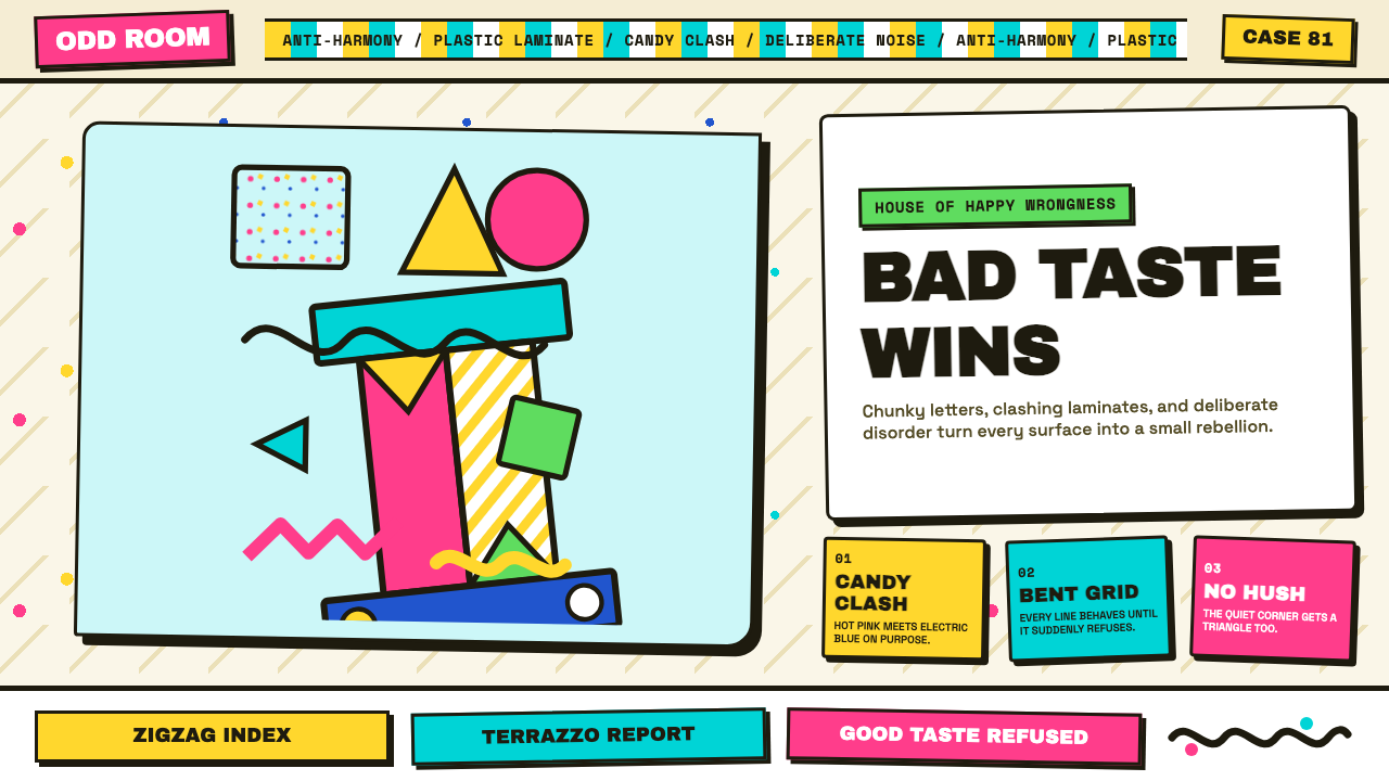 Memphis (Sottsass 1981)Joy weaponizes bad taste. Hot pink, turquoise, yellow and terrazzo specks bre…
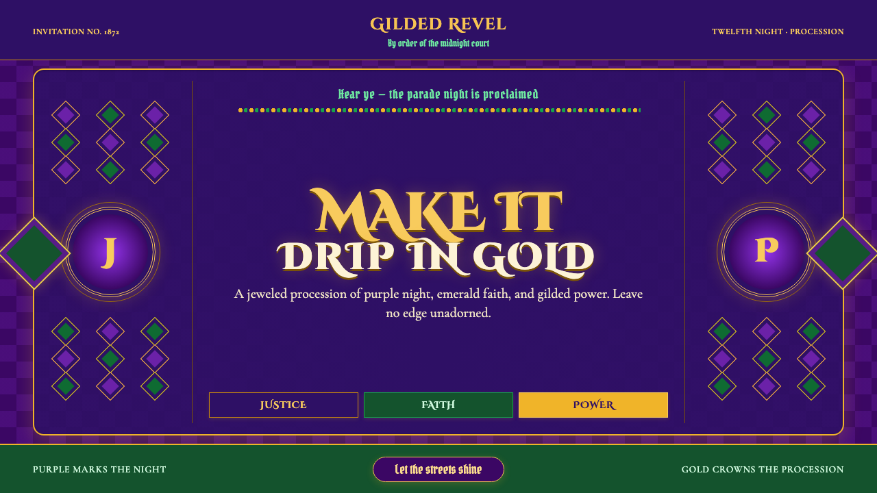 Mardi Gras New OrleansJoyfully excessive. Gilded type, jewel purple, emerald, and bead-strand borde…
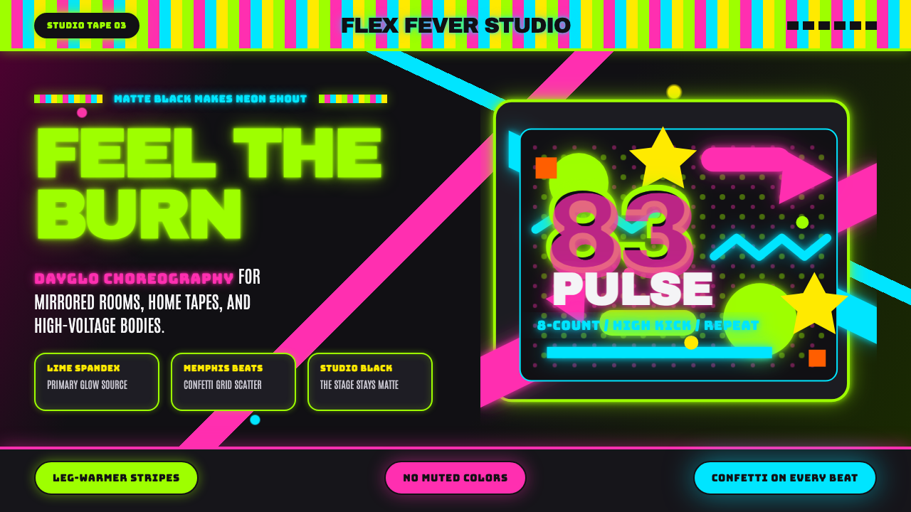 80s Aerobics Fluoro SpandexNeon refuses restraint. Lime spandex, pink-cyan confetti, and black-stage typ…
 April Greiman HybridResolution becomes material. Bitmap type and process magenta collide on a bro…
 Bolivian Cholita (Bowler-Hat Fiesta)Loud pride, fully reclaimed. Magenta pollera bands, emerald borders, bowler c…
 Chicago HouseDarkness starts the track. Neon pink, yellow and cyan hit black like Xerox st…