Design style guide设计风格指南
What is Petronas Twin Towers KL?什么是 Petronas Twin Towers KL?
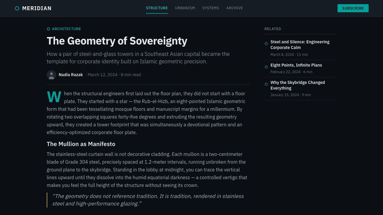
The Petronas Twin Towers transformed an eight-pointed Islamic star into a 452-metre corporate identity — fusing petrostate authority with centuries of geometric ornament.双子塔将八角伊斯兰星形转化为一座452米的企业身份宣言——将石油国家的权威与数百年几何纹饰传统熔于一炉。
Petronas Twin Towers KL in briefPetronas Twin Towers KL 速览
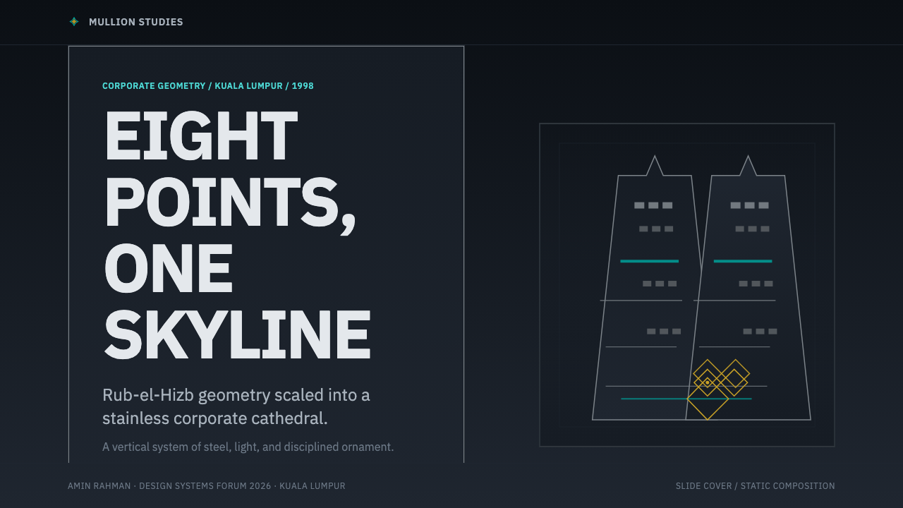
The Petronas Twin Towers design system is a corporate visual language rooted in the floor plan of the towers themselves: the Rub-el-Hizb, an eight-pointed star formed by two overlapping squares, a motif central to Islamic geometric tradition. Architect César Pelli took this ancient pattern and extruded it upward into a supertall, then allowed its underlying geometry to govern every surface, ornamental band, and structural bay of the building. The visual identity that followed inherited the same discipline — teal, silver, and gold rendered with engineering-grade precision against dark grounds.双子塔设计系统是一套根植于塔楼平面图的企业视觉语言:"鲁卜希兹卜"——由两个重叠正方形构成的八角星,伊斯兰几何传统的核心母题。建筑师塞萨尔·佩里将这一古老图案向上拉伸为超高层建筑,并让其内在几何逻辑支配建筑的每一个表面、装饰带与结构开间。随之而来的视觉识别系统继承了同样的严谨——青绿、银灰与金色以工程级精度呈现于深色底面之上。
Where most corporate modernism of the late twentieth century reached for abstraction and neutrality, the Petronas system reaches for specificity and cultural gravity. The towers were conceived as a statement of Malaysian national ambition during the Mahathir era, and the design reflects that intention: nothing is incidental, nothing is soft. The palette reads as cool, authoritative, and slightly ceremonial — closer to a state seal than a tech logo.二十世纪末的大多数企业现代主义追求抽象与中立,双子塔系统却追求特殊性与文化分量。这两座塔楼是马哈蒂尔时代马来西亚国家雄心的宣言,设计也忠实反映了这一意图:没有任何偶然,没有任何柔软。色板读来冷峻、权威、略带礼仪感——更接近国家印章,而非科技公司标志。
The visual system operates primarily in a dark register. Deep midnight backgrounds — neither pure black nor the warmth of navy, but a precise shade between them — serve as the field against which teal mullion lines, gold geometric borders, and silver typographic elements are placed. The effect is one of illuminated precision: geometry glowing in controlled conditions, like the tower facades seen from the KLCC Park bridge at night.这套视觉系统主要在深色调中运作。深邃的午夜底色——既非纯黑,也无海军蓝的温度,而是介于两者之间的精确色调——是承载青绿竖框线、金色几何边框与银灰字体元素的底场。效果是一种被照亮的精密感:几何形在受控条件下发光,一如夜晚从KLCC公园天桥望去的塔楼立面。
See the Petronas Twin Towers KL design system →查看 Petronas Twin Towers KL 完整设计系统 →
Where does Petronas Twin Towers KL come from?Petronas Twin Towers KL 从何而来?
The story begins with a design competition held in 1991 and 1992, as Malaysia sought an architect to define the centerpiece of the Kuala Lumpur City Centre development — a massive urban redevelopment on the former site of the Selangor Turf Club. Prime Minister Mahathir Mohamad wanted a building that would announce Malaysia's arrival as a modern industrial nation while remaining unmistakably rooted in Malay and Islamic cultural identity. The brief effectively asked for a structure that could be seen from space and understood as Malaysian.故事始于1991至1992年间的一场设计竞赛。彼时,马来西亚正在寻找一位建筑师,为吉隆坡城中城开发项目——建于旧雪兰莪草场原址上的大规模城市再开发——设计核心建筑。总理马哈蒂尔·穆罕默德希望建造一座既能宣告马来西亚以现代工业国家姿态崛起、又无疑根植于马来与伊斯兰文化身份的建筑。任务书实际上要求的是:从太空可见,一眼认出是马来西亚的。
César Pelli, the Argentine-American architect then running his practice from New Haven, won the commission. His decisive move was the floor plan: rather than the rectilinear footprint standard to supertall construction, he proposed a Rub-el-Hizb — the eight-pointed star that appears in the geometric ornamental tradition of Islamic architecture from Persia to Andalusia. Two squares rotated forty-five degrees, overlapping, with the corners filled in to create a regular sixteen-sided polygon. This shape, generated from pure geometric logic, became the founding module of everything: the towers, the skybridge connector, the KLCC podium, and eventually the visual identity of Petronas itself.彼时在纽黑文执业的阿根廷裔美国建筑师塞萨尔·佩里赢得了委托。他的决定性举措在于平面图:他没有采用超高层建筑通用的矩形基底,而是提议采用"鲁卜希兹卜"——从波斯到安达卢西亚的伊斯兰建筑几何装饰传统中的八角星形。两个正方形旋转四十五度相互叠压,四角填实,形成一个规则十六边形。这个由纯几何逻辑生成的形状,成为一切的基础模块:双塔、天桥连廊、KLCC底座,乃至最终的石油公司视觉识别。
Construction proceeded through the mid-1990s under the structural engineering leadership of Achmad Murdijat, who had to solve the problem of building supertall towers in Kuala Lumpur's notoriously difficult geology — the limestone karst and alluvial soil beneath the KLCC site required foundations driven to extraordinary depths on the eastern tower, a difference that contributed to the slight lean corrected during construction. The towers were topped out in 1996 and formally opened in August 1998, briefly claiming the title of world's tallest buildings before being surpassed by Taipei 101 in 2004.建设工程贯穿九十年代中期,由结构工程师阿赫马德·穆尔迪亚特主导。他必须解决在吉隆坡极为复杂的地质条件下建造超高层建筑的难题——KLCC基地下方的石灰岩溶岩与冲积土要求东塔基础打入异常深的深度,这一差异造成了施工期间修正的轻微倾斜。双塔于1996年封顶,1998年8月正式开放,短暂摘得世界最高建筑桂冠,直至2004年被台北101超越。
The color choices that became the system's palette were not arbitrary. The teal — a color sitting between the blue-green of stainless steel under cool fluorescent light and the oxidized copper of Islamic architectural ornament — references both the engineering reality of the towers' cladding and the broader chromatic tradition of Malaysian mosque interiors. Gold recalls the gilded geometric banding that appears in Malay royal regalia and Islamic illuminated manuscripts. Silver connects to the structural honesty of the stainless steel curtain wall. Together they form a palette that is simultaneously industrial and ceremonial — the two registers that Malaysian corporate identity at its most ambitious has always tried to hold at once.构成这套系统色板的颜色并非随意。那种青绿色——介于冷光荧光灯下不锈钢的蓝绿与伊斯兰建筑装饰铜绿氧化色之间——既指涉塔楼幕墙的工程现实,又呼应马来西亚清真寺内部更广泛的色彩传统。金色令人联想到出现在马来皇室礼器与伊斯兰彩绘手稿中的镀金几何带饰。银色则连接着不锈钢幕墙结构诚实性的表达。三者共同构成一套既工业又礼仪性的色板——马来西亚企业形象在最具雄心的时刻,始终试图同时持有的两种音调。
What defines the Petronas Twin Towers KL look?Petronas Twin Towers KL 的视觉特征是什么?
Color palette色板
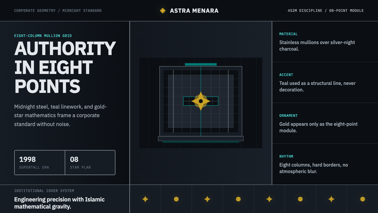
The system operates on three principal colors deployed against a deep midnight ground. Teal functions as the primary structural color — it appears in vertical mullion lines, geometric banding, and navigational elements, carrying associations with both engineered steel and Islamic tilework. Gold acts as the accent layer, reserved for borders, geometric ornamental nodes, and moments of hierarchy emphasis. Silver provides the typographic and secondary structural register, reading as cooler and more neutral than gold while maintaining the metallic quality of the overall palette. The midnight background is neither neutral nor decorative — it creates the controlled darkness against which the other three colors read as luminous rather than flat.这套系统以三种主要色彩铺设于深邃的午夜底色之上。青绿色作为主要结构色——出现在竖向框架线、几何带饰与导航元素中,同时兼具工程钢材与伊斯兰瓷砖的双重联想。金色作为强调层,保留用于边框、几何装饰节点与层级强调时刻。银色提供字体与次级结构层次,比金色更冷静、更中性,同时保持整体色板的金属质感。午夜底色既非中立也非装饰——它创造受控的黑暗,使其他三色读来发光而非扁平。
Geometric foundation几何基础
The Rub-el-Hizb — the eight-pointed star formed from two rotated overlapping squares — is not merely a decorative motif but the system's load-bearing structural module. It appears at every scale: as the tower floor plan itself, as ornamental panels on the facade, as sectional dividers in branded materials, and as the compositional anchor of any layout. This scalar consistency, where the same geometric form operates at building scale and at business-card scale, is rare in visual systems and gives the Petronas identity an unusual internal coherence. Subsidiary patterns include the sixteen-sided polygon (the filled star form), grid tessellations derived from it, and the interlocking arcs that appear in traditional Islamic geometric ornament."鲁卜希兹卜"——由两个旋转叠压正方形构成的八角星——不仅是装饰母题,更是这套系统的承重结构模块。它在每一个尺度上出现:作为塔楼平面图本身,作为立面装饰板,作为品牌材料中的分节符,以及作为任何版面的构图锚点。这种尺度一致性——同一几何形在建筑尺度与名片尺度上同等运作——在视觉系统中极为罕见,赋予了石油公司视觉识别异乎寻常的内在连贯性。辅助图案包括十六边形(填实的星形)、由此派生的网格铺砌,以及出现在传统伊斯兰几何装饰中的互锁弧形。
Surface and material quality表面与材料质感
The visual system translates the physical materials of the towers into a graphic register. Stainless steel reads as smooth, reflective silver with hard specular edges rather than soft gradients — the metal is cold and precise. The teal cladding, made from glass and steel panels, appears in graphic applications as a flat saturated field with crisp geometry rather than simulated translucency. Gold appears as a warm, matte-to-satin metallic rather than a reflective high-gloss — closer to anodized aluminum than polished brass. Together these material qualities produce a surface language that is simultaneously industrial (precision-engineered, hard-edged) and ceremonial (richly pigmented, formally ordered).这套视觉系统将塔楼的物质材料转化为图形语言。不锈钢呈现为平滑、反射性的银色,带有硬边高光而非柔和渐变——金属是冷峻而精密的。青绿色外墙由玻璃与钢板构成,在图形应用中呈现为饱和的平面色块,边缘清晰,而非模拟透明感。金色呈现为温暖的哑光至缎面金属质感,而非高反光镜面——更接近阳极氧化铝而非抛光黄铜。这些材料质感共同产生了一套表面语言:既工业(精密工程、硬边),又礼仪性(色彩丰富、形式有序)。
Typography register字体排印风格
Type in the Petronas system is formal, controlled, and hierarchical. Headlines favor letterforms with geometric clarity — strokes are even, proportions are regular, and there is a preference for faces that carry institutional weight without flourish. Body text is set compactly, often against the midnight ground in silver or white, with generous tracking in display contexts to reinforce the sense of engineering precision. Arabic script, when it appears alongside Latin letterforms, is treated with equivalent formality — proportioned to match visual weight, not subordinated in size or placement. The text block is a structural element, not a container of decoration.双子塔系统中的字体排印正式、克制、层级分明。标题偏好几何清晰的字形——笔画均匀,比例规整,倾向选用具有机构分量而无繁复装饰的字面。正文排印紧凑,常在午夜底色上以银色或白色呈现,展示语境中采用宽松字距以强化工程精密感。阿拉伯文字与拉丁字母并置时,以同等正式性处理——按视觉重量比例匹配,而非在尺寸或位置上居于次位。文字块是结构性元素,而非装饰的容器。
Grid and compositional order网格与构图秩序
Compositions in this system are bilaterally symmetrical or radially symmetrical — reflecting the geometry of the star plan itself, which has eight axes of reflection. This is a significant departure from most corporate modern design systems, which favor asymmetric grids. The Petronas palette permits and even rewards formal symmetry when the geometric ornament at the center has sufficient visual weight to anchor it. Off-center compositions do appear, especially in editorial applications, but the overall formal tendency is toward centered authority rather than dynamic asymmetry. Margins are generous; the geometry is given room to breathe, much as the KLCC precinct is set within a public park rather than pressed against neighboring structures.这套系统中的构图呈双侧对称或放射对称——映射星形平面图本身的八条反射轴。这是与大多数企业现代设计系统的重大背离——后者偏好非对称网格。双子塔色板允许甚至鼓励正式对称,前提是中心几何装饰具有足够的视觉重量来锚定构图。非居中构图确实出现,尤其在编辑应用中,但整体形式倾向是居中的权威感而非动态的非对称性。边距宽裕;几何形有足够空间呼吸,正如KLCC街区坐落于公共公园之中,而非逼压于相邻建筑旁。
Ornament as structure装饰即结构
Unlike Bauhaus or Swiss Style, which eliminate ornament as a matter of principle, the Petronas system treats geometric ornament as structurally equivalent to layout. A teal diamond border is not decoration applied to a useful object — it is the object's organizing logic made visible, in the same way that the facade's vertical fins are both structural cladding and ornamental rhythm. This reflects the Islamic geometric tradition's core insight: that pattern, properly generated from mathematical rules, does not decorate space but defines it. The ornament in this system is therefore never applied — it is derived.与将装饰作为原则性问题加以消除的包豪斯或瑞士风格不同,双子塔系统将几何装饰视为与版面等价的结构元素。一道青绿菱形边框不是施加于实用对象上的装饰——它是使对象组织逻辑可见的方式,正如立面竖向翼板同时是结构覆层与装饰韵律。这反映了伊斯兰几何传统的核心洞见:从数学规则中正确生成的图案,不是在装点空间,而是在定义空间。这套系统中的装饰因此从不是"施加"的——它是"推导"出来的。
Dark-ground luminosity深色底面发光感
The system's characteristic visual mood is produced by placing precise, saturated geometry against a very deep ground. This is the visual equivalent of the towers seen at night: the building's illuminated mullion lines become bright threads against the dark Kuala Lumpur sky, and the skybridge glows like a joining element between two lit forms. In graphic applications, this nighttime reading — light geometry on dark field — conveys authority, precision, and a degree of solemnity appropriate to a state-affiliated corporation. It also travels unusually well to screen contexts, where dark interfaces are increasingly standard.这套系统特有的视觉基调,是由将精确、饱和的几何形置于极深底色之上所产生的。这是夜晚双子塔视觉的图形等价物:建筑被照亮的竖框线成为吉隆坡深色天空中的明亮线索,天桥发光,像两个明亮体量之间的连接元素。在图形应用中,这种夜间阅读方式——深色底上的明亮几何——传达权威、精密,以及适合国家关联企业的庄重感。它在屏幕语境中同样具有异常强的适应性,而深色界面已日益成为主流。

See the Petronas Twin Towers KL design system →查看 Petronas Twin Towers KL 完整设计系统 →
Who shaped Petronas Twin Towers KL?谁塑造了 Petronas Twin Towers KL?
The Argentine-American architect who designed the Petronas Twin Towers, Pelli was already celebrated for large-scale commercial towers including the World Financial Center in New York when he entered the Kuala Lumpur competition. His decision to anchor the tower floor plan in the Rub-el-Hizb — rather than adopting the rectilinear footprint standard to supertall construction — was a defining cultural as well as architectural choice. The move gave the towers a formal identity that distinguished them from every other supertall of the late twentieth century and ensured that the geometry of Islamic ornament was literally the structural foundation of a building claiming to represent a new Malaysia.设计了双子塔的阿根廷裔美国建筑师。参加吉隆坡竞赛时,佩里已因纽约世界金融中心等大型商业高层建筑享誉业界。他决定以"鲁卜希兹卜"作为塔楼平面图基础——而非采用超高层建筑通用的矩形基底——这既是一个决定性的文化选择,也是建筑选择。这一举措赋予了双塔有别于二十世纪末所有其他超高层建筑的形式身份,并确保伊斯兰装饰几何成为一座宣称代表新马来西亚的建筑的字面结构基础。
Malaysia's Prime Minister from 1981 to 2003, Mahathir was the political architect of the Petronas Twin Towers project and the broader Kuala Lumpur City Centre development. His Vision 2020 program — which set the goal of Malaysia becoming a fully developed nation by the year 2020 — provided the ideological context for a building explicitly designed to signal national ambition. Mahathir's insistence that the towers reflect Islamic geometric heritage rather than generic international modernism was a direct brief to the architect and shaped the design system's cultural specificity.马哈蒂尔·穆罕默德,马来西亚总理(1981—2003年),是双子塔项目与吉隆坡城中城整体开发的政治设计师。他的「2020宏愿」计划——设定马来西亚于2020年成为全面发达国家的目标——为一座明确设计来彰显国家雄心的建筑提供了意识形态语境。马哈蒂尔坚持塔楼应反映伊斯兰几何遗产而非泛国际现代主义,这是对建筑师的直接指示,塑造了这套设计系统的文化特殊性。
The lead structural engineer on the Petronas Twin Towers project, Murdijat solved the complex geotechnical challenge of founding supertall towers on Kuala Lumpur's limestone karst and alluvial soil. The eastern tower required foundations driven to exceptional depths to reach stable rock, creating a construction challenge without precedent for structures of this height. His engineering decisions were inseparable from the architectural identity: the star-plan footprint, derived from the geometric ornamental module, also produced a structurally efficient core-and-perimeter system that made the supertall height achievable.双子塔项目的主结构工程师。穆尔迪亚特解决了在吉隆坡石灰岩溶岩与冲积土层上建造超高层建筑的复杂岩土工程挑战。东塔基础必须打入异常深度以触及稳定岩层,创造了这一高度等级建筑前所未有的施工难题。他的工程决策与建筑身份密不可分:从几何装饰模块推导出的星形平面基底,同时产生了一个结构高效的核心筒与外围系统,使超高层高度成为可能。
The internal design team responsible for translating the architectural identity of the towers into a corporate visual system for Petronas — Malaysia's national oil company and the towers' eponymous tenant. The Brand Office managed the extension of the teal-silver-gold palette from architecture into printed materials, signage, digital applications, and the company's global communications. The particular challenge they navigated was maintaining the ceremonial weight of the geometric system across mundane corporate contexts — annual reports, uniform programs, retail petroleum branding — without diluting the formal authority the palette carries in its most monumental applications.负责将塔楼建筑身份转化为马来西亚国家石油公司企业视觉系统的内部设计团队。品牌办公室管理着青绿-银灰-金色色板从建筑向印刷品、标识系统、数字应用与公司全球传播的延伸。他们所面对的特殊挑战是:在平凡的企业语境中——年报、制服计划、零售石油品牌——维持这套几何系统的礼仪分量,同时不稀释色板在最宏大应用场合所承载的正式权威。
Less a person than a millennium-long design lineage, the tradition of Islamic geometric ornament — developed across Persia, the Arab world, North Africa, Anatolia, and the Iberian Peninsula from roughly the ninth century onward — is the primary cultural source for the Petronas visual system. The key principles of this tradition include the generation of complex pattern from simple geometric rules (rather than drawing freehand), the treatment of pattern as mathematically continuous (capable of infinite extension in any direction), and the privileging of interlace and rotation over representational imagery. The Petronas system inherits these principles wholesale: its geometric ornament is rule-generated, scalable, and rotationally symmetric in ways that distinguish it sharply from decorative motifs borrowed without their underlying logic.与其说是一个人,不如说是一条绵延千年的设计谱系。伊斯兰几何装饰传统——大约从九世纪起在波斯、阿拉伯世界、北非、安纳托利亚与伊比利亚半岛发展而来——是双子塔视觉系统的主要文化源泉。这一传统的核心原则包括:从简单几何规则生成复杂图案(而非徒手绘制);将图案视为数学意义上的连续体(能向任意方向无限延伸);以及对交织与旋转的优先,而非对具象图像的依赖。双子塔系统全盘继承了这些原则:其几何装饰由规则生成,可无限缩放,旋转对称——这与那些借用装饰母题却不了解其底层逻辑的做法,有着清晰的区别。
How do you use Petronas Twin Towers KL today?今天怎么用 Petronas Twin Towers KL?
The Petronas system is one of the most architecturally grounded corporate visual languages ever built, and applying it well requires treating the geometric module — the eight-pointed star and its derivatives — not as decoration but as the structural principle of any composition. Before choosing colors or arranging type, establish the geometric armature. Does the layout have a center? Does the geometry tile or radiate? The color and type should then be placed in service of that geometry, not alongside it.双子塔系统是有史以来最具建筑根基的企业视觉语言之一,正确运用它需要将几何模块——八角星及其衍生形——不作为装饰,而作为任何构图的结构原则。在选择色彩或排布字体之前,先建立几何框架。版面有没有中心点?几何形是铺砌还是放射?色彩与字体应服务于几何,而非与之并列。
For presentation slides, the system suits cover pages designed around a single geometric focal point: the eight-pointed star at center, rendered in teal on a midnight ground, with the title set in silver above or below it with generous letter-spacing. Section divider slides work well with a single teal geometric band running the full width, separating the section title from the slide body. Content slides should be more restrained — the midnight ground with silver body text, teal used only for the most important data point or label, gold reserved for the session title or page reference. Avoid applying the full ornamental density to every slide; the system reads as more authoritative when the geometric richness is rationed.在演示文稿中,这套系统适合围绕单一几何焦点设计的封面页:八角星居中,在午夜底色上以青绿色呈现,标题以银色宽字距置于其上方或下方。章节分隔页适合以单条全宽青绿几何带,将章节标题与幻灯片正文分隔。内容页应更克制——午夜底色配银色正文,青绿色仅用于最重要的数据点或标签,金色保留用于场次标题或页码标注。避免在每张幻灯片上都施加完整的装饰密度;当几何丰富性被配给使用时,系统读来更具权威感。
For web interfaces and dashboards, the dark-ground palette translates directly to dark-mode UI with careful attention to contrast ratios for accessibility. Navigation and sidebar elements benefit from teal highlight states against the deep ground; data visualizations read well when the primary value is highlighted in gold against silver or teal secondary series. Pricing and tier pages suit the system's natural hierarchy: a central card in gold border for the featured tier, flanking cards in teal border for adjacent tiers, all on the midnight ground. The star-derived geometric element — even a small sixteen-sided polygon — can anchor a section header without feeling decorative.对于网页界面与仪表板,深色底面色板可直接转化为深色模式界面,需仔细关注无障碍对比度。导航与侧边栏元素在深色底色上以青绿高亮态呈现效果出色;数据可视化中,主要数值以金色高亮,青绿色或银色作为次要系列,可读性良好。定价与等级页面契合这套系统的自然层级:金色边框的中心卡片用于主推等级,青绿色边框的侧翼卡片用于相邻等级,全部置于午夜底色之上。星形派生的几何元素——哪怕是一个小的十六边形——也能在不显装饰感的情况下锚定章节标题。
For editorial and marketing applications, the system's poster quality should be embraced rather than softened. A full-bleed midnight background with a large teal geometric pattern in the upper portion and a product headline in oversized silver type below it will project the authority the system is built to convey. The danger in editorial contexts is over-ornament: the geometric bands and star motifs must serve the layout hierarchy, not crowd it. Use one strong geometric element per spread or screen; multiple competing ornamental bands flatten rather than reinforce hierarchy.对于编辑与营销应用,应拥抱而非弱化这套系统的海报质感。满铺午夜背景,上方以大型青绿几何图案,下方以超大银色字体呈现产品标题,将投射出这套系统被设计来传达的权威感。编辑语境中的危险是过度装饰:几何带饰与星形母题必须服务于版面层级,而非拥挤它。每个跨页或屏幕使用一个强有力的几何元素;多条竞争性装饰带只会平坦化而非强化层级。
The most common mistake in applying this system is treating teal, gold, and silver as interchangeable accent colors that can be freely rotated through a layout. In the authentic system, each color has a specific structural role: teal is primary structure, gold is hierarchy emphasis, silver is text and secondary support. Using gold for body text or teal for a decorative flourish that carries no structural meaning misreads the system's logic entirely. A second common error is pairing the system's dark palette with warm-toned photography or illustrative imagery — the geometric coldness and the photographic warmth fight each other. If imagery is used at all, it should be treated in a cool, high-contrast register that the geometry can absorb rather than clash with.应用这套系统最常见的错误是将青绿、金色与银色视为可在版面中自由轮换的等价强调色。在真实系统中,每种色彩有其特定的结构角色:青绿色是主结构,金色是层级强调,银色是文字与次级支撑。将金色用于正文,或将青绿色用于没有结构意义的装饰性花饰,是对系统逻辑的根本误读。另一个常见错误是将系统的深色色板与暖调摄影或插图配对——几何的冷峻与摄影的温度相互冲突。若使用图像,应以冷调、高对比度的处理方式呈现,使几何能够将其吸收而非与之抗衡。
See the Petronas Twin Towers KL design system →查看 Petronas Twin Towers KL 完整设计系统 →
Petronas Twin Towers KL — FAQPetronas Twin Towers KL · 常见问题
Why does this system work on a dark background when most corporate visual systems use white or light grounds?为什么这套系统用深色底色,而大多数企业视觉系统使用白色或浅色底面?
The dark ground is not a stylistic preference but a structural decision rooted in the architecture. The towers are experienced most powerfully at night, when the illuminated facade geometry — the teal mullion lines, the lit skybridge — glows against the dark Kuala Lumpur sky. A white-ground graphic application of the same palette would produce a very different emotional register: lighter, more approachable, but without the solemnity that the midnight backdrop provides. The dark ground also creates the luminosity effect — teal and gold on a deep dark field read as light-emitting, which is consistent with a brand narrative about a national energy company literally providing light and power.深色底面不是风格偏好,而是根植于建筑的结构性决定。双塔最有力的体验时刻在夜晚——被照亮的立面几何,青绿竖框线与发光天桥,在吉隆坡暗色天空中发光。同一色板若用于白色底面的图形应用,会产生截然不同的情感基调:更轻盈,更易亲近,但缺少午夜底色带来的庄重感。深色底色同时创造了发光效果——深色底场上的青绿与金色读来仿佛自发光,这与一家国家能源公司字面意义上提供光与电的品牌叙事一脉相承。
How does Islamic geometric ornament differ from generic decorative pattern?伊斯兰几何装饰与普通装饰性图案有何不同?
The distinction is generative logic. Decorative pattern is typically drawn to fill a space — it is applied to a surface. Islamic geometric pattern is generated from mathematical rules: a small set of construction operations (rotation, reflection, translation) applied repeatedly to a seed shape produces the full pattern. This means the pattern has no intrinsic boundary — it can theoretically continue to infinity in any direction, and cropping it at a frame edge does not violate its logic. In the Petronas context, this distinction matters practically: the eight-pointed star is not an image placed on the building — it is the rule from which the building is derived. Copying the appearance of the star without understanding its generative principle produces pastiche; applying the generative principle produces something with genuine coherence.区别在于生成逻辑。装饰性图案通常是为填充空间而绘制的——它是施加于表面的。伊斯兰几何图案由数学规则生成:将一小组构造操作(旋转、反射、平移)反复施加于种子形状,产生完整图案。这意味着图案没有内在边界——理论上可以向任何方向无限延伸,在框架边缘裁切它并不违背其逻辑。在双子塔语境中,这一区别具有实际意义:八角星不是放置在建筑上的图像——它是从中推导出建筑的规则。复制星形的外观而不理解其生成原则,产生的是仿制品;应用生成原则,产生的才是具有真实连贯性的东西。
Can this system be adapted for smaller organizations without the petrostate authority behind it?这套系统能否被没有石油国家权威背景的小型组织改编使用?
Yes, but the adaptation requires honest acknowledgment of what gives the system its weight. The Petronas visual language carries authority partly because of its architectural referent — there are actual 452-metre towers embodying this geometry — and partly because of the organization's scale and cultural significance. A smaller organization appropriating the full palette and ornamental density without that institutional backing risks looking aspirational in a way that reads as pretension rather than confidence. The most successful adaptations scale down the ornamental complexity and lead with one element — typically the dark ground and the geometric anchor — while using teal and gold more sparingly. The geometric principle travels better than the full palette does.可以,但改编需要诚实承认是什么赋予了这套系统分量。双子塔视觉语言的权威感部分来自其建筑指涉——确实存在452米高的建筑体现这一几何——部分来自组织的规模与文化重要性。没有那种机构背景的小型组织若全套挪用色板与装饰密度,可能显得过于攀高,读来像是虚张声势而非真实自信。最成功的改编做法是降低装饰复杂度,以单一元素主导——通常是深色底面与几何锚点——而更节制地使用青绿与金色。几何原则比完整色板更具可移植性。
How should this system handle bilingual content for both English and Malay or Arabic?这套系统应如何处理英语与马来语或阿拉伯语的双语内容?
The Petronas system was designed from the outset for a multilingual context — Malaysia's official communications operate in Malay, while English is the language of international business, and the Islamic geometric tradition has historical roots in Arabic-script cultures. The key principle is typographic equivalence: Arabic or Jawi script should be sized and weighted to carry the same visual authority as the Latin equivalent, not reduced in size to fit an assumed primary-language hierarchy. Geometric decorative elements serve as neutral connective tissue between scripts — a teal border band carries no linguistic bias. In practice, this means working with type foundries that have issued both Latin and Arabic families in the same weight range, and setting both scripts with equally generous spacing.双子塔系统从一开始就为多语言语境而设计——马来西亚官方传播以马来语运作,英语是国际商务语言,而伊斯兰几何传统在历史上根植于阿拉伯文字文化。核心原则是字体等价性:阿拉伯文字或爪夷文字的字号与字重应与拉丁对应文字承载同等的视觉权威,而非缩小以迁就假定的主要语言层级。几何装饰元素作为文字之间中立的连接性组织——青绿边框带不携带任何语言偏见。在实践中,这意味着选用同一家字体厂商同一字重范围内同时发行拉丁与阿拉伯字体家族的产品,并为两套文字设置同等宽松的字距。
Is there a risk of cultural misappropriation when non-Muslim designers or organizations use this system?非穆斯林设计师或组织使用这套系统时,是否存在文化挪用的风险?
The Islamic geometric tradition is a living design practice used across enormously diverse cultural contexts by Muslim and non-Muslim designers alike — it is not esoteric or restricted. The risk of misuse is not primarily about religion but about understanding: applying the superficial appearance of Islamic geometric ornament (star shapes, interlace) without the generative logic, the proportional discipline, and the cultural seriousness that gives it meaning produces something that reads as costume rather than design. The Petronas system specifically grounds its geometric use in an architectural referent with real historical, national, and cultural significance. Designers working in this system outside that context should be transparent about the reference, approach the generative principles with rigor, and avoid flattening a mathematically rich tradition into mere decoration.伊斯兰几何传统是一套被穆斯林与非穆斯林设计师在极为多样的文化语境中广泛使用的活态设计实践——它既不神秘,也不受限。误用的风险主要不在于宗教,而在于理解:运用伊斯兰几何装饰的表面外观(星形、交织纹),却缺乏赋予其意义的生成逻辑、比例自律与文化严肃性,产生的东西读来像是戏服而非设计。双子塔系统明确地将其几何运用扎根于一个具有真实历史、国家与文化意义的建筑指涉中。在那个语境之外使用这套系统的设计师应对参照来源保持透明,以严谨态度对待生成原则,并避免将一个数学上丰富的传统平坦化为单纯的装饰。
Related design styles相关设计风格
 2001 — A Space OdysseyAbsolute restraint. Black void, white monolith geometry, one HAL-red signal.绝对克制:黑色虚空、白色巨石几何、唯一的 HAL 红信号。
 Dune Arrakis (Villeneuve)Silence has scale. Sand-ochre slabs, spice-blue alarm, and tracked Inter on b…沉默自有尺度:沙赭巨块、香料蓝警讯与黑底宽字距 Inter。
 Fly.io Edge-Compute PurpleEdge-cloud with discipline. Electric purple nodes, Inter type, and terminal b…克制的边缘云:深黑底、电紫节点、Inter 字体与终端块。
 NVIDIA GPU Green-BlackPure black turns compute theatrical. Acid green hairlines and chip geometry s…纯黑让算力成舞台。酸绿细线与芯片几何制造光感。
 Samsung GalaxyTech-luxury goes black. Electric blue cuts through AMOLED void and titanium-g…科技奢华坠入纯黑。电光蓝切开AMOLED黑场与钛灰几何。
 Burj Khalifa TowerAltitude becomes authority. Navy glass, silver facets, and hairline gold rule…高度即权威。夜蓝玻璃、银色切面与发丝金线向上攀升。