What is Kill la Kill?
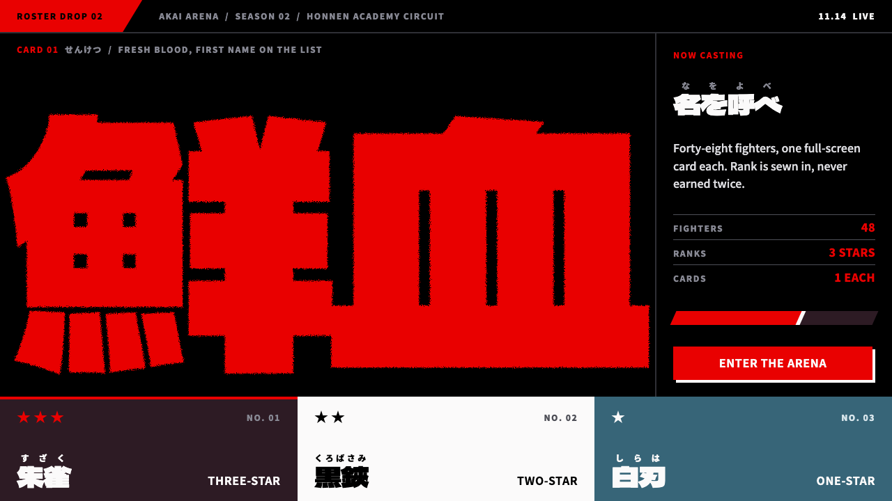
Kill la Kill built a whole visual language out of the title card: giant ink-bitten kanji on black, where impact is allowed to beat legibility.
Kill la Kill in brief
Kill la Kill, in design terms, is the look of Studio Trigger's 2013 debut television series, defined above all by its telop cards: full-screen captions in which names, titles and attack calls are set in enormous, rough-edged kanji, usually red or white on a pure black field. The words are not placed on the picture; they are the picture. A single character can fill the height of the frame.
Around that core sit a few supporting devices. Hard diagonal cuts slice the frame into wedges. Speed lines radiate from a point to push the eye. Tiny ruby, the small phonetic kana printed above kanji, hovers over the giant characters like a whispered footnote to a shout. The palette is deliberately narrow: the black and red of the series' living sailor uniform, white for type, and one cool sky-blue panel that gives the eye a single place to rest.
The governing principle is that impact beats legibility. Where most interface design asks whether something can be read comfortably, this style asks whether it hits the viewer before they have had time to read it. That is a risky trade, and it works only when it is applied with discipline: one loud thing per screen, everything else silent.

Where does Kill la Kill come from?
Kill la Kill was broadcast from October 2013 to March 2014 and was the first original television series from Studio Trigger, a Tokyo animation studio founded by veterans of the studio Gainax. It was directed by Hiroyuki Imaishi and written by Kazuki Nakashima. The story follows a schoolgirl named Ryuko Matoi who wields a half-scissor blade and wears a sentient sailor uniform called Senketsu, whose name means 'fresh blood' and whose black-and-red scheme became the series' color identity.
The visual lineage is the Gainax school of hyperkinetic anime, in which energy, exaggeration and speed matter more than anatomical or perspectival correctness. Imaishi's earlier work established a manner of drawing and cutting that favors extreme poses, smeared motion and pop-art flatness. Animator Sushio, listed among the key figures, belongs to the circle of artists whose bold, sketchy and extremely stylized drawing helped define that manner.
The telop card has a second root in Japanese television itself. Telop, the on-screen caption, is a familiar feature of Japanese broadcasts, where variety shows plaster the screen with large, colorful, emphatic lettering. Kill la Kill borrowed that grammar and pushed it to an extreme, setting the captions in Fontworks Raglan Punch, a heavy brush-like typeface whose edges look as if they were eaten by ink. The roughness is the point: it makes each character feel hand-struck, not typeset.
A third root is the economy of limited animation. When a studio cannot draw every frame in full motion, it can still deliver force through held poses, speed lines and cuts to text. Kill la Kill turned that constraint into a signature, using flat color fields and stark cards to create rhythm. The series was the product of a young studio proving that a distinctive look, rather than a large budget, could make an audience remember its name. As a design system, it takes the card as its smallest unit and builds everything else, from navigation to buttons, as a variation on it.
What defines the Kill la Kill look?
Color
The palette is the black and red of Senketsu: a pure black ground, a blood-like red for the biggest words, and white for secondary type. A single cool sky-blue panel, borrowed from the series' key art, provides contrast and relief. Colors are flat and fully saturated, with no gradients and no soft tints. Because the palette is so narrow, any extra hue reads as an event.
Type
Display type is a heavy, brush-like kanji face with edges that look chewed by ink, so each stroke feels struck rather than typeset. Characters are enlarged until they touch or exceed the frame, and a name may be cropped by the edge. Tiny ruby sits above the giant characters as a contrast of scale. Latin type, where it appears, is blunt and condensed, never delicate.
Shape
Edges are hard and diagonal. Panels are cut into wedges and parallelograms rather than rounded rectangles, and rules, bars and slashes appear as structural elements. Corners are sharp, there are no soft shadows, and shapes overlap like torn paper or cut film. Speed lines radiate from a single point to give a static card forward motion.
Composition
Compose each screen around one dominant word. The text fills the frame edge to edge, leaving only slivers of black around it, and everything else is subordinated. There is little symmetry; placement is aggressive, off-center and often tilted. Information density is low but force is high, so a card might hold a single name and one small caption.
Contrast
Contrast is maximal: huge against tiny, red against black, rough against clean. The ruby-to-kanji relationship is the clearest example, where a whisper sits over a shout. Because contrast does the work that hierarchy usually does, the style needs no borders, boxes or decorative dividers. Light type on black gives the whole system a night-time, stage-lit feeling.
Motion
Where motion appears, it is abrupt: hard cuts, snap-ins, quick zooms toward the text and held frames. Nothing eases politely into place. The mood is theatrical and loud, like a stage announcement, and it depends on stillness between the hits so that each one lands.

Who shaped Kill la Kill?
Imaishi directed Kill la Kill, and his philosophy of putting impact first is the foundation of the whole look. Working in the Gainax tradition of hyperkinetic animation, he favors extreme poses, flat color and bold cutting over refinement. The telop cards are a direct expression of his instinct that the audience should be hit before they can analyze.
Nakashima wrote the series, supplying the declamatory, shouted language that the title cards typeset: names, titles and attack calls delivered at full volume. A visual system built around giant words depends on text that deserves to be giant, and his scripts gave the design its material.
Sushio is an animator in the circle around Imaishi whose bold, sketchy, highly stylized drawing helped define the series' kinetic energy. His presence among the key figures is a reminder that the look came from artists and not only from a typeface, and that the rough edge of the lettering echoes the rough edge of the drawing.
How do you use Kill la Kill today?
In presentations, this style is made for opening slides, section breaks and one-line statements. Put a single word or short phrase in enormous red or white letters on pure black and let it fill the slide. Chapter titles, event names, product launch titles and keynote hooks all suit it. Keep small ruby-like captions above the headline for subtitles or context, and resist adding anything else.
For content and data slides, keep the black ground and let one number play the role of the giant word. A single huge figure with a short caption is stronger than a table. If a slide must carry several items, use the red only for the one that matters and render the rest in white at a much smaller scale. The sky-blue panel is best reserved for a contrasting note, such as a caveat or a positive result.
In web interfaces, the style suits landing pages for entertainment, esports, music events, fashion drops and creator brands that want a bold, aggressive first impression. A hero section can be one giant word with diagonal cuts and a single red button. Navigation should stay small and plain so that the hero dominates. Forms, long text and dense dashboards are poor fits, because legibility is deliberately sacrificed.
In editorial and marketing work, it excels at posters, title sequences, teaser graphics and social cards where a name needs to hit instantly. Cropping the lettering at the frame edge adds energy. When used for print, keep the black solid and the red pure, and avoid soft effects that would dilute the effect.
The common mistake is to apply the loudness everywhere. If every element is huge, red and diagonal, nothing stands out and the screen becomes noise. Another mistake is to use a clean, even typeface and expect the same result; the rough ink-bitten edge is part of the design. A third is to use the style for content people must read carefully, such as terms, instructions or long articles. Reserve it for the moments that should hit, and let ordinary pages stay quiet.

Kill la Kill — FAQ
What is the Kill la Kill design style?
It is the visual language of Studio Trigger's 2013 series, built around telop cards: giant, rough-edged kanji in red or white on pure black, with tiny ruby above, hard diagonal cuts and speed lines. The palette is black and red with one cool blue panel. Its rule is that impact beats legibility.
Where does the style come from?
It comes from Kill la Kill, broadcast from October 2013 to March 2014 and directed by Hiroyuki Imaishi with writing by Kazuki Nakashima. It draws on the Gainax lineage of hyperkinetic anime, on Japanese television caption lettering and on the visual economy of limited animation. The lettering is set in Fontworks Raglan Punch.
Why use such rough, hard-to-read lettering?
Because the goal is to be felt before being read. The ink-bitten edge makes characters look struck by hand, and the sheer size turns words into images. It works for short names and declarations that the audience already half-expects. It does not work for sentences that must be studied.
Can I use it for a product website?
Yes, for the right product. Entertainment, events, fashion, music and creator brands suit it. Use it in the hero and campaign sections and let the rest of the site stay calm and legible. For tools, finance, health or documentation sites, the aggressive tone would fight the content.
How many colors can I add?
As few as possible. Black, red and white carry the system, and one cool sky-blue panel is the only planned exception. Adding more hues weakens the contrast that makes the cards hit. If a screen needs a second accent, make it replace the blue rather than join it.
Related design styles
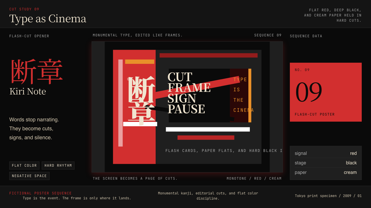 SHAFT Monogatari TypographyType becomes cinema. Red cuts, black flats, and monumental kanji steer the fr…
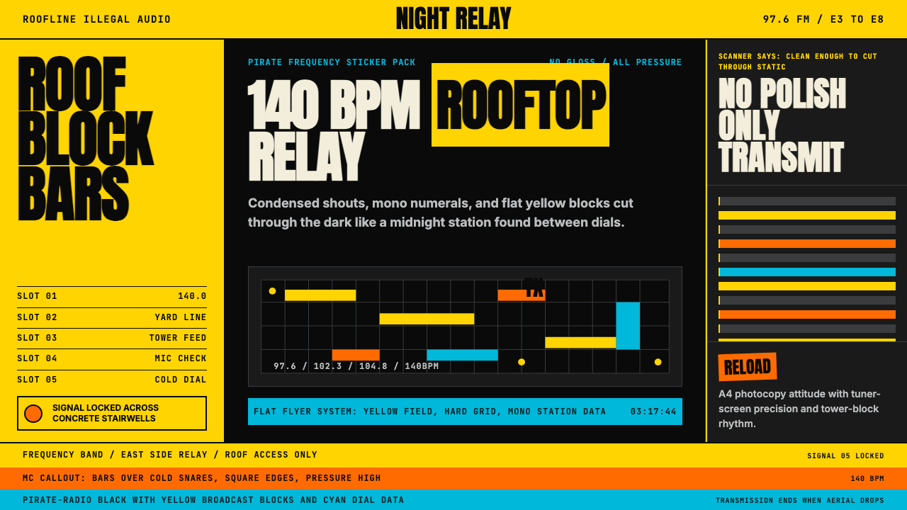 Grime London Pirate Radio (2003)Pirate signal, flat and urgent. Yellow blocks, mono FM numerals, hard flyer g…
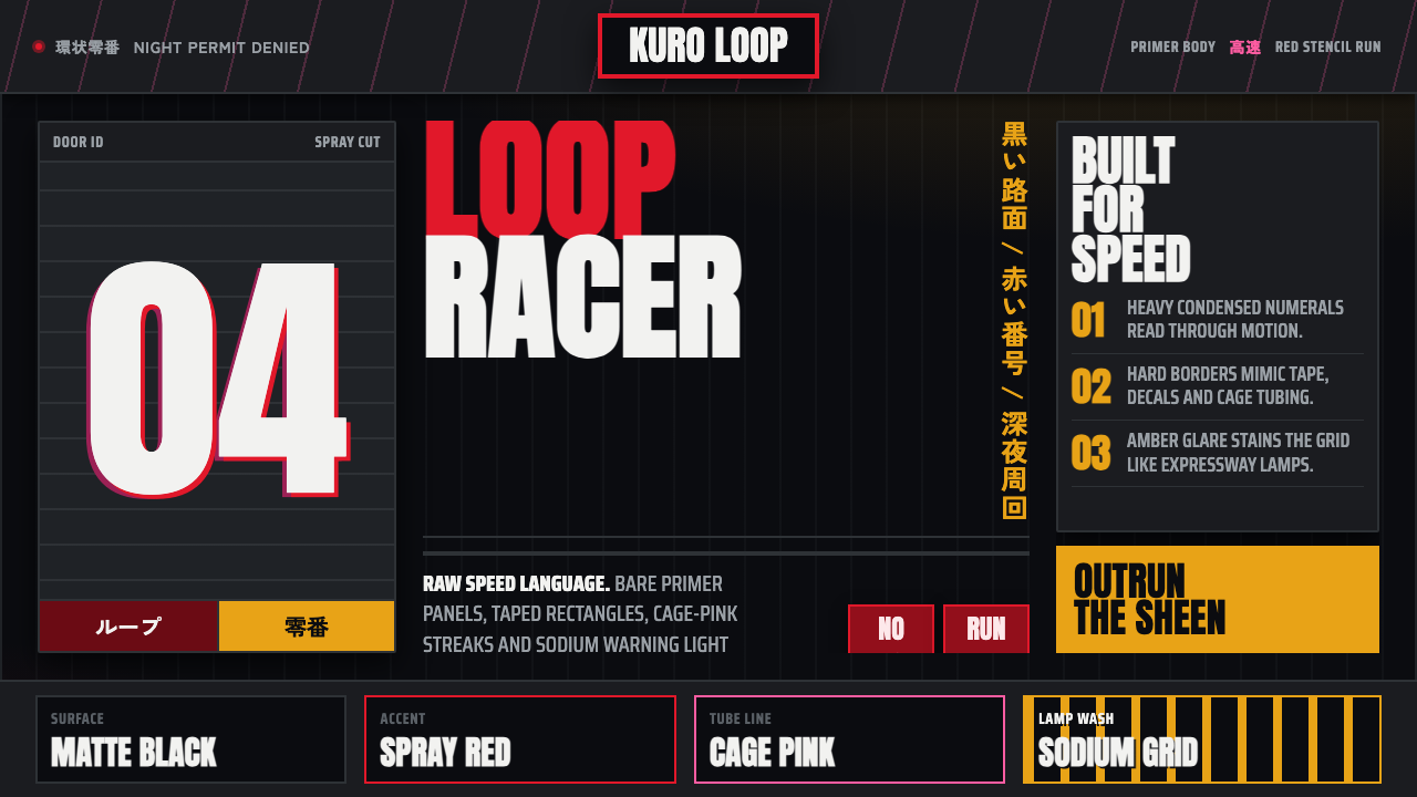 Kanjōzoku Loop RacerSpeed as contraband. Hot red numbers slice black tarmac with amber grid glare.
 Akira (Otomo)Cyberpunk at impact. Kaneda red, cyan kanji, halftone concrete, and diagonal…
 Melbourne Laneway Stencil (Hosier Lane)Permission-wall maximalism. Magenta tags slash charcoal bluestone and cream p…
 Money Heist (La Casa de Papel)Resistance becomes spectacle. Arterial red cuts through graphite grids and ta…