What is Karim Rashid?
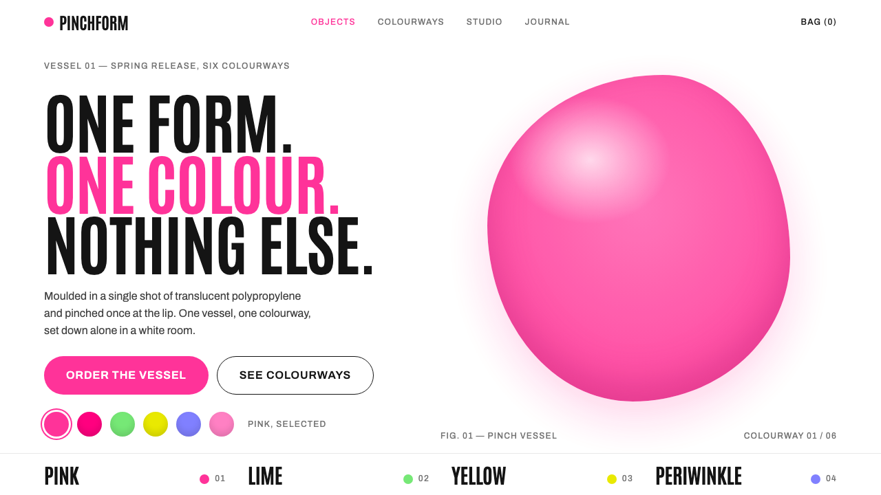
Blobject design puts one soft, candy-coloured plastic form alone in a white room, and lets tall condensed type do the shouting.
Karim Rashid in brief
The Karim Rashid style is a visual system drawn from the object world of the industrial designer Karim Rashid in the late 1990s. Its centre of gravity is the 'blobject': a rounded, pinched, softly swollen product, often moulded from a single piece of translucent plastic, that looks as if it were poured rather than assembled. On a screen, the style translates that object into a layout where one such form sits alone in a white room, in one candy colour, with nothing around it.
What makes the look distinctive is the argument between soft and hard. The objects are pillowy and rounded, with every corner relented into a curve. The typography is the opposite: tall, tightly packed condensed gothic capitals that stack like a skyline above the product and give the soft forms a precise, almost architectural frame. Hot pink carries the interface voice, while lime, yellow and periwinkle appear mainly as object colours, never as competing page chrome.
It is a style of optimism. White space is generous, light is even and shadowless, and the mood is clean, friendly and unmistakably millennial. It belongs to the moment when consumer products believed that the digital age would feel like candy rather than like a cold grey machine.

Where does Karim Rashid come from?
The roots of the style lie in the work of Karim Rashid, a designer who trained and first practised in Canada before settling in New York. In 1991 he coined the phrase 'sensual minimalism', a deliberately warm answer to the severe minimalism of the period. The idea was that reduction did not have to mean coldness: a simple object could still be tactile, curved and emotionally generous.
The breakthrough object of the story is the Garbo wastebasket, made in 1996 for Umbra. It is a single moulded piece of translucent polypropylene with edges that look gently pinched, sold in colours such as fluorescent lime, lavender and a pale greige. It turned a humble household item into something people wanted to display, and it came to stand for what critics and the press called the blobject: a rounded blob of an object. Umbra, the mass-market homeware company, matters to the history because it put this sensibility into ordinary shops rather than gallery plinths.
The blobject peak is usually placed around 1997 to 2004. In those years, soft translucent plastics, rounded corners and saturated candy colours spread across product design, from kitchenware to electronics. The visual culture of the era shared the same enthusiasm for a friendly, curvy, digital-age future, and this design system borrows the showroom logic of that moment: one product at a time, a white ground, no cast shadow, and plenty of empty space so that the object can be read as a pure silhouette.
The movements recorded for this system capture the lineage precisely: the blobject itself, sensual minimalism, and late-1990s digital-age product design in coloured translucent plastic. Taken together, they explain why the web adaptation feels like a gallery wall and a toy shelf at the same time, and why it works best when it stays disciplined about showing only a single hero form.
What defines the Karim Rashid look?
Color
One saturated candy colour at a time. Hot pink carries links, buttons and emphasis, and acts as the voice of the interface. Lime, yellow and periwinkle arrive as object colours, used to tint the hero product rather than to decorate the page. The ground is white, so each colour reads as a pure, flat hit with no tonal mud around it.
Typography
Tall, narrow, condensed gothic capitals set very tight, stacked in the way Rashid's own site stacks project titles above its rounded products. The type is deliberately hard and vertical so that it contrasts with the soft bodies below it. Hierarchy comes from scale and compression, not from decorative variety.
The Blob Form
The central motif is a pillowy, pinched volume, one soft form with no visible seams or joints. It should look moulded in a single pour. On the page it behaves like a product photograph or render: centred or deliberately offset, large, and given room to breathe, with no clutter of secondary objects.
Rounded Corners
Corners are always rounded. Cards, buttons, inputs and image frames all relent into curves, echoing the objects themselves. A sharp corner would break the logic, because the style argues that the digital age should feel tactile and friendly rather than angular and technical.
White Space
The page is a white room. Empty space is what holds the composition together, and it is generous on every side of the hero object. This is the showroom logic: one product, one colour, plenty of floor. Filling the room with extra panels or dense columns destroys the effect.
Light and Shadow
Light is even and soft, and the page carries no heavy drop shadows. Depth is implied by the swell of the form itself and by translucency, not by theatrical lighting. The calm, shadowless field keeps the mood optimistic and keeps the page looking clean.

Who shaped Karim Rashid?
The industrial designer whose late-1990s object world gives the system its name and its mood. He coined the phrase sensual minimalism in 1991, trained and first practised in Canada, and worked from New York. His website's habit of stacking project titles above rounded products is the direct model for this system's pairing of tall condensed type with soft forms.
The homeware company that produced Rashid's Garbo wastebasket in 1996. By manufacturing the blobject in volume and selling it through ordinary retail, Umbra carried the aesthetic out of the design gallery and into everyday homes, which is why the style reads as friendly and consumer-facing rather than as an art-world experiment.
How do you use Karim Rashid today?
The blobject style is best treated as a showroom, and a layout that respects that metaphor will always look better than one that merely borrows the colour. The core rule is to show one thing at a time, in one candy colour, with the rest of the page left quiet.
For presentation slides, a cover works beautifully when it follows the exhibition logic: a large rounded form in one colour on a white field, with a tall condensed title stacked above it. Content slides should keep to a single idea per slide, a short heading in the condensed capitals and a lot of empty white. Data slides work best when charts are simplified into rounded bars and soft discs, each tinted with a single object colour instead of a rainbow legend.
For web interfaces, the style suits product launch pages, designer portfolios and optimistic consumer brands that want to feel clean and slightly millennial. The pink accent belongs on buttons, links and emphasis. Cards and inputs keep generously rounded corners, and the hero area is built around one product image rather than a carousel. It is less suited to dense dashboards, where its large empty areas and single-object focus waste valuable room.
For editorial and marketing work, the style lets a product or a single idea take the whole stage. A campaign page can alternate between a pure white field holding one coloured form and a stacked headline above it, with short copy that never competes with the object. Photography or rendering of the product should follow the same rules: even light, no hard cast shadow, and a simple white backdrop.
The most common mistake is to treat the palette as licence for a colour party. Using pink, lime, yellow and periwinkle together on the same screen turns a controlled showroom into a toy store. Keep the object colours one at a time, keep the type hard and tall so that it still contrasts with the soft shapes, and resist the urge to add extra decorative elements.

Karim Rashid — FAQ
What is a blobject?
It is a nickname for a rounded, softly swollen product that looks poured rather than assembled, often in translucent coloured plastic. Karim Rashid's Garbo wastebasket for Umbra, made in 1996, is the best-known example. In this design system, the word describes the single soft form that sits at the centre of every composition.
Why pair soft shapes with such tall, hard type?
Because the contrast is the point. The condensed gothic capitals are tight, vertical and precise, so they give the pillowy objects a clear frame to push against. It follows the way Rashid's own site stacks project titles above rounded products. Without the hard type, the soft forms would drift into mere cuteness.
Can I use several candy colours at once?
It is better not to. The system works by showing one object in one colour at a time, with pink handling the interface voice and the other colours reserved for tinting objects. Combining them across the same screen weakens the showroom effect and starts to look like a toy catalogue.
Is it a light or dark style?
It is a light style. The white room is essential to the look: it keeps colour pure and gives the object room to stand as a silhouette. A dark background would remove the showroom logic and make the candy colours feel like neon rather than plastic.
What kinds of projects suit this style best?
Product launch pages, designer portfolios and consumer brands that want to feel optimistic, clean and a little millennial. It suits situations where a single object or idea deserves the whole stage, and it is less suitable for data-heavy tools that need dense information.
Related design styles
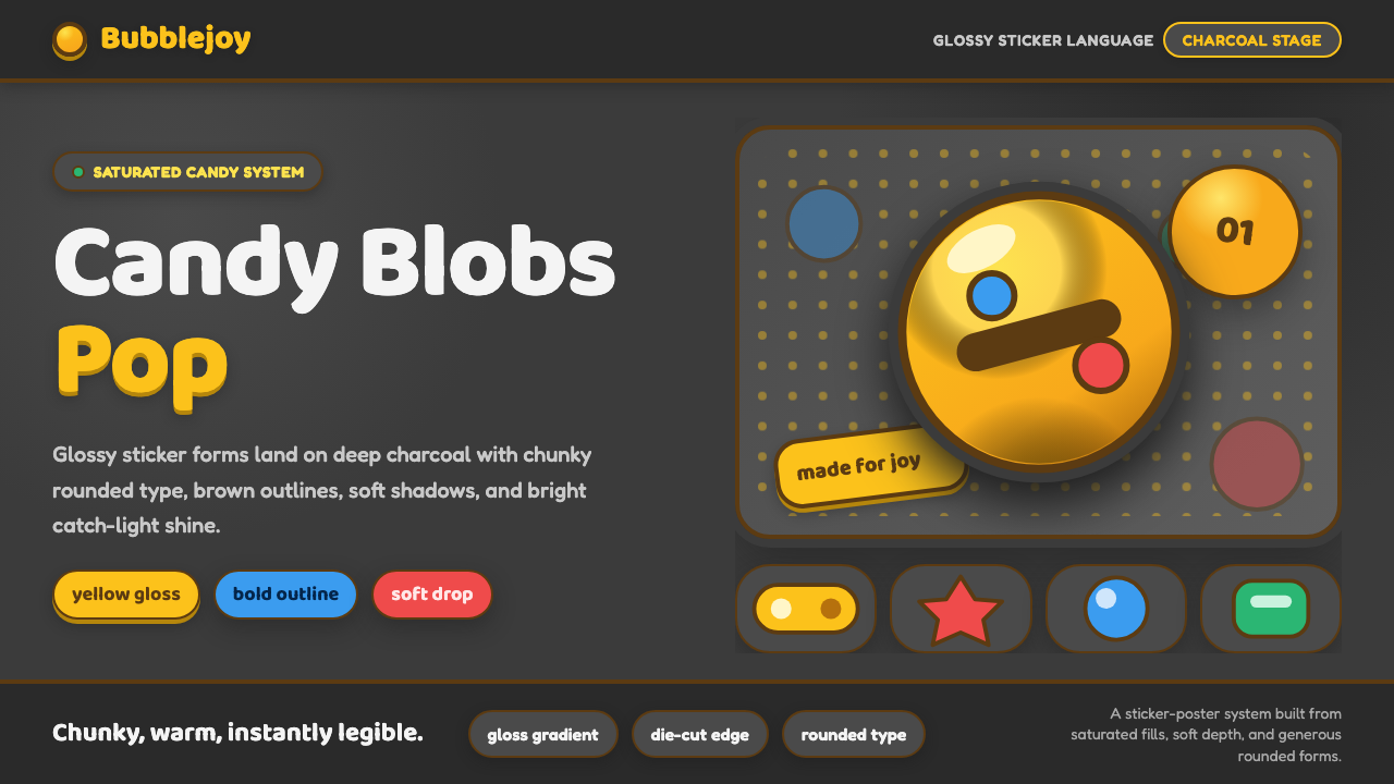 Emoji & Sticker DesignJoy goes glossy. Blob-yellow spheres pop on charcoal with brown sticker outli…
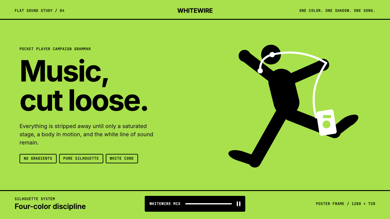 iPod Silhouette 2004Discipline dances. Lime flat-field, black silhouette, and one white cord carr…
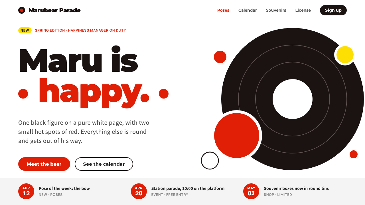 KumamonA black circle on pure white. Official red lands only on cheeks, buttons and…
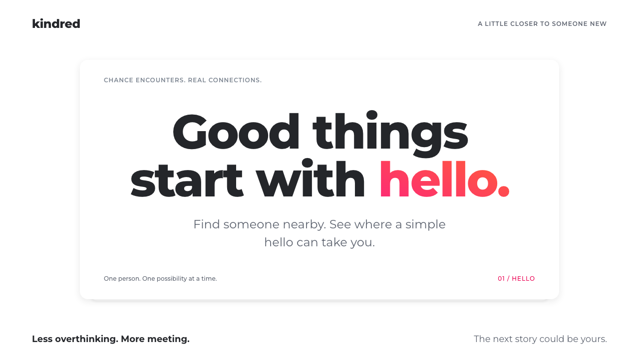 TinderConnection, made simple. White card layers, bold Montserrat, one pink-to-oran…
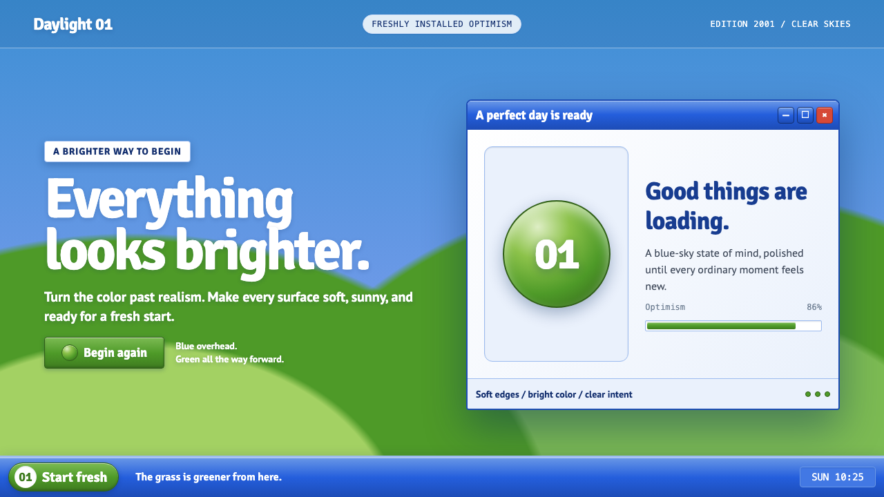 Windows XP Bliss (2001)Fresh-install optimism. Sky blue, hill green, and glossy gel chrome turn real…
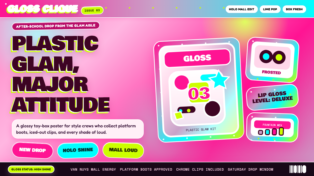 Bratz Doll 2003Y2K maximalism, mall-glossy. Hot-pink gradients, holographic lavender, chunky…