What is Hawaiian ʻAʻā Lava Field?
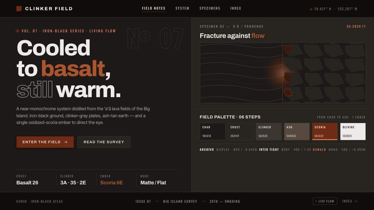
Hawaiian ʻAʻā Lava Field turns a living volcanic landscape into a severe dark system — iron-black crust, fractured gray surfaces, and one ember of scoria red beneath the char.
Hawaiian ʻAʻā Lava Field in brief
Hawaiian ʻAʻā Lava Field is a contemporary natural-landscape aesthetic drawn from the active lava terrain of Hawaiʻi’s Big Island. Its central image is the hardened basalt river: iron-rich, nearly black, matte rather than reflective, and broken into sharp clinker rubble. Beside it sits pāhoehoe, whose smoother, ropy crust introduces a quieter form of movement without softening the landscape’s severity.
The style translates this contrast into a dark visual hierarchy. Iron-black grounds establish depth and silence; clinker-gray surfaces behave like plates of cooled crust; weathered ash-tan tones suggest earth exposed between flows. Oxidized scoria red appears rarely, like heat surviving beneath an apparently cold field. Its scarcity is essential: the red is an event, not a general decorative color.
Clean modern sans-serif typography provides the human-made counterpoint to raw volcanic texture. Letters remain calm, direct, and highly legible while surrounding forms may be fractured, irregular, or sharply cropped. The result is not a picturesque tropical style. It is geological, material, and restrained — a system shaped by pressure, cooling, rupture, and the visible difference between rough ʻaʻā and flowing pāhoehoe.
Where does Hawaiian ʻAʻā Lava Field come from?
The aesthetic belongs to the period from 2010 to the present, but its subject is not a closed historical episode. The lava fields of Hawaiʻi’s Big Island are living terrain, continuously reshaped by recent eruptions. That continuing change gives the style its conceptual foundation: the landscape is never merely an ancient ruin. It is a surface formed, broken, and formed again.
Its primary material source is iron-rich basalt. Once cooled, the lava reads as volcanic char rather than warm sand: dense iron-black, light-absorbing, matte, and rough. This distinction separates the system from familiar coastal palettes built around sun, water, pale beaches, and saturated vegetation. Hawaiʻi appears here through its hardened interior — severe, mineral, and almost entirely stripped of softness.
The governing morphological contrast is between ʻaʻā and pāhoehoe. ʻAʻā presents jagged clinker rubble, abrupt edges, and a field assembled from countless broken pieces. Pāhoehoe forms smoother, ropy crust that records the memory of flow. Together they supply two complementary compositional behaviors: fracture and continuity, interruption and direction, rough plates and long folded movement.
Kīlauea and Mauna Loa anchor the aesthetic geographically and symbolically. They are not treated as picturesque silhouettes placed behind an interface; they represent the forces that keep the Big Island’s lava terrain active and unfinished. Contemporary designers draw from this living geology by converting its material relationships into hierarchy: darkness as ground, gray as cooled surface, ash-tan as weathering, and scoria red as the rare sign of retained heat.
What defines the Hawaiian ʻAʻā Lava Field look?
Iron-Black Ground
The dominant field is a true volcanic near-black, closer to cooled basalt char than tinted charcoal. It should absorb attention rather than sparkle, creating a broad matte silence behind the content. Subtle variation may suggest uneven rock, but the ground must remain visually stable enough to support reading and navigation.
Clinker-Gray Plates
Secondary surfaces resemble plates lifted from a cooled ʻaʻā field. They are gray enough to separate from the ground but remain dark, mineral, and subdued. Their outlines favor chipped corners, abrupt cuts, or layered slabs over friendly rounding. The distinction between surfaces should feel material rather than luminous.
Scoria Ember
Warm oxidized scoria red is the system’s rarest and most forceful signal. It belongs on decisive actions, critical states, or a single focal mark, where it can resemble exposed heat beneath black crust. Repetition weakens the metaphor. When every component glows, the lava field becomes ordinary red-and-black branding.
Ash-Tan Weathering
Weathered ash-tan introduces an earthy middle register between black basalt and warm scoria. It is dry, muted, and dusted rather than golden or sandy. Used in supporting text, diagrams, or broad quiet areas, it brings geological age and exposure into the system without making the palette feel cozy.
Fracture and Flow
Composition alternates between the broken rhythm of ʻaʻā and the long directional folds of pāhoehoe. Dense clusters of angular modules can sit beside calm horizontal or curving passages. This contrast prevents volcanic texture from becoming undifferentiated noise and gives the viewer both obstacles and paths through the page.
Modern Sans Typography
Typography is clean, modern, and deliberately calmer than the surrounding geology. Strong headings may feel compact and weighty, while body text remains open and highly readable. The type should not imitate cracks or carved stone. Its role is to establish human order across a field whose texture already carries sufficient drama.
Matte Material Depth
Depth comes from overlapping dark plates, cropped edges, and restrained tonal separation rather than glossy highlights or atmospheric glow. Texture should feel dry and abrasive, with light revealing structure only sparingly. The interface remains contemporary because the material cues support hierarchy instead of turning every surface into a literal rock illustration.

Who shaped Hawaiian ʻAʻā Lava Field?
Kīlauea is one of the two named volcanic anchors of the Hawaiian ʻAʻā Lava Field aesthetic. Within the system, it represents the living and continuously reshaped character of the Big Island’s lava terrain. Its importance is conceptual rather than illustrative: it supports a design language in which apparently solid surfaces remain part of an active geological process.
Mauna Loa provides the aesthetic’s second geographic anchor. Together with Kīlauea, it places the design language firmly on Hawaiʻi’s Big Island and prevents volcanic darkness from becoming a placeless fantasy. It stands for scale, accumulated lava terrain, and the sense that the visual field extends beyond any single framed composition.
ʻAʻā supplies the style’s fractured vocabulary: jagged black clinker, sharp-edged rubble, irregular plates, and abrupt transitions. In design, these qualities become chipped containers, clustered modules, cropped shards, and forceful breaks in rhythm. The goal is controlled roughness — enough fracture to convey volcanic material, but not so much that information loses structure.
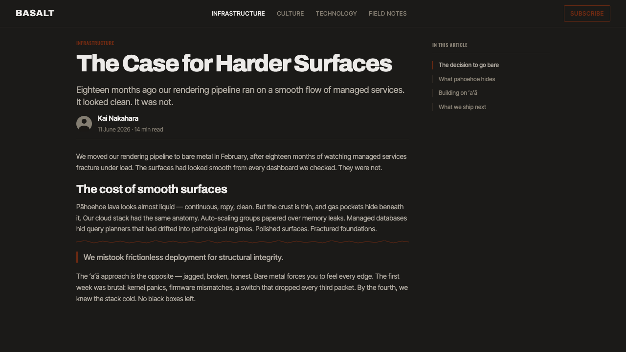
Pāhoehoe is the necessary counterform to ʻaʻā. Its smooth ropy crust preserves a visible memory of movement and gives the system continuity, direction, and release. Used as a compositional idea rather than literal decoration, it can guide reading through long bands, folded paths, or gently turning sequences that offset the heavier clinker fields.
How do you use Hawaiian ʻAʻā Lava Field today?
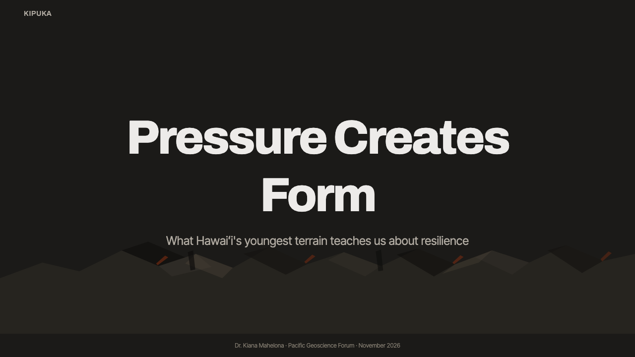
On presentation covers, begin with a broad iron-black field and one dominant geological gesture: an angular clinker plate, a cropped ridge, or a ropy band crossing the composition. Set the title in calm modern sans type and let scoria red mark only the most important word or point. Content slides should replace scenic drama with disciplined dark panels, clear headings, and ash-tan supporting information.
Data slides benefit from the distinction between cooled structure and retained heat. Clinker-gray categories can establish the baseline, while scoria red identifies the exceptional series, threshold, or urgent result. Charts should remain clean and readable rather than imitate rubble. Use fractured framing around the data, not inside every mark; the volcanic metaphor must clarify emphasis rather than obscure comparison.
For web dashboards and pricing interfaces, near-black grounds provide a focused operational atmosphere, while layered clinker-gray cards separate tools, metrics, and tiers. Ash-tan works well for secondary labels and explanatory copy. Reserve the ember accent for primary actions, warnings, active selections, or a recommended offer. Sharp-edged panels can carry the ʻaʻā character, balanced by smoother navigational paths derived from pāhoehoe.
Editorial and marketing layouts can use the style to frame stories about material, endurance, transformation, or powerful natural processes. Long-form pages need generous quiet zones so that rough texture does not compete with reading. Marketing sections may alternate between dense fractured compositions and open black fields, allowing a product image, statement, or call to action to emerge like a warm point exposed through cooled crust.
The most common mistake is to equate volcanic design with constant red glow, smoke, sparks, and glossy molten effects. Hawaiian ʻAʻā Lava Field is primarily a cooled-lava aesthetic: dark, matte, rough, and materially restrained. Overusing warm color destroys the ember’s significance; covering every surface with literal rock texture damages usability. The style succeeds when geology governs hierarchy and rhythm, not when scenery overwhelms content.
Hawaiian ʻAʻā Lava Field — FAQ
Is Hawaiian ʻAʻā Lava Field simply a volcanic red-and-black theme?
No. Its dominant condition is cooled basalt: iron-black, matte, rough, and interrupted by clinker-gray plates and weathered ash-tan earth. Scoria red is deliberately rare. The style depends more on the contrast between fractured ʻaʻā and ropy pāhoehoe than on dramatic fire imagery. Removing that morphological contrast leaves only a generic dark palette.
How should ʻaʻā and pāhoehoe appear in the same layout?
Use ʻaʻā to create density, interruption, and angular structure; use pāhoehoe to provide direction, continuity, and visual release. They need not be literal illustrations of rock. A cluster of chipped panels can carry the ʻaʻā role, while a long folded band or smooth reading path carries the pāhoehoe role. Their relationship should organize movement through the content.
Can the style use photography or detailed volcanic texture?
Yes, but texture should support material recognition without reducing legibility. Strong crops of basalt, clinker rubble, or ropy crust work best when paired with calm typographic zones. If photography occupies every background, the distinctions among navigation, content, and decoration collapse. Treat imagery as concentrated geological evidence, not as an uninterrupted scenic wallpaper.
Why is the typography so clean when the landscape is so rough?
The contrast gives the system coherence. Volcanic surfaces already supply irregularity, sharpness, and visual pressure; distressed or stone-like lettering would repeat those qualities until the design became noisy. Clean sans-serif type establishes a readable human layer over the raw terrain. It allows texture to remain expressive while information stays direct, contemporary, and controlled.
What kinds of products suit Hawaiian ʻAʻā Lava Field best?
It suits products that benefit from gravity, focus, material presence, and a sense of transformation: analytical dashboards, technical presentations, premium dark interfaces, editorial stories, and campaigns built around endurance or powerful natural processes. It is less natural for products that depend on softness, cheerful abundance, or playful warmth. The aesthetic is strongest when severity supports the message rather than contradicting it.
Related design styles
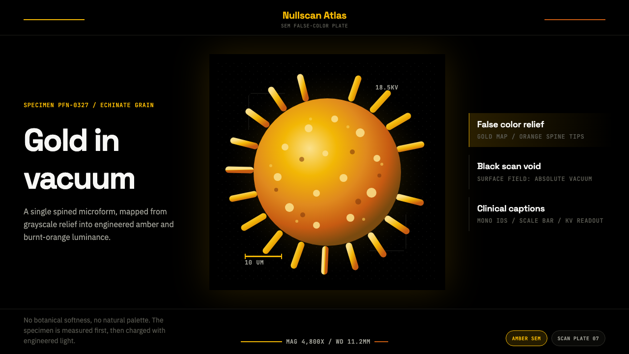 Pollen MicrographMeasured, then made luminous. Gold SEM grain floats in black with mono scale…
 Transit Diagram (modern)Topology over geography. Cyan, red and yellow routes lock to 45-degree angles…
 RCR Weathering SteelRust is the only finish. Matte weathering steel emerges from soot-dark voids…
 Swiss Franc NoteCurrency-grade calm. Oxblood grid, Inter numerals, amber-teal prism lines.
 All Blacks Silver FernOne colour, total force. Jet-black field, a single metallic-silver fern, whit…
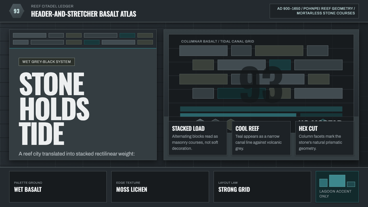 Nan Madol Basalt MegalithStone holds tide. Grey-black basalt grids cut by a narrow lagoon-teal vein.