What is Ethiopian Ge'ez Gospel?
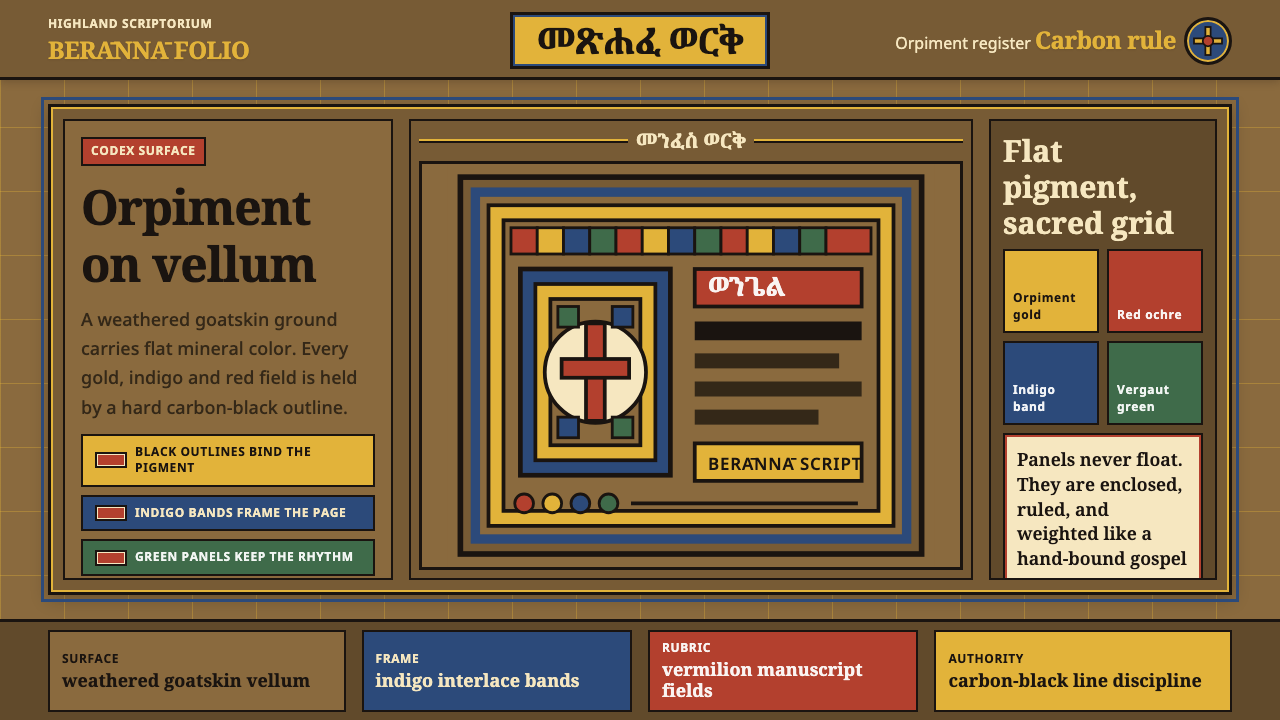
Ethiopian Ge’ez Gospel turns sacred color into disciplined architecture: orpiment gold, indigo, red ochre, and vergaut green held inside crisp carbon-black lines on weathered vellum.
Ethiopian Ge'ez Gospel in brief
Ethiopian Ge’ez Gospel refers here to the visual language of illuminated Christian manuscripts produced in the monastic scriptoria of the Ethiopian highlands. Its page is not a neutral white field but weathered goatskin parchment, with the warmth and irregularity of the material remaining visible beneath sacred imagery.
The system is defined by bounded color. Orpiment gold, indigo, red ochre, and vergaut green appear as flat, saturated pigment fields, each contained by a decisive carbon-black line. The result is neither naturalistic painting nor loose decoration: every color has a place, every boundary is intentional, and the page feels ordered through enclosure.
The surviving Abba Garima Gospels offer the clearest visual reference in the supplied tradition: frontal saints with enormous round eyes, placed within geometric interlace frames against a mid-brown ground. Translated into digital design, the style asks for vellum-like surfaces, strong outlined forms, sacred-looking focal imagery, and color used with ceremonial restraint.

Where does Ethiopian Ge'ez Gospel come from?
The tradition belongs to the medieval and later Ethiopian Orthodox manuscript culture, rooted in the Aksumite and subsequent monastic scriptoria of the Ethiopian highlands. Its earliest exemplar in the supplied material is the Garima Gospels, dated to the fourth through sixth centuries, while the broader tradition continued before 1900.
The physical starting point was berānnā, parchment made by tanning goatskin. This matters aesthetically because the page surface is part of the image rather than an invisible support. Weathering, mid-brown warmth, and the sense of a worked organic material become foundational qualities that digital layouts should preserve rather than conceal.
Ethiopian Orthodox scribes and manuscript illuminators developed pages in which pigment, outline, and sacred image operate as one system. Orpiment gold supplies the signature radiance; indigo, red ochre, and vergaut green establish contrasting fields; carbon-black contours keep those fields legible and prevent color from dissolving into atmospheric shading.
The Abba Garima scriptorium painters are represented here through the visual evidence of the Abba Garima Gospels: frontal saints, enlarged round eyes, and geometric interlace frames. The historical lesson is not to imitate isolated motifs mechanically, but to carry forward the scriptorium discipline in which material, sacred subject, flat pigment, and line-bound structure reinforce one another.
What defines the Ethiopian Ge'ez Gospel look?
Vellum Ground
The page should feel like weathered goatskin parchment: warm, fibrous, and materially present. A mid-brown ground gives every pigment a historic anchor and prevents the composition from feeling like color floating on a modern white screen.
Bounded Pigment
Color appears in flat, saturated fields rather than blended modeling. Orpiment gold, indigo, red ochre, and vergaut green should occupy deliberate shapes whose edges remain unmistakable.
Carbon-Black Contour
A crisp carbon-black line encloses each major pigment area and gives the page its authority. The outline is structural, not a soft decorative stroke; it separates fields, clarifies figures, and makes flat color feel deliberate.
Frontal Sacred Figure
Figures should meet the viewer directly rather than dissolve into a naturalistic scene. The frontal saints of the Garima reference, with their enormous round eyes, create stillness, presence, and an unmistakable sacred focal point.
Geometric Interlace
Interlace frames provide an ordered enclosure for sacred imagery. Their repeated crossings can structure cards, headers, borders, or dividers, provided the pattern remains geometric and supports hierarchy instead of becoming surface ornament.
Ceremonial Contrast
Contrast should feel solemn rather than aggressive. Gold against indigo, red ochre against vellum, and black against pigment create a visual rhythm of revelation and containment, with each accent reserved for a meaningful role.

Who shaped Ethiopian Ge'ez Gospel?
These practitioners transformed goatskin parchment into berānnā and built the page through disciplined relationships between material, pigment, line, and sacred image. Their collective practice is the central source of the style’s restraint and authority.
The painters associated with the Abba Garima scriptorium are represented by the Garima Gospels’ frontal saints, enlarged round eyes, and geometric interlace framing. Their work supplies the clearest visual model for sacred focal imagery within a bounded composition.
The highland scriptoria form the cultural setting in which this design language coheres. They connect the organic page, saturated mineral color, black contour, and Christian sacred book into a single disciplined visual environment.
How do you use Ethiopian Ge'ez Gospel today?
For presentation slides, use the vellum ground as the continuous page surface and let the cover introduce the visual grammar through a single frontal focal image or interlace frame. Content slides should organize information inside outlined pigment fields, while data slides can treat gold, indigo, red ochre, and green as meaningful categories rather than a decorative rainbow. Keep the strongest contrast for the central message.
For web interfaces, the style suits dashboards, catalogs, and pricing pages that need authority, hierarchy, and a memorable material identity. Use the parchment ground as the quiet base, carbon-black lines for containers and navigation, and saturated pigment accents for states or categories. Cards should feel enclosed and deliberate, with gold reserved for the primary action or the most important status.
For editorial and marketing work, build a page that feels illuminated rather than merely branded. A feature article can place a large outlined image beside a narrow column of text, with interlace used at section thresholds and pigment fields used for quotations or metadata. Campaign pages can alternate between quiet vellum passages and concentrated indigo or red ochre panels, always allowing the material ground to remain part of the story.
For educational material, the system offers a strong way to distinguish primary content from annotation. Use black contour and dark text for the reading structure, then assign gold, indigo, red ochre, or vergaut green to recurring concepts. The visual language is especially effective when the interface needs to make information feel preserved, authoritative, and connected to a living tradition.
The common mistake is to treat the palette as a collection of exotic colors while abandoning the discipline that gives it meaning. Random ornaments, soft photographic shadows, glossy effects, and unbounded gradients weaken the style immediately. The essential relationship is not color alone but pigment held by line on a material ground.

Ethiopian Ge'ez Gospel — FAQ
Is this style simply a medieval parchment theme?
No. Parchment is the ground, not the whole system. The identity comes from the relationship between weathered goatskin, flat saturated pigment, carbon-black contour, frontal sacred imagery, and geometric interlace. Remove the bounded line and disciplined composition, and the result becomes a generic historical texture rather than Ethiopian Ge’ez Gospel.
Can the style use a clean white background?
It can, but the supplied tradition is strongest when the page retains a weathered mid-brown vellum character. A white ground may work for a lighter digital adaptation, yet it should preserve the other commitments: bounded pigment, crisp black outlines, frontal focal imagery, and geometric enclosure. Otherwise the visual language loses its material and ceremonial weight.
Why are the outlines so important?
The outline keeps sacred color legible and gives every field a defined place. It turns pigment into structure. Without the carbon-black boundary, gold, indigo, red ochre, and green risk becoming atmospheric decoration; with it, they read as deliberate visual units held in order.
How should imagery be adapted for digital products?
Treat imagery as a frontal, bounded presence rather than a photographic scene with atmospheric depth. A focal figure or emblem can sit within an interlace frame, while flat pigment fields establish emphasis around it. The aim is not to reproduce a manuscript literally, but to preserve the relationship between sacred focus, material ground, color, and line.
When is this style a poor fit?
It is a poor fit when the product depends on glossy realism, soft atmospheric depth, or a deliberately weightless contemporary surface. It also requires care when sacred references would feel disconnected from the subject. The style works best when material presence, preservation, ceremony, and bounded visual order are genuine values of the experience.
Related design styles
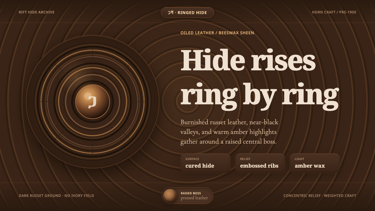 Ethiopian Hide ShieldDark hide speaks in relief. Russet rings and amber beeswax light rise from ne…
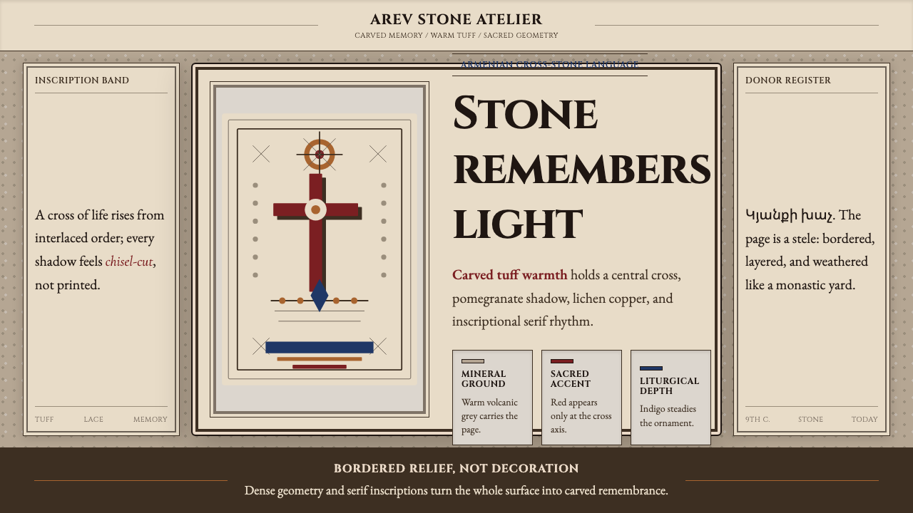 Armenian Khachkar Cross-StoneStone becomes memory. Tuff grey, pomegranate red, and carved borders hold the…
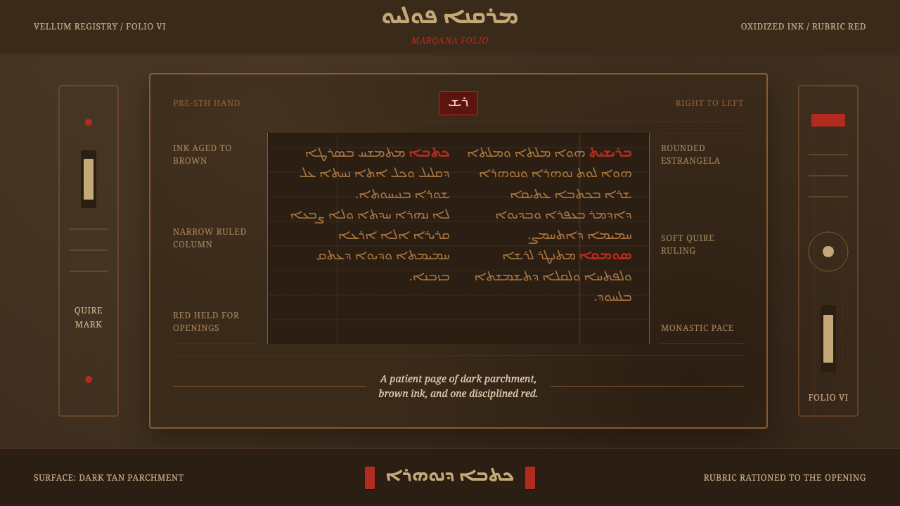 Syriac EstrangelaAncient warmth survives. Brown parchment, right-to-left columns, rationed rub…
 Afghan Baluchi Prayer RugDevotional darkness glows. Plum field, oxblood mihrab, and camel borders surf…
 Alchi Monastery MuralDevotional depth. Lapis fields and coffered grids glow on terracotta plaster.
 Bagan Yun LacquerwareEngraved, not painted. Cinnabar, orpiment and jade hairlines polished from ne…