What is Ed Ruscha?
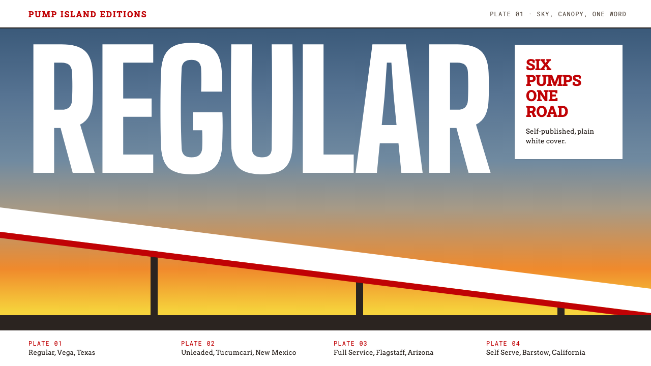
Ed Ruscha turned the roadside gas station into deadpan Pop: one word, one hard diagonal, a sky that melts from slate to amber, and not a trace of sentiment.
Ed Ruscha in brief
Ed Ruscha's gasoline-station imagery is a design language drawn from the American West of the early and middle 1960s. It grows out of two linked bodies of work: the 1963 artist's book Twentysix Gasoline Stations, and the 1966 Standard Station screenprint, in which a filling-station canopy slices across the picture on a single steep diagonal beneath an enormous sky. Together they define a look that is flat, matte, exact and quietly funny.
The visual register has two faces. The painterly face is the screenprint: a slate-blue sky that gradually dissolves into an amber horizon, a hard-edged building, saturated red and white details, and a large amount of empty air. The documentary face is the book: plain white pages, a cover and captions in stacked red slab-serif capitals, one unembellished snapshot per spread, and text that names only the brand and the town. What the two share is a refusal to editorialize.
Typography does the talking. Where other Pop artists crowded the canvas with consumer goods, Ruscha often left the sky nearly empty and set a single word in slab serif or squared block letters against it, as if a sign had been lifted out of the landscape and left floating. The effect is cool rather than nostalgic. It borrows the warmth of American roadside culture without taking on the sentimentality that usually comes with it.

Where does Ed Ruscha come from?
Ruscha was based in Los Angeles, and the pictures grew out of a repeated road trip between there and Oklahoma City along Route 66. The gasoline stations he photographed were the ordinary stops of that drive, shot without any attempt to flatter them. In 1963 he gathered the photographs into a small, self-published book, Twentysix Gasoline Stations, and the same year he made a painting called Standard Station, Amarillo, taking the filling-station canopy out of the snapshot sequence and into the language of a large Pop painting.
The book belongs to a wider line of conceptual artists' books. It has no narrative, no essay and no argument. The title states the number and the subject, the captions give the brand and the town, and the images are deliberately unpicturesque. That plain, catalogue-like manner was radical in its moment, because it presented a photograph as a piece of information rather than as an expressive print. In the same breath it made the gas station feel like a legitimate subject for art.
The people around Ruscha shaped how this work was seen. The Ferus Gallery circle in Los Angeles gave West Coast Pop a home, and figures such as the curator Walter Hopps and the gallerist Irving Blum helped place Ruscha's paintings and prints in front of an audience. The writer and musician Mason Williams was a friend and collaborator of the period. Together they formed a small ecosystem in which a roadside subject could be treated as seriously as a still life.
In 1966 the subject returned in the Standard Station screenprint, the image most people now associate with the style: the sloping canopy, the amber-to-slate sky, the red-striped diagonal. A 1968 Hollywood image carried the same sky-and-single-word logic into a different landmark, and from 1980 Ruscha developed a squared lettering often called Boy Scout Utility Modern. Taken as a whole, this is a body of work that spans almost two decades, but whose core grammar was fixed by the original 1963 and 1966 pictures.
What defines the Ed Ruscha look?
Color
The signature move is a sky that starts as cool slate blue and bleeds into warm amber at the horizon. Against it, a few saturated reds and clean whites carry the building and its trim, while the surrounding ground stays muted. In the book register, color is almost absent: white paper, black photographs and one red for the stacked captions. Either way the palette is restrained and reads as printed, not painted, with matte fills and no sparkle.
Typography
Type is a central image rather than a caption. Heavy slab-serif capitals and squared, block-built letters are set in a single, plain word and stacked in tight lines on the book cover. The letters feel like signage: industrial, direct and slightly comic. There is no italic flourish and no softness. A single word floating in open sky is the clearest signature of the style.
Composition
The layout leans on one hard diagonal. A canopy or a roofline cuts the frame at a steep angle and leaves the rest of the picture to the sky. Emptiness is a design decision here: large areas of open air or blank page give the single subject room and make it feel monumental. In the book, the structure is the opposite and equally strict: one image per spread, always centered, always the same.
Surface and finish
Everything is flat and matte. Edges are clean and shapes are filled with even tone, like a screenprint rather than an oil painting. There is no soft glow, no atmospheric blur and no decorative texture. Shadows are minimal and structural. The result is a surface that looks manufactured, which fits a subject that is itself a piece of standardized infrastructure.
Photographic register
In the book mode, photographs are snapshots taken without drama: no golden hour, no dramatic crop, no human subject. Captions are limited to brand and town. The images are treated as evidence, laid out in a consistent grid of one picture per spread. This deadpan neutrality is what separates the style from nostalgic road-trip imagery.
Tone
Deadpan is the keyword. The style never winks and never sermonizes. It treats a filling station with the gravity normally reserved for a monument, and the humor comes from that mismatch. This restraint is what lets the work feel American without feeling patriotic, and cool without feeling cold.

Who shaped Ed Ruscha?
Ruscha is the originator of the imagery. He made Twentysix Gasoline Stations in 1963 and the Standard Station screenprint in 1966, and he later developed the squared lettering associated with his name. His career connects Pop painting, photography and the conceptual artist's book, and his habit of isolating a single word against an open sky has become one of the most recognizable moves in modern American art.
Hopps was a curator associated with the Ferus Gallery circle in Los Angeles. He is part of the network that gave West Coast Pop and the young Ruscha an institutional audience in the early 1960s, and his name is the usual one cited when people describe how the scene around Ruscha cohered.
Blum was a gallerist from the same Ferus Gallery circle. Alongside Hopps, he stands for the small group of dealers and curators who helped West Coast Pop reach the public, and who made it possible for a roadside subject to be shown as serious painting.
Williams, a writer and musician, was a friend and collaborator in Ruscha's circle during the period when the gasoline-station pictures were made. He is a reminder that the style grew out of a community of friends who shared the same roads and the same dry humor, not out of a single studio.
How do you use Ed Ruscha today?
On slides, the style works best as a cover. Use a single large word or short title in slab serif or squared capitals, placed against a sky that moves from slate blue to amber, and leave most of the slide empty. Content slides can borrow the book's restraint: white background, stacked red capitals for headings, one image per slide and a caption that gives only the essential fact. For data slides, keep the chart flat and matte, use the red sparingly for the one number that matters, and keep the sky-gradient for title slides rather than behind charts.
In web interfaces, the deadpan tone suits portfolio sites, documentation, project pages and editorial products that want a distinct American Pop character without becoming loud. For a dashboard, keep the chrome plain and white, set key labels in slab-serif capitals and let one hard diagonal or one block of amber carry the brand. A pricing page can be built almost entirely from white space, one red heading and flat buttons, with no shadows or glows to soften the edges.
In editorial and marketing work, think of the book rather than the painting. A catalog, a lookbook, a zine or a series of product shots can use the one-image-per-spread rhythm, a cover in stacked red capitals, and captions that name only what the thing is and where it is. The approach is especially strong for campaigns that treat ordinary objects, such as a shop front, a vehicle or a stretch of road, with unexpected seriousness.
The common mistake is turning the style into road-trip nostalgia. Adding retro neon, vintage textures, soft glows or heavy shadows destroys the deadpan matte quality that defines it. A second error is filling the sky: the empty air is part of the design, so crowding it with extra copy or decoration removes the very thing that gives the single word its weight. Keep the palette small, the edges hard and the humor dry.
A last practical note is to commit to one mode per piece. Use the painterly sky-and-diagonal mode for covers, hero sections and posters, and the plain white-page-and-caption mode for dense or informational pages. Mixing them in the same view usually muddies both, while alternating them across a project gives you a clear rhythm between impact and information.

Ed Ruscha — FAQ
What is Ed Ruscha's gasoline-station style?
It is a deadpan Pop look built from Ruscha's 1963 artist's book Twentysix Gasoline Stations and his 1966 Standard Station screenprint. Typical features are a slate-to-amber sky, a single hard diagonal, a lone word in slab serif or squared letters, flat matte fills and a complete absence of sentiment. It is meant to feel cool, exact and quietly funny.
Is this style the same as retro Americana or Route 66 nostalgia?
No. The subject is the same roadside landscape, but the treatment is the opposite. Nostalgic Americana uses warm glows, aged textures and decorative neon. Ruscha's work is matte, flat and deadpan, and it treats the gas station as a plain fact. Using it as a retro filter loses what makes it distinctive.
Which fonts and colors fit the style?
Think heavy slab-serif capitals or squared block lettering, and a small palette: cool slate blue shading into warm amber for the sky, saturated red and clean white for details, black for photographs. Keep large areas empty and use color only where it carries meaning.
Can the style work for modern digital products?
Yes, especially for portfolios, documentation, editorial sites and campaign pages. Its flat fills, hard edges and generous empty space translate cleanly to screens. It is less suited to dense, colorful dashboards that need many categories, because the style depends on restraint and a single dominant gesture.
What is the difference between the book mode and the screenprint mode?
The screenprint mode is the dramatic one: a big sky gradient, a diagonal canopy and strong color. The book mode is plainer: white pages, stacked red capitals, one flat snapshot per spread and captions limited to brand and town. Both share the same deadpan attitude, so pick one per piece and use the other for contrast.
Related design styles
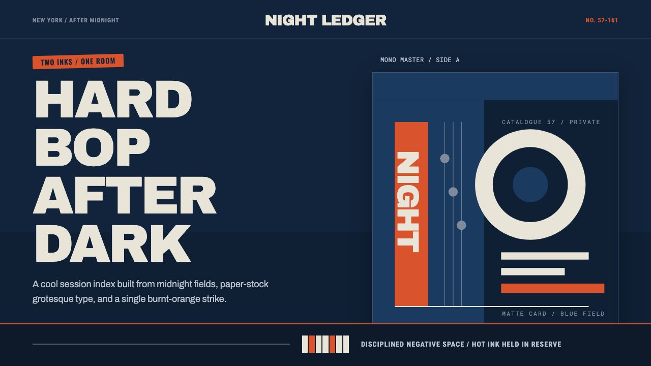 Blue Note JazzCool intelligence, printed flat. Midnight blue, paper type, and one burnt-ora…
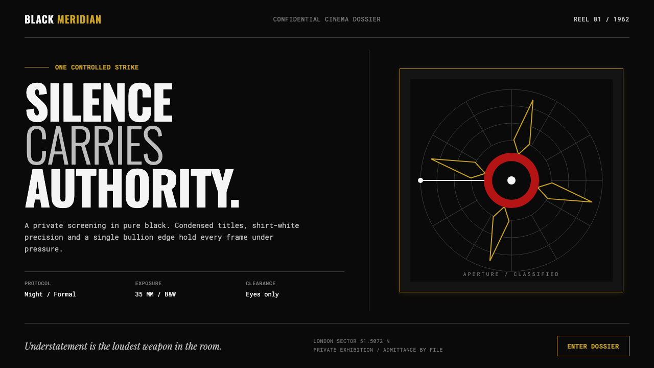 James Bond 007 (1962)Understatement carries authority. Pure black, condensed white type and one pr…
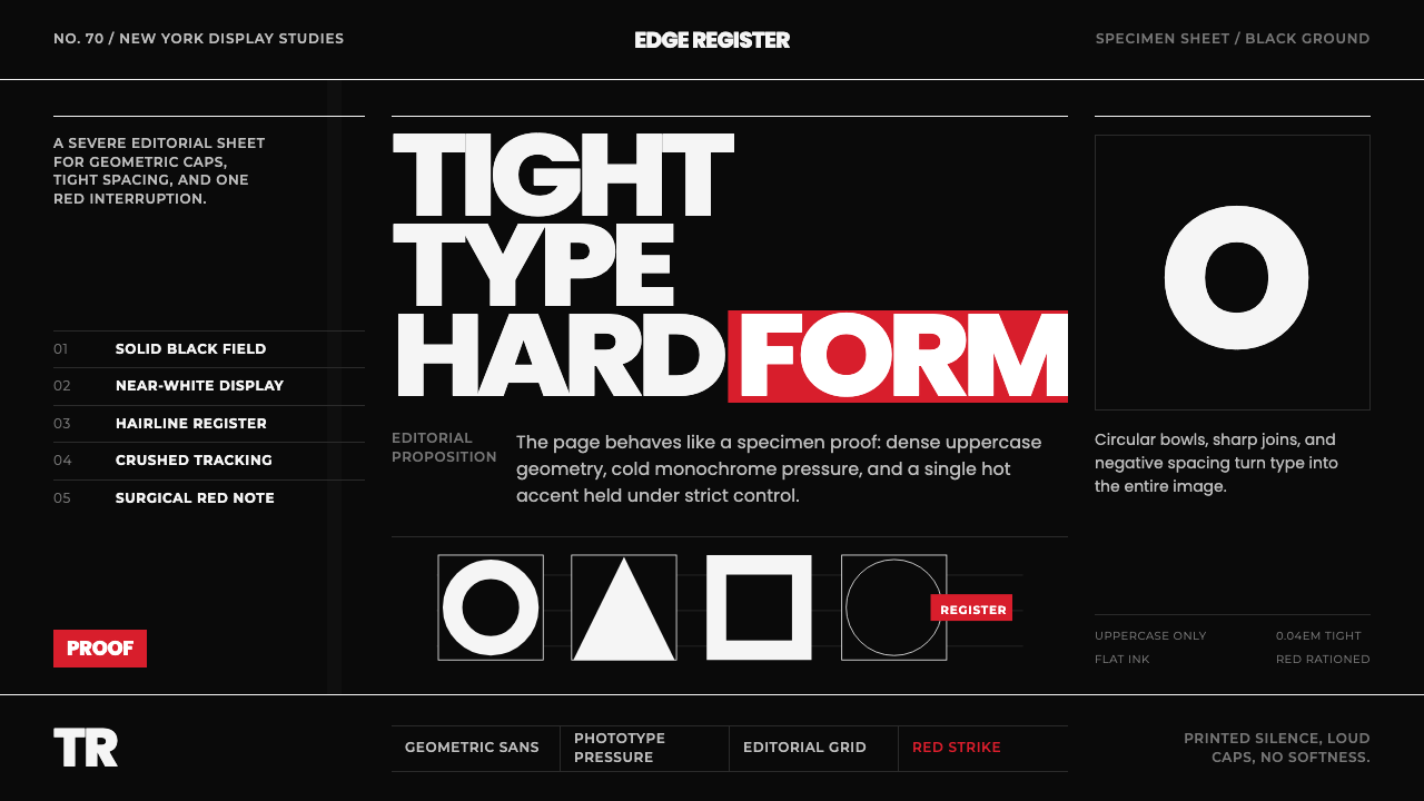 Avant Garde GothicType is the image. Tight white caps on black, ruled grids, one hot red strike.
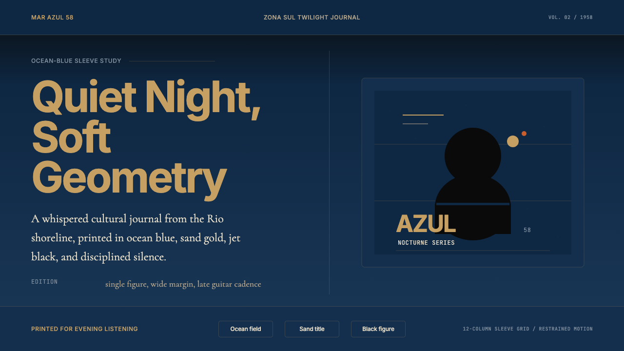 Brazilian Bossa Nova Cool 1958Twilight cool. Ocean blue, sand-gold Inter, one black silhouette with LP-slee…
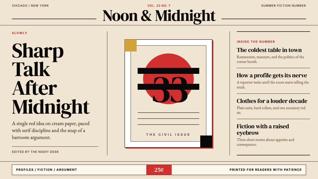 Esquire MagazineConceptual punch on paper. Cream stock, black hairlines, and one saturated re…
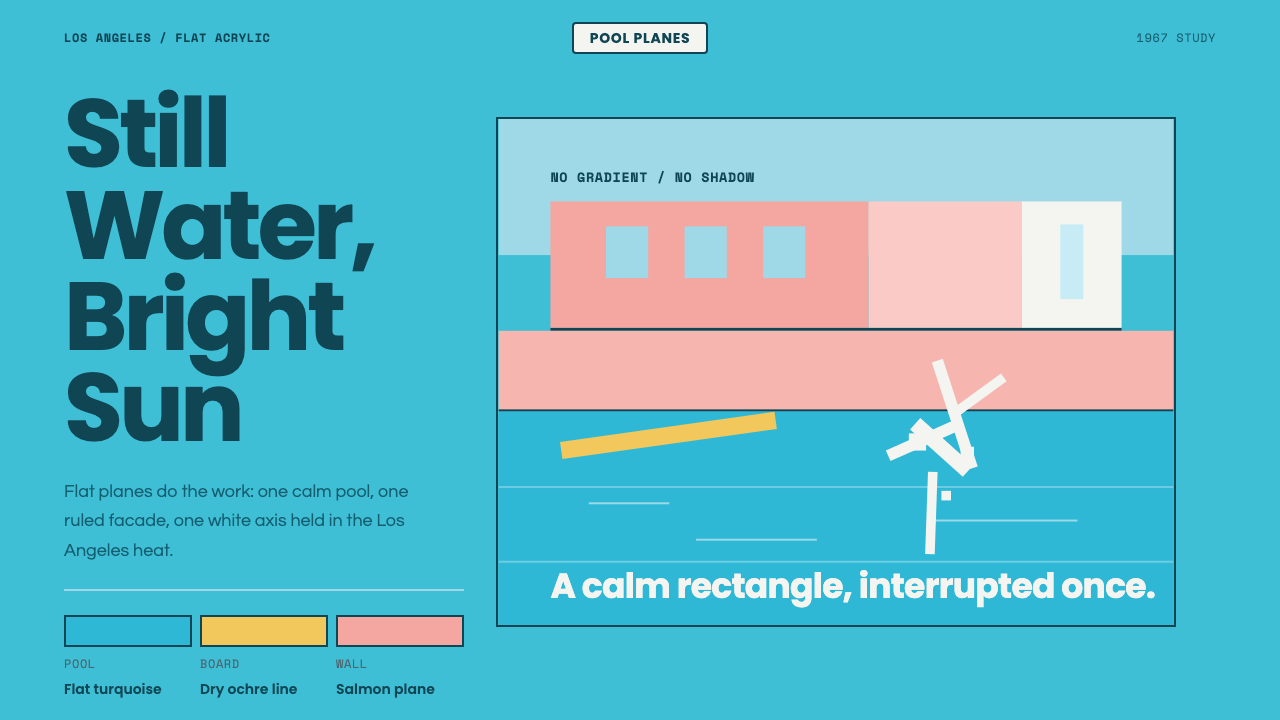 Hockney Pool BlueSerenity turns graphic. Turquoise planes, salmon edges, one white splash.