What is Burle Marx Landscape?
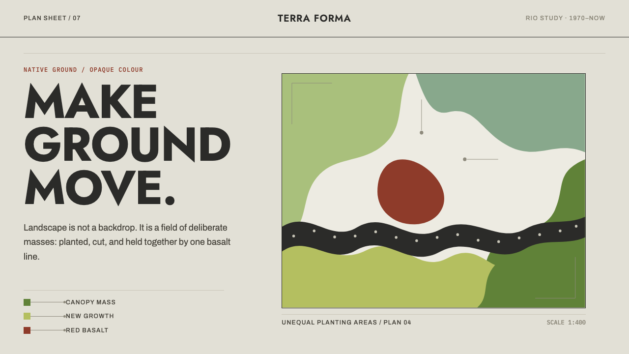
Burle Marx drew gardens as flat gouache colour on a white plan sheet, and the screen becomes that sheet: pale limestone, cut-curve greens, one heavy basalt wave.
Burle Marx Landscape in brief
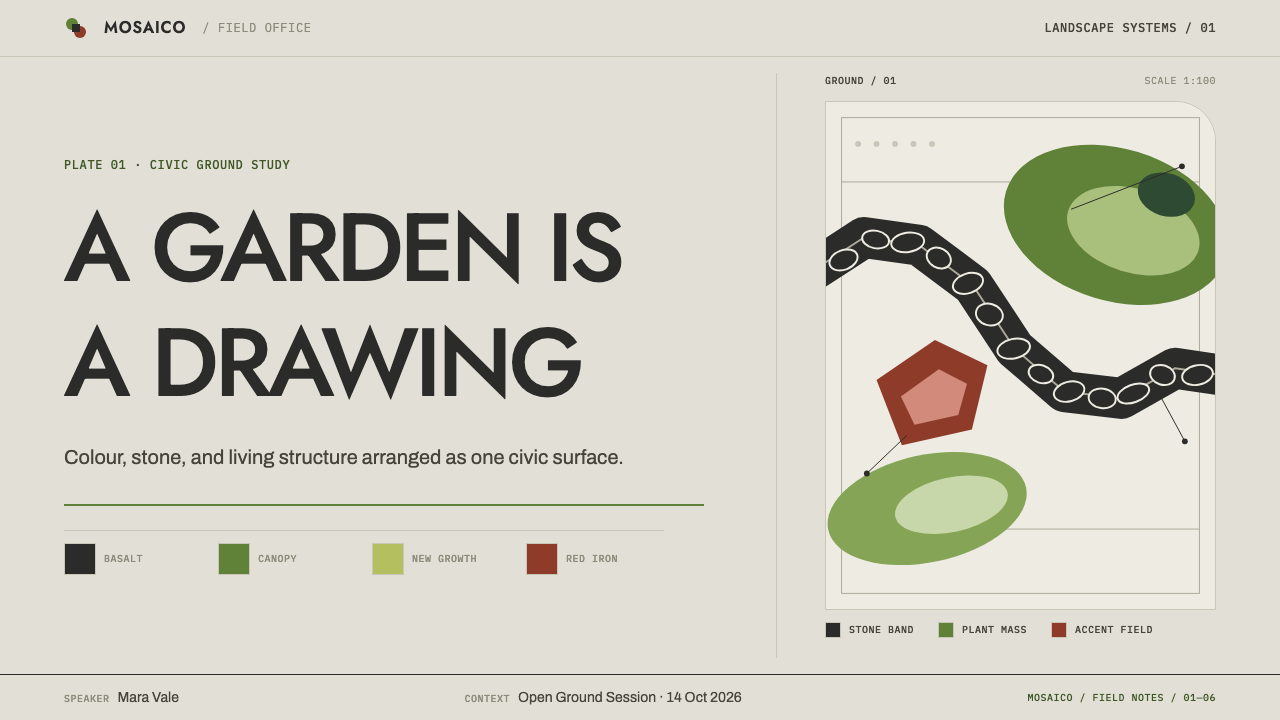
Roberto Burle Marx drew gardens in plan, in gouache, on white paper. Native tropical planting was used as structure rather than as decoration, symmetry was broken on purpose, water was left free-form, and every species was laid down as one flat, opaque block of colour. The result is landscape design that looks like abstract painting, because in the drawing it effectively is: a map of colour fields with curved, cut edges.
The style is therefore defined by a particular way of seeing. The garden is viewed from above, as a sheet. Planting becomes shape and colour, not texture or shading. There is no gradient, no mirroring, and no drop shadow; each area is a single decision made once. Alongside the plan sheet sits a second, physical language: hand-set stone paving laid in black and red basalt on white limestone, in the Portuguese pavement tradition known as calçada portuguesa.
As a design system, it treats the screen as the plan sheet. The page is pale limestone. Colour arrives in solid areas with cut-curve edges, never shaded and never mirrored. A dark, hand-set basalt wave, drawn from the Copacabana promenade, runs through the page as the one heavy mark on an otherwise light ground. The effect is airy, confident and unmistakably Brazilian-modern.
Where does Burle Marx Landscape come from?
The style belongs to Rio de Janeiro, Brazil, and to a working life that runs from the 1930s through the 1990s. Burle Marx sits within Brazilian modernism and, more specifically, within tropical modernist landscape architecture, a current that took the plants, light and landforms of the tropics as the basic material of modern design rather than as something to be imported or imitated from elsewhere. The architects Lucio Costa, Oscar Niemeyer and Affonso Eduardo Reidy are named alongside him as part of that modernist circle.
His method began on paper. Gardens were drawn in plan, in gouache, as fields of opaque colour, and each species in the drawing became one flat block. The planting served as structure: groups of leaves and forms were arranged to define space, not to decorate it. Symmetry, long the default of formal gardens, was broken on purpose, and water was allowed to take free-form shapes rather than rectangles and circles. These drawings are the direct visual source of the screen-as-plan-sheet logic in the design system.
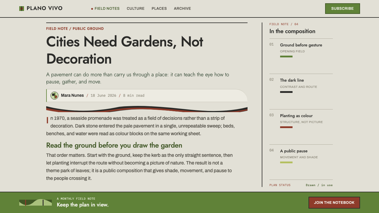
In 1970 he took on the Copacabana seafront promenade. He retained the wave pattern that had been laid there in 1906, and replaced the other two sidewalks with new abstract patterns: black and red basalt inlaid on white limestone, all in calçada portuguesa, the hand-set Portuguese stone paving tradition. The retained wave is the origin of the one heavy dark mark in the design system, set against an otherwise pale limestone ground.
What carries over from this history is an attitude to colour and ground. Colour is applied as areas, not as effects; the ground is a pale, sun-bleached stone, not pure white; and the single heavy mark takes its weight from being alone. A design that borrows this look should keep that attitude, because the style depends more on restraint with mass than on any particular palette.
What defines the Burle Marx Landscape look?
The plan-sheet page
The page is treated as a plan, a sheet seen from above, rather than as a scene or a window. Layouts are organised as areas of colour laid on a ground, and the viewer reads them as a map. The ground is pale limestone, sun-bleached rather than pure white, which gives the whole page a slightly warm, mineral light.
Flat gouache blocks
Colour arrives as solid, opaque areas, as a gouache painter would lay them. Each block is a single flat colour: never shaded, never graded, never mirrored. A species of plant is one block, and a region of a layout is one block. Depth comes from overlap and arrangement, not from simulated light.
Cut-curve edges
Shapes have curved edges that look cut from paper rather than drawn with a ruler. They are organic but decisive: smooth sweeps with clear corners where one area meets another. This is the visual signature of the plan drawings, and it gives the system a fluid, biomorphic rhythm that a grid of rectangles cannot produce.
Broken symmetry
Symmetry is broken on purpose. Compositions balance by weight and rhythm rather than by mirroring, so a large mass on one side is answered by several smaller shapes on the other. The effect is lively and confident, and it signals that the layout was composed rather than generated.
Free-form water
Water is left free-form: a flowing, irregular shape that sits among the planting blocks instead of a rectangle or circle. In a layout this becomes a space for a hero image, a form or a quiet callout, shaped as a curve. It is the one element that is allowed to be an irregular open shape.
Planting as structure
Native tropical planting is used as structure, not decoration: greens of different depths and temperatures lie side by side to define zones. In an interface this suggests using colour to mark regions and functions, such as navigation, content and feedback, instead of using borders and dividers. The greens in this system are layered gouache colours, not gradients.
The basalt wave
A dark band, drawn from the Copacabana wave and set like hand-laid stone, runs through the page as the single heavy mark. It is the only strongly weighted element on an otherwise light ground, and that isolation is what gives it power. One wave is a signature; several waves become wallpaper.
Who shaped Burle Marx Landscape?
The Brazilian landscape architect whose gouache plan drawings define the style. He used native tropical planting as structure, broke symmetry on purpose, kept water free-form, and gave each species one flat colour block. His work spans the 1930s to the 1990s, with the Copacabana promenade intervention of 1970 as its best-known graphic moment.
An architect of Brazilian modernism, named alongside Burle Marx as part of the circle in which the tropical modernist landscape approach developed. He represents the architectural side of the same movement.
A Brazilian modernist architect who belongs to the same circle. His name is a reminder that Burle Marx's landscapes were conceived in dialogue with modern architecture rather than as an independent genre.
A Brazilian modernist architect named among the key figures of the movement. Together with Costa and Niemeyer, he helps place the style within the wider story of Brazilian modernism.
How do you use Burle Marx Landscape today?
The Burle Marx system suits subjects tied to place, nature, architecture and culture: botanical and environmental organisations, landscape and architecture practices, hospitality, travel, cities, museums and sustainability reporting. It is a bright, open, optimistic language that works well wherever the aim is to feel modern without feeling cold.
For slides, a cover can be a pale limestone field with a few large gouache-green blocks placed asymmetrically, the title set in a clear area, and a single dark wave crossing the lower edge. Content slides use colour blocks to define zones, with one block per idea and the basalt band reserved for the section break. For data slides, area charts, stacked bars and map-like diagrams are natural fits, built as flat colour regions with cut-curve edges rather than lines with gradient fills.
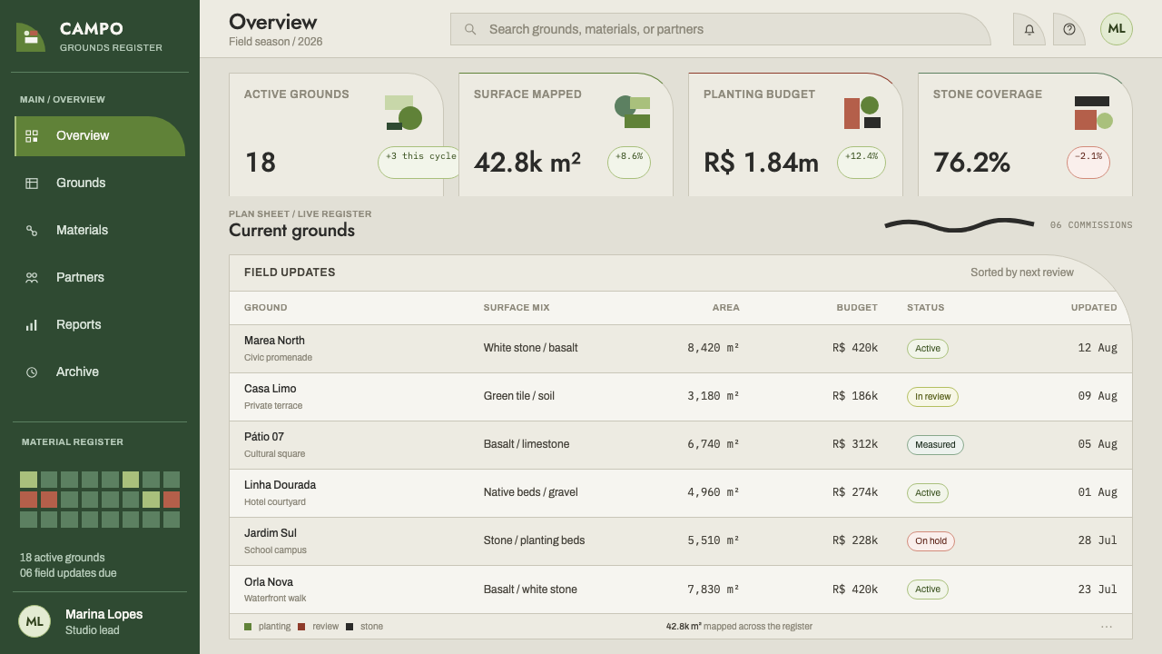
For web interfaces, use colour blocks to mark regions such as navigation, content and feedback, instead of drawing borders everywhere. Dashboards can be arranged as plans: a curved water-shaped panel for a hero metric, green blocks for categories, and a dark band for the one thing that deserves weight. Pricing tiers can be flat colour blocks of different greens laid out asymmetrically, without shadows or glass effects.
For editorial and marketing work, the style gives long-form features about place, travel and design an immediate visual identity. Large flat colour fields can frame photography, and the basalt wave can serve as a section divider or header mark. Photography of gardens, stone and architecture pairs naturally, provided it sits inside crisp, shape-bounded frames and is not blended into the ground.
The most common mistake is to add what gouache does not have: gradients, drop shadows, glass blurs and mirrored layouts all break the logic of the flat plan sheet. A second mistake is to repeat the basalt wave until it becomes decoration. It works because it is the one heavy mark, so use it once per view. Finally, do not default to pure white; the pale limestone ground gives the whole system its warmth.
Burle Marx Landscape — FAQ
Who was Roberto Burle Marx?
He was a Brazilian landscape architect based in Rio de Janeiro, active from the 1930s to the 1990s, and part of Brazilian modernism. He drew gardens in plan, in gouache, on white paper, using native tropical plants as structure, breaking symmetry on purpose and leaving water free-form. His 1970 intervention on the Copacabana promenade is among his best-known graphic works.
What is calçada portuguesa?
It is the Portuguese tradition of paving with small stones set by hand, here laid in black and red basalt on white limestone. In Copacabana the 1906 wave was kept and two other sidewalks were remade with new abstract patterns in the same technique. In the design system it explains why the dark band feels hand-set and mosaic-like rather than drawn.
Why does the style avoid gradients and shadows?
Because gouache plan drawings are made of flat, opaque colour areas, and each species is one block. Gradients and shadows import a lighting simulation that the drawings never had. Keeping every area to a single flat colour preserves the clarity of the plan sheet, and it lets the one heavy basalt band carry the page's weight on its own.
Can I use the wave more than once on a page?
It is better not to. The wave works because it is the one heavy mark on an otherwise light ground, and repeating it turns a signature into wallpaper. If you need more rhythm, vary the cut-curve colour blocks and the free-form water shape instead, and keep the basalt band singular and dark.
Why is the background pale limestone rather than white?
Because the system treats the page as a plan sheet in sun, and the limestone ground comes from the paving of the Copacabana promenade. A sun-bleached stone tone is warmer and more mineral than pure white, and it lets the flat greens and the dark basalt band sit on it like inlay. Pure white would make the colour blocks feel like screen graphics instead of drawn areas.
Related design styles
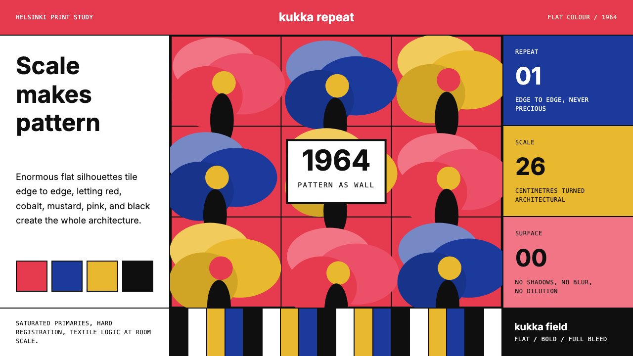 Finnish Marimekko Unikko (1964)Scale becomes pattern. Poppy red, cobalt, mustard, and Inter tile flat silhou…
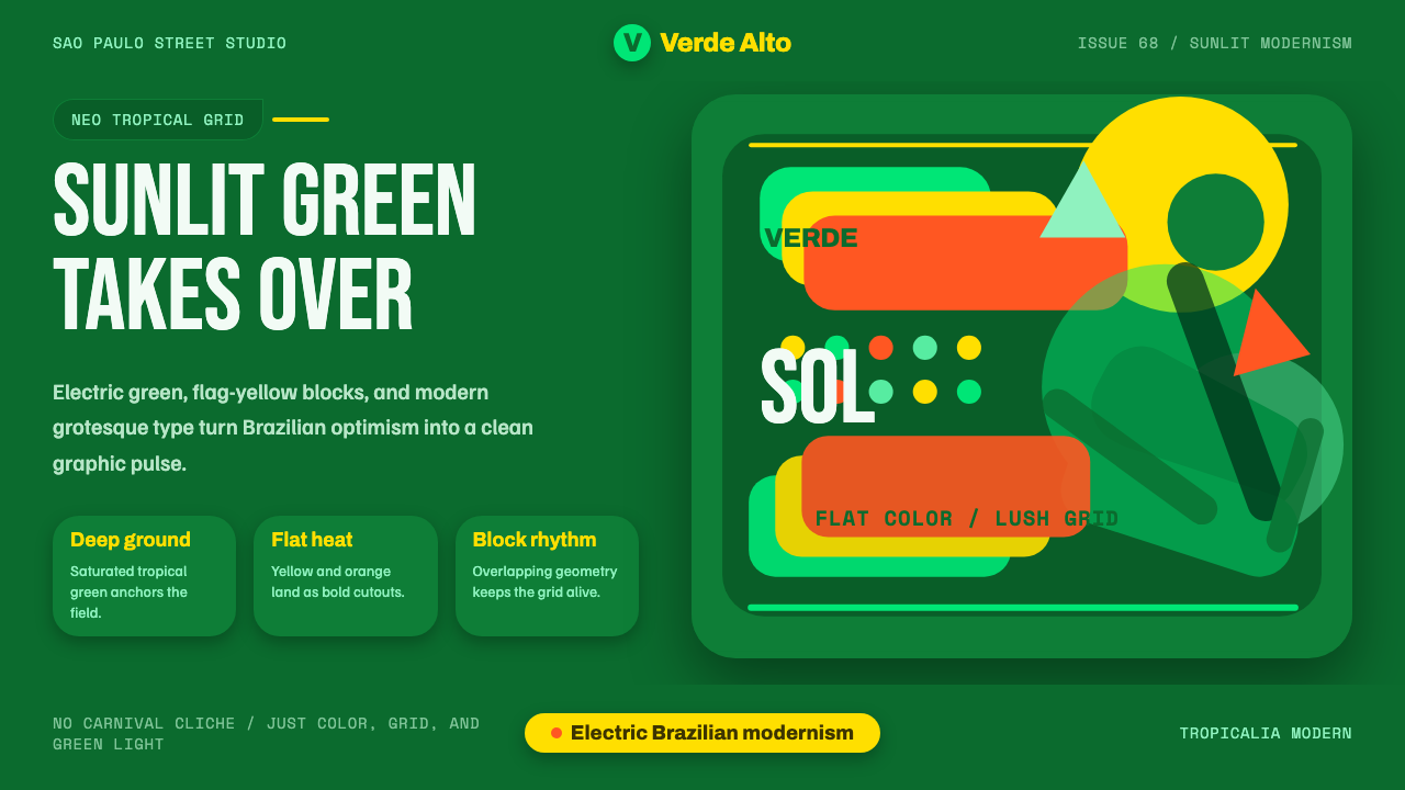 Tropicália ModernBrazilian optimism goes electric. Deep green, flag yellow, and leaf silhouett…
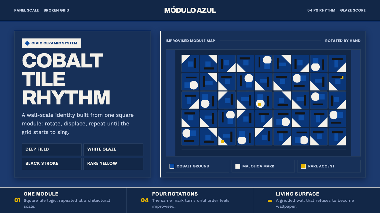 Athos Bulcão Azulejo PanelCobalt grid, alive. Majolica white marks rotate across a broken navy tile fie…
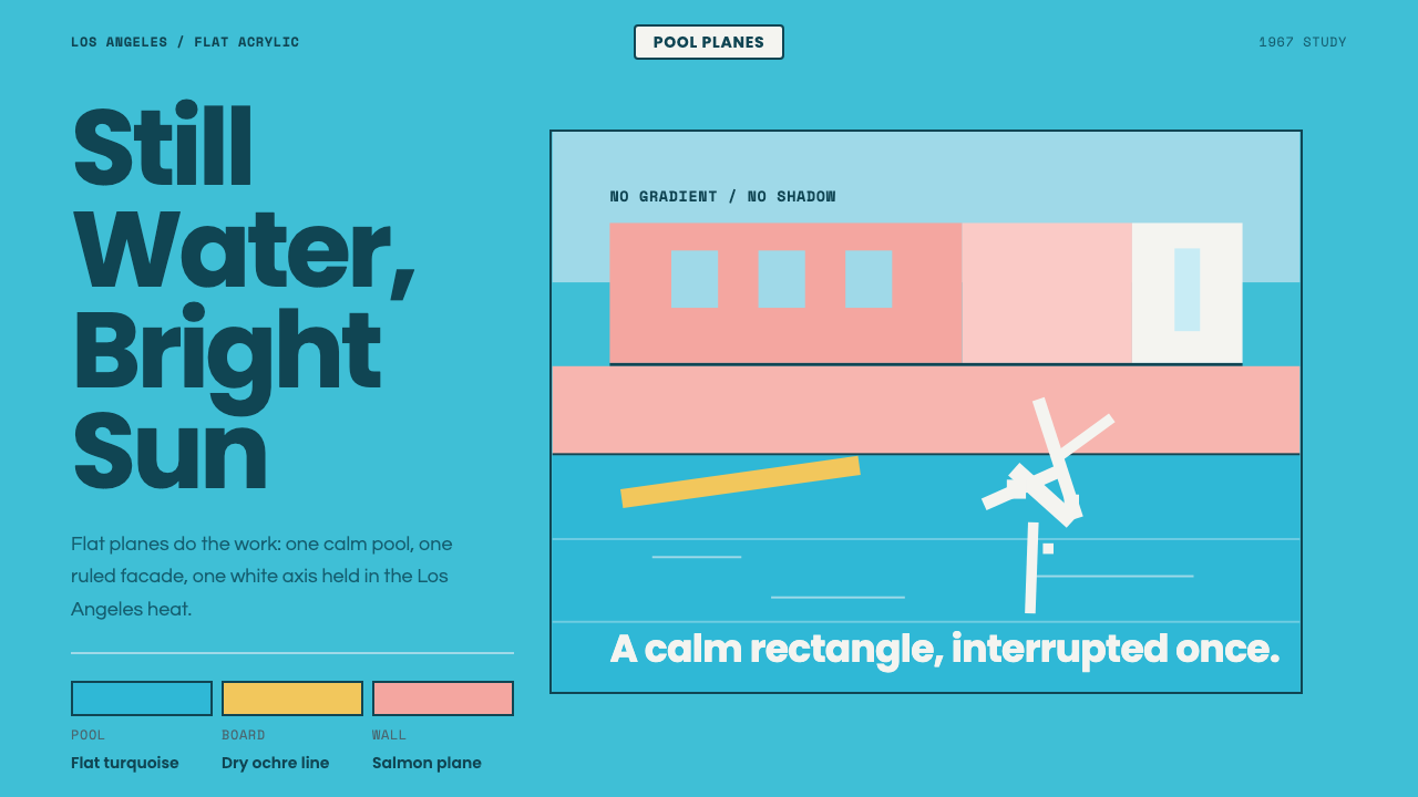 Hockney Pool BlueSerenity turns graphic. Turquoise planes, salmon edges, one white splash.
 Atompunk / Raygun GothicTomorrow shines loud. Tangerine marquee type cuts through turquoise chrome ge…
 Braniff (Girard)Color becomes fuselage. Jellybean orange, turquoise blocks, and geometric san…