What is Brunei Omar Ali Mosque?
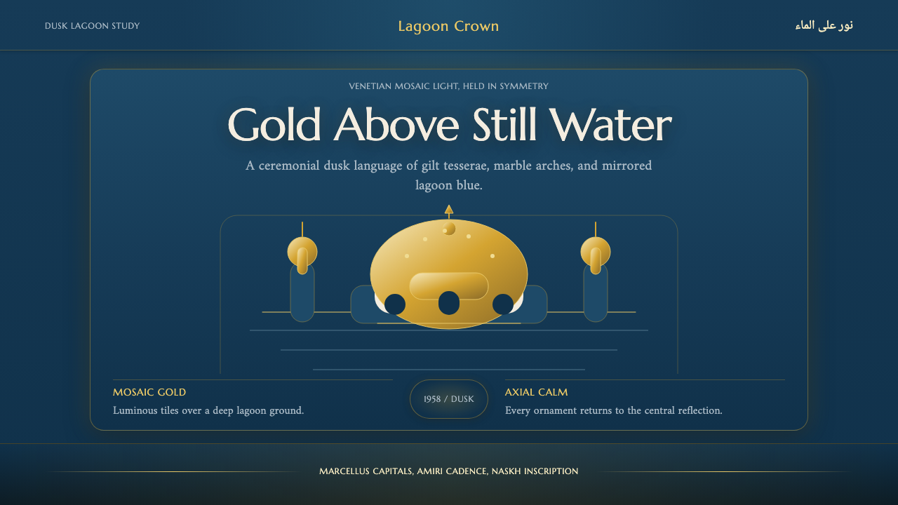
The Sultan Omar Ali Saifuddien Mosque turns a single dome into an event: millions of gold tesserae catching dusk light over the mirror of a still artificial lagoon.
Brunei Omar Ali Mosque in brief
The Sultan Omar Ali Saifuddien Mosque stands in Bandar Seri Begawan, the capital of Brunei, and is best known for one image: its dome, laid with millions of gold Venetian mosaic pieces over white Carrara marble, glowing above a mirror-still artificial lagoon at dusk. The building itself is a deliberate fusion — Mughal onion curves paired with Italian Renaissance arches and balustrades — but the design system this theme draws from is narrower and more atmospheric. It is the golden-hour scene at the water's edge, not the full architectural plan.
As a design language, this theme is built around a single, disciplined contrast: an overwhelmingly dark, cool ground — the deep blue of lagoon water at dusk — punctuated by one luminous, warm accent, the gilt of the dome. Nothing else competes with that pairing. White marble reads as a cool structural neutral rather than a bright highlight, and every other surface stays subdued so the gold has somewhere to shine.
The visual grammar leans on symmetry and doubling. A dome mirrored in still water is, formally, an object reflected across an axis, and the theme treats that axis as sacred: layouts built from it favor centered compositions, vertical balance, and the sense that whatever sits above a line should have an answering echo below it, even if that echo is quieter and darker than the original.
Where does Brunei Omar Ali Mosque come from?
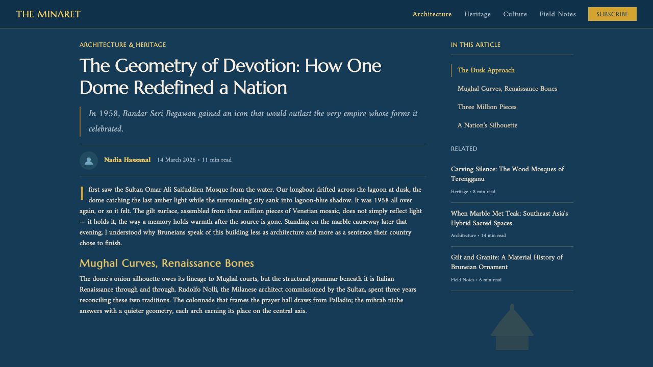
The mosque was built under and named for Sultan Omar Ali Saifuddien III, and it was completed in 1958, a period when Brunei — a small sultanate on the island of Borneo — was consolidating its identity ahead of the wider decolonization movements reshaping Southeast Asia. A monumental state mosque, built to a scale and material quality far beyond ordinary religious buildings of the region, served as both an act of faith and a statement of the sultanate's continuity and standing.
The building's fusion of Mughal onion curves with Italian Renaissance arches and balustrades reflects a pattern common to twentieth-century state architecture in maritime Southeast Asia: rulers commissioning grand religious buildings often drew on established, internationally legible architectural vocabularies — Mughal domes as shorthand for Islamic monumental grandeur, Italianate stonework as shorthand for European high craftsmanship — and layered them onto a single structure rather than inventing an entirely new form. The dome's gold surface, three million individual Venetian mosaic pieces set by hand over marble, belongs to a much older craft lineage: gilt glass tesserae mosaic, historically associated with Venetian workshops, applied here at a scale meant to be legible from a distance and luminous under changing light.
Beside the mosque, the design system also draws on the artificial lagoon and the Mahligai, a stone replica of a royal Bruneian barge moored in the water. The barge form recalls Brunei's history as a maritime sultanate whose court and ceremonial life were historically tied to the water — Bandar Seri Begawan itself grew up around the Brunei River, with stilt villages and waterborne life predating the modern city. Placing a ceremonial barge beside the mosque, and letting the whole complex mirror in still water, folds that maritime royal memory into a specifically religious monument.
The result is a landmark whose most reproduced image is not a floor plan or a facade elevation but a single dusk photograph: gold dome, blue water, and a stone barge floating between them. That photograph — rather than the building's full architectural program — is the visual source this design theme distills, which is why its palette and mood are narrower and more concentrated than the mosque's actual material and stylistic range.
What defines the Brunei Omar Ali Mosque look?
Lagoon Blue & Gilt
The theme's entire color logic rests on one relationship: a deep, cool lagoon blue as the dominant ground, and a warm, luminous gold reserved for a single focal element. The blue is never bright or tropical — it reads as still water at dusk, closer to navy or ink than to daytime sea. Gold is never spread thin as a decorative tint; it appears concentrated, as if the palette has agreed there is only one true light source in the composition and everything else exists to set it off.
Mosaic Shimmer
The gold surface is not a flat, uniform fill but the visual memory of thousands of small individual tiles catching light at slightly different angles. Translated into interface language, this becomes a preference for gold treatments with subtle internal variation and glow rather than a single flat gold tone — the sense that the surface is made of many small reflective units rather than one continuous plane, even when it is rendered simply.
Axial Symmetry
Composition is organized around a central vertical axis, the way the mosque's dome sits centered above its own reflection. Elements are weighted to balance left and right rather than pulling toward one corner, and a strong central focal point — one dome, one hero image, one key figure — is preferred over a scattered, asymmetric arrangement of several competing elements.
Reflection & Mirroring
Because the mosque's defining image is its own reflection in still water, the design language treats mirroring as a structural device, not just a decorative flourish: a bright element near the top of a composition can be given a quieter, darker echo below it, the way a gilt dome is answered by its own dimmer, water-softened double.
Onion Curve Silhouette
The mosque's dome carries the tapering, bulbous profile characteristic of Mughal religious architecture — a curve that swells outward before narrowing to a point. As a shape reference, this favors rounded, gently swelling silhouettes for focal graphic elements over hard rectangles, without tipping into full ornamental flourish.
Balustrade Framing
The Italian Renaissance side of the building contributes disciplined arches and balustrades — repeated, regular verticals that frame a view rather than fill it. This suggests using thin repeated dividing elements — rails, rules, evenly spaced verticals — to frame a hero visual, giving the golden focal point a structured, architectural edge rather than letting it float unbounded.
Dusk Glow
Light in this system is treated as low-angle and warm, the way late-day sun rakes across gold and softens into blue shadow elsewhere. Highlights are concentrated and glowing rather than bright and even, and the overall mood favors the hush of early evening over the flatness of midday light.

Who shaped Brunei Omar Ali Mosque?
The mosque was built under and takes its name from Sultan Omar Ali Saifuddien III, whose commission produced a state monument completed in 1958 at a scale and material richness — gold mosaic dome, imported marble, an artificial lagoon — well beyond ordinary religious architecture in the region, tying his reign to a lasting emblem of Bruneian identity.
The dome's surface belongs to the historic craft tradition of gilt glass mosaic associated with Venetian workshops, in which thousands of individually set gold tesserae are used to clad a large curved surface so that it catches and scatters light rather than reflecting it as a single flat plane — the source of the theme's shimmering, multi-faceted gold quality.
The mosque's form deliberately fuses Mughal onion-dome curves with Italian Renaissance arches and balustrades, a hybrid architectural lineage that lends the design system both its rounded, swelling focal silhouette and its disciplined, repeated framing elements.
The dome's gold mosaic is laid over a base of white Carrara marble, the same Italian stone prized for centuries in European sculpture and monumental architecture, providing the cool, neutral structural surface against which the theme's warm gold accent is set.
How do you use Brunei Omar Ali Mosque today?
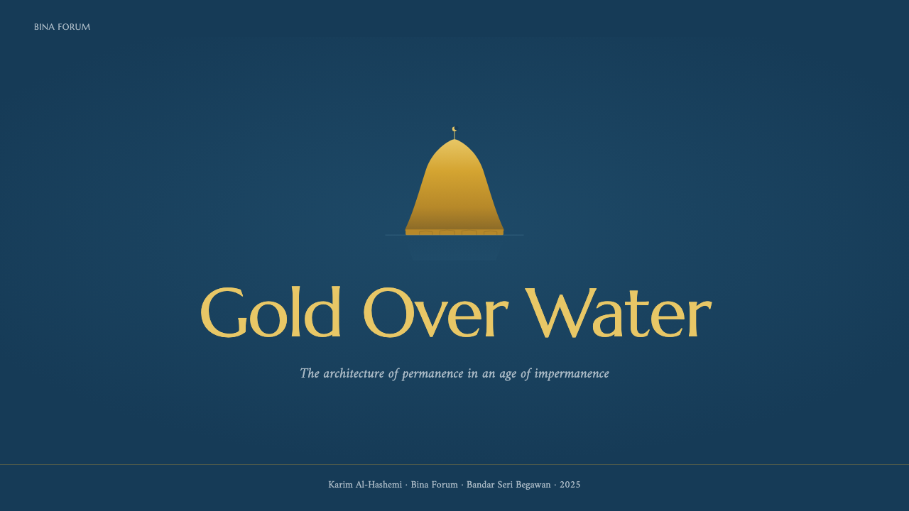
For presentation slides, this theme is strongest where it can commit fully to the dark-ground, single-accent logic. A cover slide works best as near-black or deep lagoon blue with one glowing gold focal shape or title treatment centered on the axis — resist the urge to add a second bright color. Content slides should keep the dark blue ground and use gold sparingly, reserved for the single most important word, number, or icon on the page, with supporting text rendered in a quieter, desaturated tone so it recedes rather than competes. Data slides benefit from the mirroring principle: a bar or line chart can be given a faint, inverted echo beneath the baseline, evoking reflection without literally duplicating every data label.
In web interfaces, the theme suits dashboards and pricing pages that want to feel premium and considered rather than playful. A dark navy-to-ink background with a single gold accent reserved for the primary call-to-action button, the active navigation state, or a highlighted pricing tier reads as deliberate scarcity — gold that appears everywhere loses the specialness the mosque's dome depends on. Card components and panels should stay close to the background tone with only thin, light dividing rules, echoing the balustrade's disciplined framing rather than heavy borders or drop shadows.
For editorial and marketing layouts, the axial symmetry principle is the most transferable idea: a magazine-style feature page or landing page hero can center its headline and hero image on a vertical axis, with supporting elements balanced left and right rather than asymmetrically stacked. A faint reflected gradient beneath a hero image or product shot — darker and softer than the object itself — can stand in for the lagoon's mirror without requiring an actual water photograph.
The theme also works well for luxury travel, hospitality, and heritage-brand marketing, where a single warm accent against overwhelming cool darkness signals restraint and significance rather than abundance. A pricing or membership page that reserves gold exclusively for the top tier, leaving lower tiers in cooler blues and greys, borrows the mosque's own hierarchy: one gilt object, everything else in supporting shadow.
The most common mistake is treating gold as a general accent color to be sprinkled across buttons, icons, and text links throughout an interface. In the source image, gold works because it is rare — a single dome against an entire lagoon of blue. Applying it liberally collapses that hierarchy and produces a generically 'luxury gold' look rather than the specific, concentrated glow this theme depends on. A second mistake is lightening the blue ground toward a bright daytime sky tone; the mood only holds if the blue stays dark enough that gold reads as the sole light source in the frame.
Brunei Omar Ali Mosque — FAQ
Is this theme specifically Islamic architectural style, or something narrower?
It is narrower and more atmospheric than 'Islamic architecture' as a category. The theme is drawn from one specific building's most iconic scene — the gilt dome of the Sultan Omar Ali Saifuddien Mosque mirrored in its lagoon at dusk — rather than from the broader visual vocabulary of mosque design across regions and centuries. Other mosque traditions use very different palettes, materials, and ornament; this theme is deliberately about one dark-and-gold, water-mirrored moment, not a general-purpose religious architecture style.
Can this theme work in a light, daytime palette instead of a dark one?
It loses most of its identity if it does. The entire logic depends on gold reading as the singular light source against an overwhelmingly dark, cool ground — that is what makes the dome feel luminous rather than merely bright. Rendered on a light background, the same gold tone reads as a generic decorative accent rather than a glowing focal point, and the reflective, dusk-lit mood the theme is built around simply does not translate. If a lighter version is needed, it is better treated as a different, related theme rather than a variant of this one.
How much ornament should a design based on this theme actually carry?
Less than the mosque itself. The building carries a great deal of Mughal and Italianate architectural detail, but the design theme distills only its dusk-lagoon scene, which is visually simple: one dark ground, one glowing focal shape, a symmetrical composition, and a faint mirrored echo. Interfaces and layouts built from it should stay closer to that simplicity — a single well-placed gold element does more work than an interface covered in gold filigree or repeated dome-shaped motifs.
Does the theme require using an actual dome or mosque imagery to feel authentic?
No. The theme abstracts a color and composition logic — dark cool ground, single warm focal accent, axial symmetry, faint reflection — rather than a specific iconographic motif. It can be applied fully through palette, layout, and light treatment alone, without any literal architectural imagery. Using an actual photograph of the mosque is one option for hero visuals, but it is not necessary, and forcing dome-shaped UI elements everywhere can tip the design toward pastiche rather than a genuinely felt mood.
What kind of products or brands does this theme suit best?
It suits products and brands that want to signal restraint, significance, and quiet premium quality — heritage brands, luxury hospitality and travel, cultural and religious institutions, and any product where a single carefully placed highlight communicates more than an abundance of color. It is less suited to playful, high-energy consumer products, since the entire mood depends on stillness, darkness, and scarcity of light rather than vibrancy or motion.
Related design styles
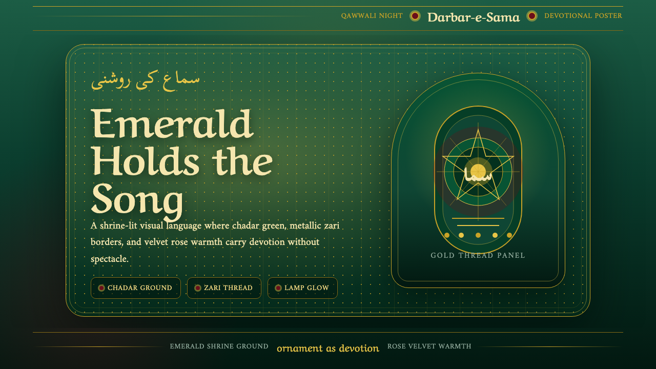 Qawwali DevotionalSacred warmth glows. Emerald cloth, zari gold borders, and Nastaliq rhythm ho…
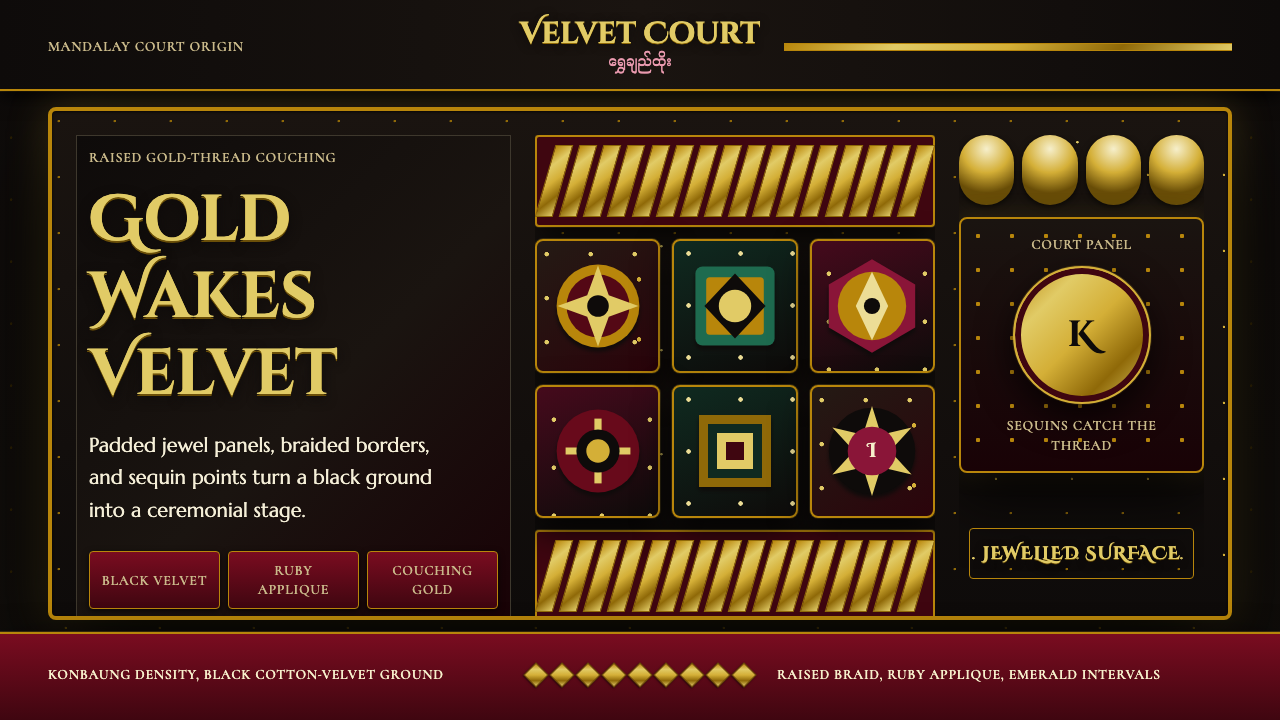 Burmese Kalaga TapestryVelvet becomes theater. Black ground, gold-thread borders, ruby and emerald p…
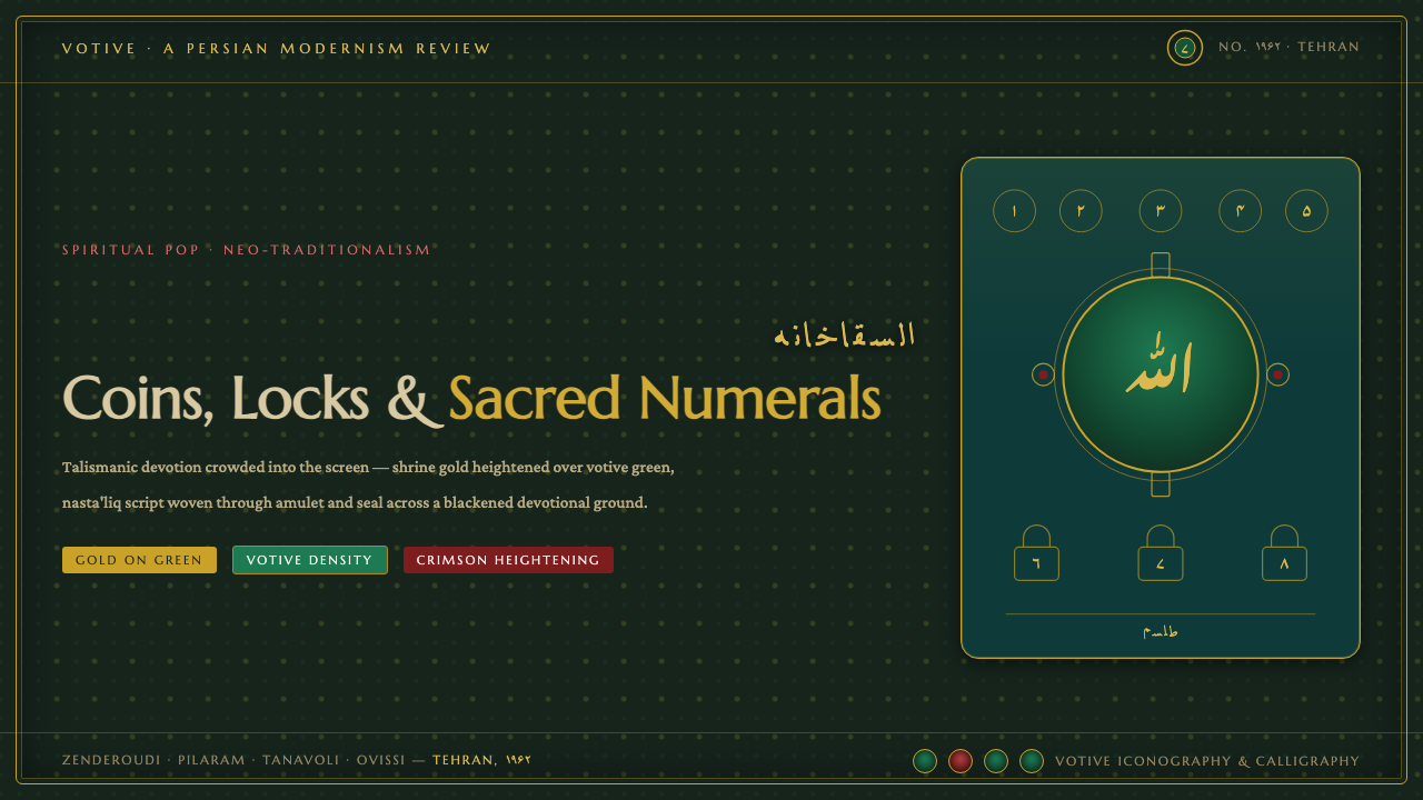 Saqqakhaneh MovementSpiritual Pop with a shrine pulse. Coins, locks and nasta'liq in gold over bl…
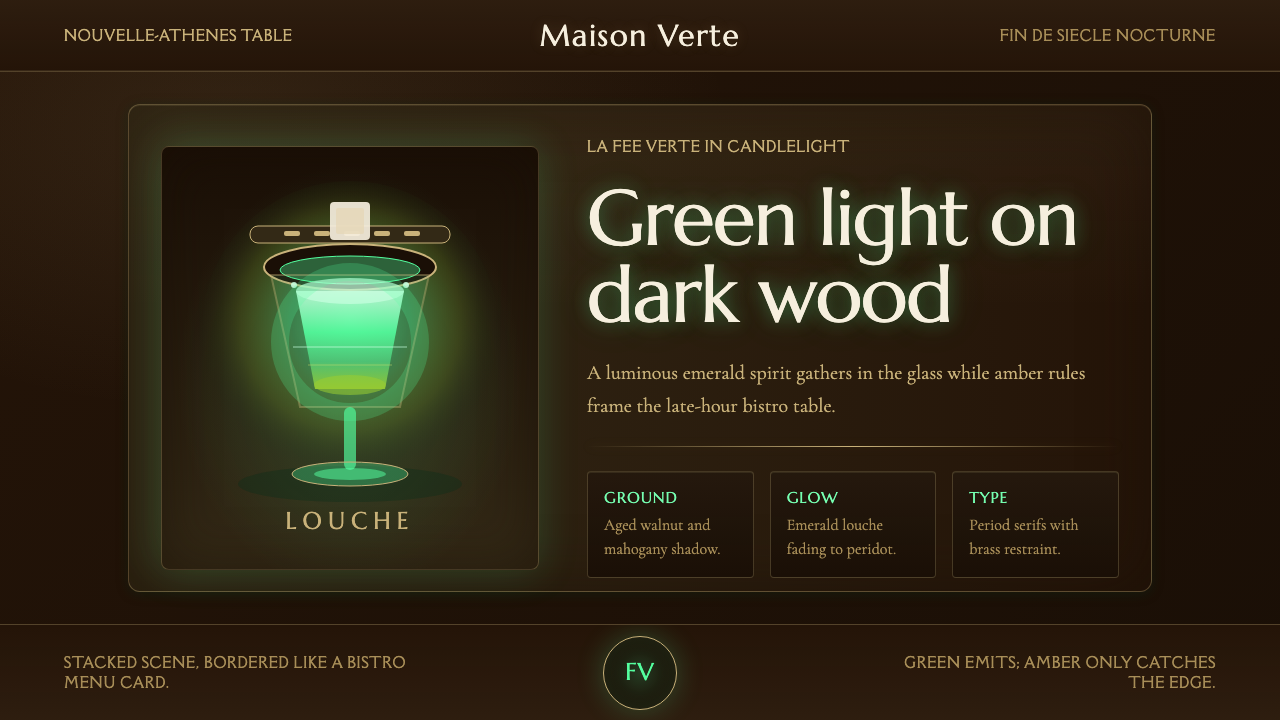 Absinthe Green Fairy GlowDarkness makes the fairy glow. Emerald louche on mahogany, framed by amber se…
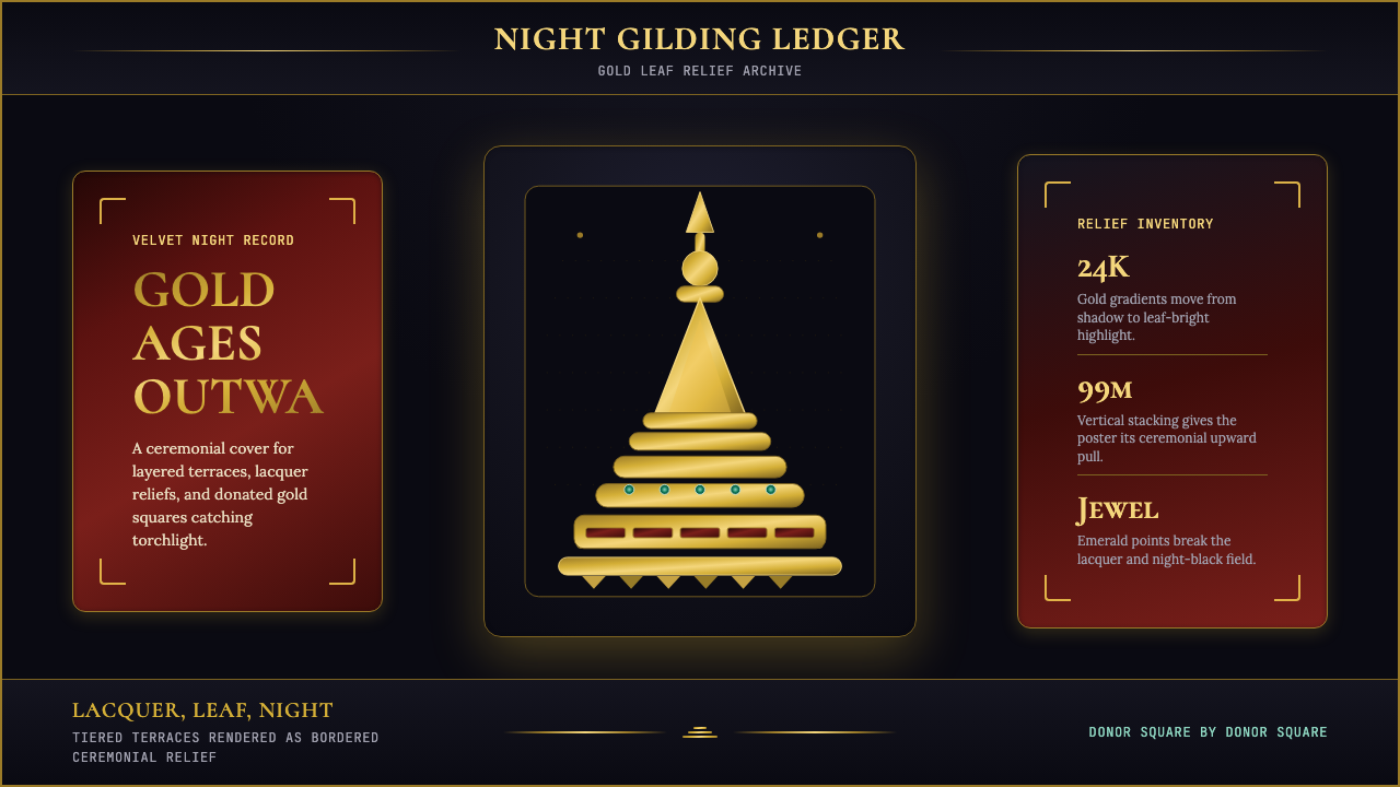 Burmese Shwedagon Stupa ReliefGold refuses restraint. Velvet black, teak-red lacquer, and tiered gradients…
 Chola Bronze NatarajaA patinated bronze under museum spotlight. Near-black field, verdigris recess…