What is Beijing 2008?
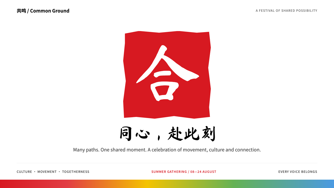
Beijing 2008 is the look of a ceremony with a pulse: a red carved seal, black brush lettering and a ribbon of five colours, all given room to breathe on white.
Beijing 2008 in brief
Beijing 2008 is the visual identity of the Games of the XXIX Olympiad, held in Beijing from 8 to 24 August 2008. At its centre is a red seal carved in relief, in which a white dancing figure doubles as a stylised character for the capital. Beneath it sit the words Beijing 2008 in black brush lettering and the five Olympic rings, all set on a generous white field.
Around that lockup the Games built a wider system known as the Look of the Games. It included a gradient band that ran from red through warm tones to sky blue and was used on venues and banners, auspicious cloud scrolls drawn in traditional Chinese line, sports pictograms inspired by ancient seal script, and five mascots, the Fuwa, each carrying one of the ring colours.
What makes it a distinctive style rather than just a logo is the balance it strikes. It is ceremonial without being heavy, festive without being noisy, and unmistakably Chinese without falling back on clichés. Large quiet areas of white let a small number of strong marks carry the meaning, and the information on top of them stays clear enough to read at a glance.

Where does Beijing 2008 come from?
The story begins with the emblem. The Beijing organising committee unveiled it in 2003, under the title Chinese Seal, Dancing Beijing. Its designer, Guo Chunning, drew on the tradition of the carved seal, the mark with which Chinese artists, officials and families have for centuries signed documents and paintings. By setting the dancing figure inside a seal, the emblem tied the modern Games to a very old habit of authorship and trust.
The brush lettering of the name belongs to the same lineage. Calligraphy has long been treated in China as the highest of the visual arts, and the choice to write Beijing 2008 with a brush rather than set it in a typeface gave the identity a human hand. The Olympic rings beside it stay in their standard form, which is what lets a local mark sit comfortably inside a global brand.
The Fuwa followed in 2005. They were created under the direction of the artist Han Meilin and arrived as a group of five, each tied to one ring colour and to a different animal or symbol from Chinese tradition. Their names, read together, form a greeting. Using five characters instead of one mascot let the identity scale across five colours, five rings and five continents, and it gave designers a friendly voice to place beside the formal seal.
The architecture of the Games supplied the final layer. The National Stadium, known as the Bird's Nest and designed with the Swiss practice Herzog & de Meuron, wove its structure into a tangled steel lattice, while the Water Cube took its skin from a pattern of soap bubbles. Both became textures that the graphic system could borrow. The whole identity was gathered under the slogan One World, One Dream, and it sits inside a wider moment in which Chinese national branding revived seal script and calligraphy as a confident, public face.
What defines the Beijing 2008 look?
Seal red as the anchor
One warm, saturated red carries the identity. It appears as the carved seal and as the leading colour of the gradient band, and it is used with confidence in large flat areas rather than as a thin accent. Everything else on the page is arranged around it.
Black brush lettering
Titles and the name of the Games are written with a loaded brush, with visible pressure, taper and a slight roughness at the edges. Set against the geometry of the rings, the brush stroke adds warmth and a sense of someone having actually written the words.
A field of white
White is the ground and also the main design material. The generous empty space around the seal gives it ceremony, and it keeps schedules, tables and photographs from crowding the identity. The system relies on restraint to feel grand.
The five-colour band
A ribbon that moves from red through orange, yellow and green to sky blue wraps venues, headers and dividers. It echoes the ring colours without copying them, and it supplies movement and cheerfulness to an otherwise formal layout.
Cloud scrolls
Auspicious clouds are drawn as flowing, spiralling lines that curl back on themselves. Laid over the gradient band, they soften its edges and give the surface a handcrafted, ornamental layer that stays light enough not to compete with content.
Seal-script pictograms
Sports icons are reduced to black and white and drawn with the thick-and-thin rhythm of seal script, so that they look like rubbings taken from stone. Each figure is instantly readable and still feels carved rather than drawn by a machine.
Ring-coloured mascots
The five Fuwa carry blue, black, red, yellow and green in the order of the rings. They are the playful end of the system, used for children's content, badges and decorative accents, and they should be kept away from anything that needs to feel strictly official.

Who shaped Beijing 2008?
Designer of the Games emblem, Chinese Seal, Dancing Beijing, unveiled in 2003. His seal and dancing figure is the foundation of the entire identity.
Artist who led the creation of the Fuwa mascots, unveiled in 2005. His work gave the identity its friendly, folk-rooted side.
The Swiss architects behind the National Stadium, the Bird's Nest. Its woven steel structure became a recurring texture in the visual language of the Games.
How do you use Beijing 2008 today?
In slides, Beijing 2008 works best for ceremonial moments: an opening cover, a section divider, a closing thank-you. Put the red seal or a large brush-lettered title on a clean white slide and let the empty space do the work. On content slides, keep the white ground and use the five-colour band only as a thin header or footer. For data slides, such as medal tables or schedules, assign the five colours to categories in a fixed order and keep text black, so the numbers stay as readable as they would be in a plain table.
On the web, the style suits event sites, ticketing pages, schedules, results and countdown pages. A white page with a red header, a black brush-lettered hero title and a ribbon of colour at the top gives an immediate sense of occasion. Dashboards and result tables should stay almost entirely black and white, with red reserved for the currently selected item or a live result. Seal-style pictograms make excellent navigation icons for sport categories.
In editorial and marketing work, the identity suits commemorative posters, programme booklets, national-day campaigns and cultural festivals. A single large seal, a vertical line of brush calligraphy and wide margins will give a page the feel of a printed official document. Cloud scrolls can run along the edge of a banner or the base of a poster as a gentle decorative border.
The style also adapts well to non-sporting subjects that want dignity without coldness, such as museum exhibitions, award ceremonies, traditional craft brands and cultural institutions. The red seal can stand for the organiser, while the brush lettering carries the title.
The most common mistake is to overfill the page. The whole system works because of its quiet white space and its few strong marks, so stacking the seal, the full gradient band, the clouds, the mascots and several pictograms on one screen turns ceremony into clutter. The second mistake is to use the brush script for long running text. It belongs to titles and short phrases only; paragraphs should be set in a plain, highly legible type.

Beijing 2008 — FAQ
What is the Beijing 2008 design style?
It is the visual identity of the 2008 Beijing Olympic Games, built around a red carved seal with a dancing figure, black brush lettering, the Olympic rings and a ribbon of five colours on a white field. As a design system it translates that identity into a clear, ceremonial look for event and cultural projects.
Who designed the elements of the Beijing 2008 identity?
The emblem was designed by Guo Chunning and unveiled in 2003. The Fuwa mascots were created under the direction of Han Meilin and unveiled in 2005. The National Stadium, whose steel lattice became a graphic texture, was designed with Herzog & de Meuron.
Which projects suit this style?
It suits event websites, schedules, medal tables, countdown pages, commemorative posters, cultural festivals, exhibitions and any product that needs a sense of ceremony while keeping information clear. It is a poor fit for fast, casual or highly playful products.
How do I keep the style from looking cluttered?
Keep the page mostly white, use the seal red sparingly and with purpose, and choose only one or two decorative layers, such as the colour band or the cloud scrolls, rather than all of them. Keep body text plain and reserve brush lettering for titles.
What is the idea behind One World, One Dream?
It was the slogan that gathered the Games under a single message of shared humanity. In design terms, it explains why the system pairs a distinctly Chinese seal and brush with the universal Olympic rings and a colour band meant to feel open and welcoming.
Related design styles
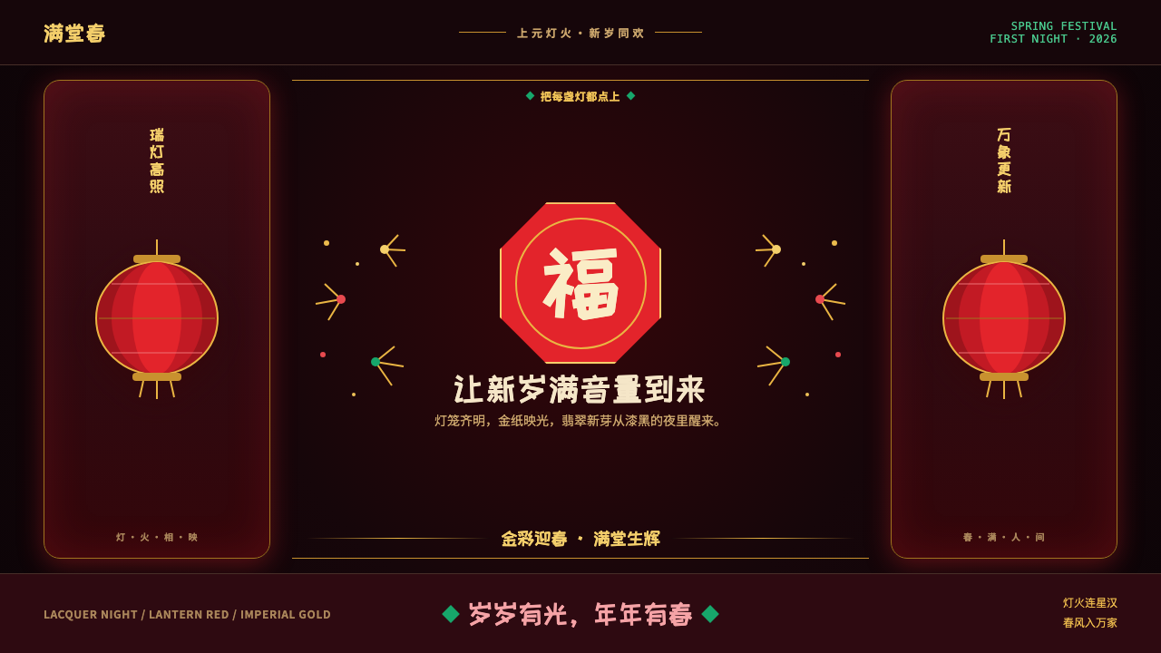 Chinese New Year Spring FestivalThe new year arrives at full volume. Lantern red glows through lacquer night…
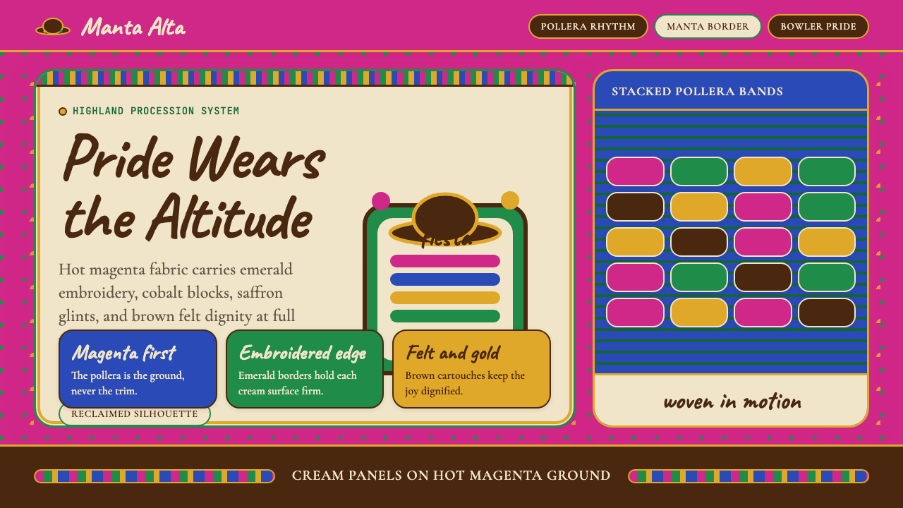 Bolivian Cholita (Bowler-Hat Fiesta)Loud pride, fully reclaimed. Magenta pollera bands, emerald borders, bowler c…
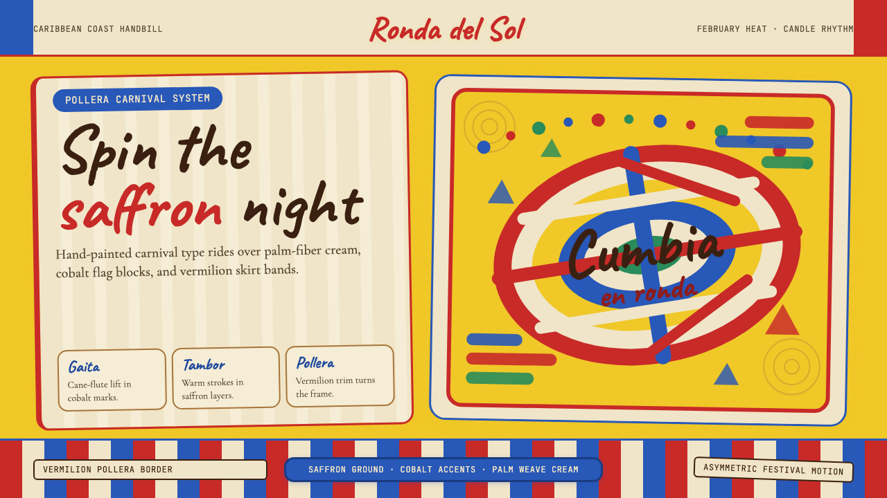 Colombian Cumbia (Pollera Carnival)Carnival heat spins. Saffron ground, Caveat script, vermilion stripes, cobalt…
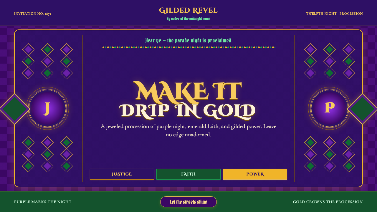 Mardi Gras New OrleansJoyfully excessive. Gilded type, jewel purple, emerald, and bead-strand borde…
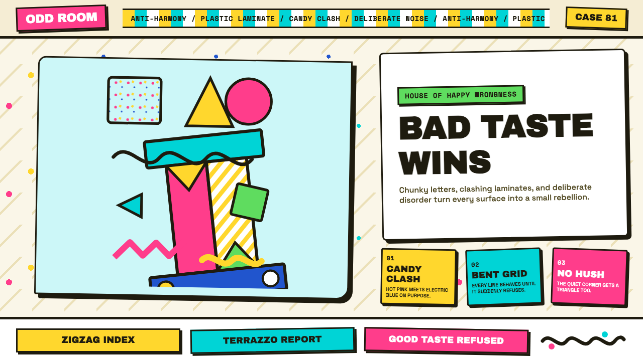 Memphis (Sottsass 1981)Joy weaponizes bad taste. Hot pink, turquoise, yellow and terrazzo specks bre…
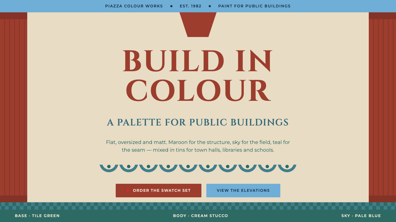 Michael Graves PostmodernClassicism, flattened and painted. Maroon pilasters frame Cinzel caps between…