What is Barbara Kruger?
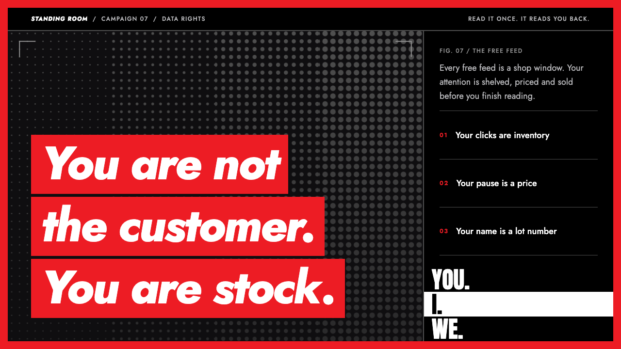
Barbara Kruger's red-bar style is one sentence aimed at you: white bold-oblique type on a flat red band, laid over a coarse black-and-white photograph.
Barbara Kruger in brief
The Barbara Kruger red-bar style is a visual language drawn from the American artist's photo-and-text works of the 1980s. The formula is blunt and instantly recognisable: a tightly cropped, grainy black-and-white photograph, one to three hard red rectangles laid across it, and a short sentence in white bold-oblique capitals sitting inside those bars. The sentence is almost always addressed directly to the viewer, and it tends to open with a pronoun: you, I, we, they.
As an interface style it is a dark, high-contrast system. The ground is a photographic grey-black, red is used only for the bars and the outer frame, and white is used only for the type. There are no gradients, no soft shadows and no decorative extras. Copy is kept short enough to fit inside a single bar, because the bar is the unit of the design: if a sentence will not fit in one, it is not yet finished.
What makes the style distinctive is not the palette but the attitude. The layout behaves like a headline, a slogan and an accusation at once. It borrows the authority of mass-media graphics, the tabloid cover, the poster, the warning label, and aims that authority back at the person reading. For a project that needs to stop a visitor in one line and make them think about who is speaking to whom, nothing in the history of graphic design does that job more efficiently.

Where does Barbara Kruger come from?
Barbara Kruger is an American artist based in New York. Before she was known as an artist she worked as a designer at the magazine Mademoiselle, starting in 1967, and the experience of laying out pictures and headlines for a mass-circulation publication shaped everything that followed. She learned how a crop, a caption and a typeface can steer a reader before the reader has decided to read. Around 1980 she began to turn that professional toolkit against its usual purpose.
Her method was to take an image from an old stock or archive photograph, usually black and white and often decades old, enlarge it until the grain showed, and set a sentence of her own across it. The sentences are short and personal, and they turn on pronouns. In the red-bar works made between 1981 and 1989, the sentences sit inside flat red rectangles with white bold-oblique type. The best known of them, the piece that reads I shop therefore I am, plays on a philosophical line about thought and turns it into a statement about consumption.
Kruger belongs to the group of artists known as the Pictures Generation, who in the late 1970s and early 1980s worked with existing images from advertising, film and the press rather than making new pictures from scratch. Her circle included Cindy Sherman and Sherrie Levine, and her practice sits alongside feminist art and text-based conceptual art. Jenny Holzer, who also worked with short declarative sentences in public space, is the nearest neighbour in method. What distinguishes Kruger is the clarity of the format: a repeatable layout that anyone could recognise from across a room.
From the early 1990s she moved from the photograph to the whole room. Her installations spread text across walls, floors and ceilings at architectural scale, and the work has continued into the 2020s. That later phase is why this design system also draws on a tall, condensed display face for stacked, wall-filling type. The system therefore holds two eras of her work in one set of rules: the compact red-bar picture of the 1980s and the room-scale text installation that followed, both built from the same ingredients of photograph, red, white and a direct address.
What defines the Barbara Kruger look?
Grainy black-and-white photograph
The ground is a photograph, not a flat colour: a tightly cropped, high-contrast black-and-white image that has been enlarged until its grain shows. Because the image is old stock imagery, it has the generic, anonymous look of mass media. A darkened grey-black treatment keeps the type legible and gives the whole page a cold, newsprint-like mood.
Flat red bars
Red appears only as hard-edged rectangles laid across the image, and as a thin outer frame. There is no gradient, no transparency and no rounding. The bars are the design's grid: they run edge to edge or sit as a stack of one to three bands, and they decide where the eye goes. Red is an alarm colour here, and it is never used for decoration.
White bold-oblique capitals
Type is a heavy, slanted geometric sans in white, set in capitals or tight sentence case, sitting directly inside the red bars. The slant gives the line forward motion, as if the sentence is leaning toward the reader. The face used in Kruger's own work is a bold oblique grotesque of the Futura family, and this system uses a close modern equivalent.
Direct address and pronouns
The copy talks to the reader. Sentences open with you, I, we or they, and they are short enough to fit inside one bar. The pronouns do the structural work of the design: they pull the viewer into the sentence and quietly ask who is speaking, who is addressed and who is excluded. Copy that cannot be set in this voice does not belong in the style.
Short copy, one idea per frame
Each frame carries one claim. Where a layout might include a subtitle, a paragraph and a button, here it has a sentence and nothing else. This restraint is what makes the style forceful. A long text would turn the bar into a caption and drain the confrontation out of it. If more explanation is needed, it goes to the next frame or the next page.
Tall condensed type for room-scale pieces
For the later, installation-scale side of her practice, the system adds a tall condensed display face used in stacked lines that fill a whole wall or floor. It is the same voice as the red bar at larger scale: louder, flatter and more architectural. It is best saved for hero sections or full-bleed splash screens, not for running text.

Who shaped Barbara Kruger?
The New York artist whose red-bar photographs from 1981 to 1989 define the style. A former designer at Mademoiselle, she turned magazine layout tools into a form of criticism, and she later extended the same language into text installations covering whole rooms.
A fellow member of the Pictures Generation who worked with staged photographic self-portraits that echo stock images of women in media. She is often named alongside Kruger as part of the same moment of image-based critique.
Another Pictures Generation artist, known for re-photographing and re-presenting existing artworks, which raises the same question that Kruger asks of stock photography: who owns an image, and who is speaking through it?
An artist who also works with short declarative sentences in public space. Holzer and Kruger are often compared as the two great practitioners of language as image: where Kruger pairs sentences with pictures, Holzer lets the sentence stand alone.
How do you use Barbara Kruger today?
On slides, the style is built for the opening and closing beats of a talk. A cover that says one blunt sentence in a red bar over a darkened photograph will set the tone better than a title and subtitle. Content slides should still carry one claim each: a photograph, one to three bars, one line of white type. Data slides are not a natural fit; if numbers are needed, show one number large in a bar and let the photograph carry the context.
In web interfaces, the style belongs on landing pages, campaign pages, manifestos and error or empty states that want to say something rather than apologise. A hero section can use a full-bleed grayscale photograph with a red bar holding the headline, while the rest of the page falls back to a plain dark background. Dashboards, pricing tables and dense forms work against it, because the style depends on there being very little on screen.
For editorial and marketing work, the style suits protest-adjacent campaigns, exhibition posters, magazine covers, social-media tiles and book jackets. It is strong when the sentence is genuinely sharp: a statement about attention, money, power or belonging. A rewrite of a product tagline into this format often exposes whether the tagline says anything at all, which is part of its value.
The most common mistake is using the red bar as a sticker on a stock photo with a vague slogan. The format only works when the sentence is specific and addressed to someone. The second mistake is adding colours, rounded corners, soft shadows or a second typeface, which dilutes the hard, flat feel. The third is letting copy run long: once it exceeds a single bar, the confrontation is gone and the layout looks like a caption.
One further note concerns provenance. This style quotes a specific living artist's recognisable format. Use it as a structural reference, writing your own sentences and choosing your own images, and avoid reproducing her actual works or slogans. When it is used with new language and new photographs, the structure is a powerful, reusable way to make a short line carry real weight.

Barbara Kruger — FAQ
What is the Barbara Kruger red-bar design style?
It is a design language based on Barbara Kruger's photo-and-text works of the 1980s: a grainy black-and-white photograph, one to three flat red bars, and a short line of white bold-oblique type that addresses the viewer directly, often beginning with you, I or we.
Why does the style use only red, white and gray-black?
Because the restraint is the point. Gray-black from the photograph acts as the ground, red works as an alarm colour on the bars and the frame, and white carries the type. Any extra colour softens the confrontation the style is built to produce.
How long should the copy be?
Short enough to fit inside one red bar. The bar is the unit of the design, so a sentence that does not fit has not yet been edited down. If a point needs more explanation, move it to the next frame or the next page rather than lengthening the bar.
Where does this style work best?
Landing pages, campaign and manifesto pages, posters, magazine covers, social tiles and opening or closing slides: anywhere a single sentence has to stop the viewer. It is a poor fit for dense dashboards, tables and long forms.
Can I copy Kruger's own slogans?
No. Treat the style as a structure: write your own sentences, choose your own photographs, and keep the format of red bar, white bold-oblique type and direct address. Reproducing her actual works would copy the artist rather than use the design language.
Related design styles
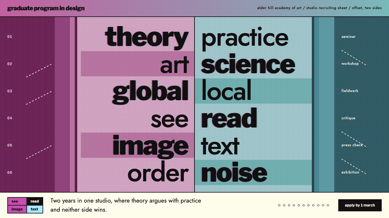 CranbrookNo single reading order. Black Franklin word pairs on a central axis, magenta…
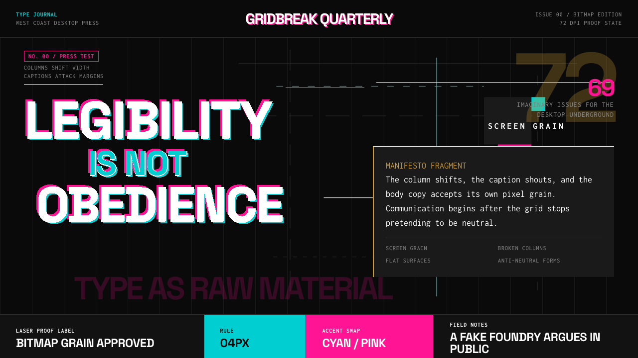 Emigre Magazine (1984–2005)Defies the tidy grid. Cyan, ochre, and hot-pink bitmap type collides on black.
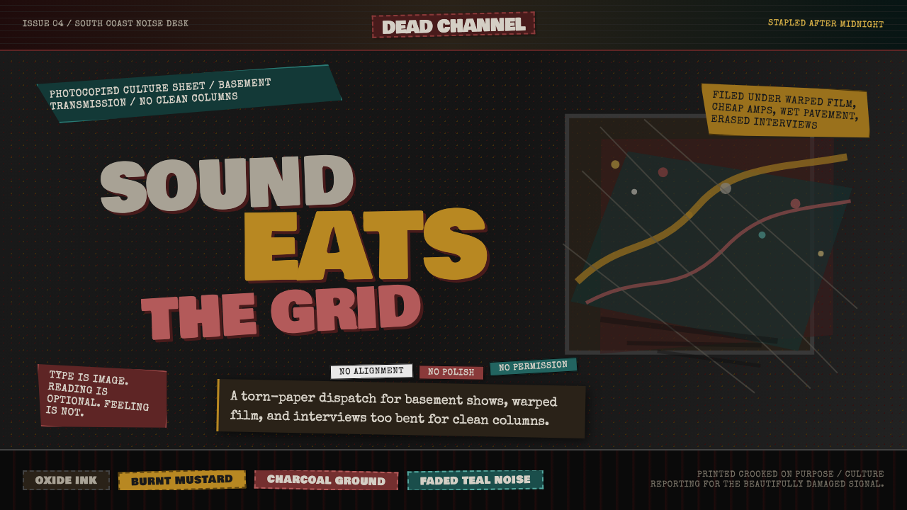 Grunge (Carson 1993)Carson's anti-rules, photocopied. Oxblood on charcoal, distressed type, delib…
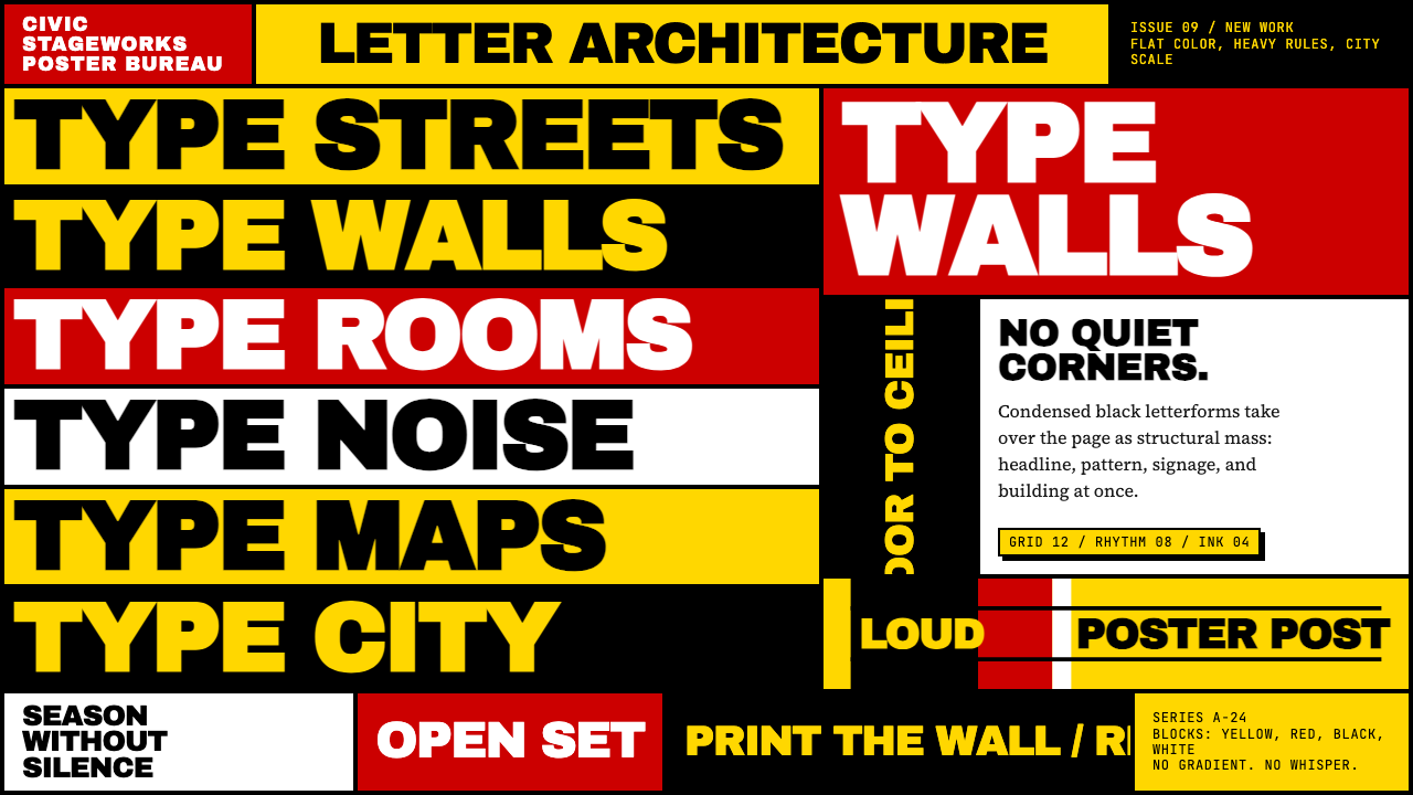 Paula Scher / PentagramType becomes architecture. Yellow-red-black blocks and stacked condensed caps…
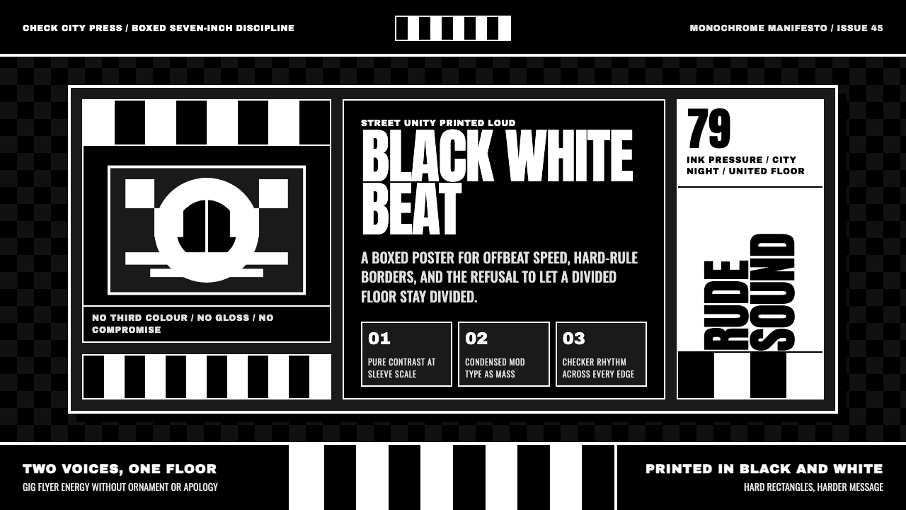 2 Tone SkaContrast as manifesto. White Anton type locks into a near-black checkerboard…
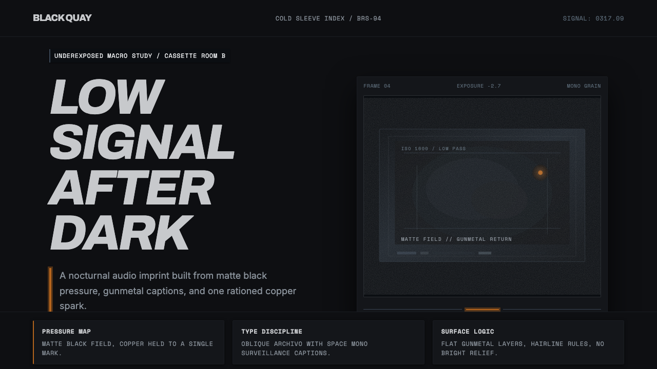 Bristol Trip-HopMenace through minimalism. Near-black grain, gunmetal type, one copper spark.