What is A Bathing Ape?
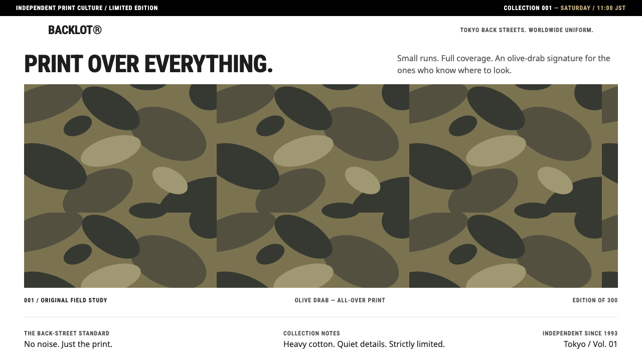
A Bathing Ape keeps the page plain and white so that the camouflage print, with its hidden ape heads, is the only thing allowed to shout.
A Bathing Ape in brief
A Bathing Ape, usually shortened to BAPE, is a Japanese streetwear label founded by Nigo in the Ura-Harajuku district of Tokyo in 1993. The design system here borrows the discipline of the label's official store: a plain white page, a black announcement bar across the top, condensed Helvetica-style headings and a strict grid of products. Against that quiet frame, the camouflage is the figure.
The print in question is the 1st Camo, launched in 1996. It took the pattern of American hunting camouflage and redrew it so that warped ape heads hide inside the blobs. It began in just two colourways, Olive Drab and Sand Yellow, and those two remain the colours that sit at the centre of this style.
The idea is a division of labour. Everything that is structure, such as the announcement bar, the headings, the grid and the buttons, stays neutral and obedient. Everything that is personality lives in one repeating pattern. The result looks disciplined and generous with white space, yet carries a very strong identity, which is why the system suits fashion retail, limited-release pages and brand events.

Where does A Bathing Ape come from?
A Bathing Ape was founded in 1993 by Nigo, whose full name is Tomoaki Nagao, in Ura-Harajuku, the network of back streets behind Tokyo's busy Harajuku fashion district. In that period Ura-Harajuku was a hub of small independent shops, where a limited run of a few hundred T-shirts could produce a queue around the corner. Streetwear here grew out of shop culture, friendship and scarcity, not out of runway fashion.
Nigo worked alongside Jun Takahashi, another figure of the Ura-Harajuku scene, and the two are closely associated with the creative circle in which the label took shape. The area's movement, often described simply as Ura-Harajuku streetwear, treated clothing as a collectable, with small releases and a loyal audience. That attitude of limited release is the basis of what is sometimes called Japanese hype culture, and BAPE became one of its most visible symbols.
The 1st Camo of 1996 was the label's signature move. Camouflage was already familiar as a military and hunting pattern, but BAPE turned it into a fashion print, camouflage as an everyday graphic. By hiding warped ape heads in the pattern, it added a joke and a secret that only close viewers would notice. This is a classic strategy of streetwear: a design that is widely visible yet rewards those who look closely.
In the 2000s the label expanded globally, with stores outside Japan and the Shark hoodie among its best-known items. The current web-store look, from around the 2020s, is the version this system is modelled on. Its choice to remove nearly everything from the page except the products is notable, because it follows decades of loud branding with a deliberately calm retail frame. The camouflage, no longer needing to compete with page decoration, becomes the one thing the eye goes to.
What defines the A Bathing Ape look?
Plain White Page
The page background is pure, uncluttered white. There are no textures, no gradients and no decorative blocks. This is the stage on which the print is displayed, in the same way that a gallery wall is left blank for the work. The white also gives product photographs a neutral setting and makes the whole page feel clean, almost clinical, in contrast to the visual noise of the print itself.
Black Announcement Bar
A thin black bar runs across the top of the page and carries release news and notices in small white type. It is the one strong horizontal element, and it plays the role of a shop's door sign: this is what is happening now. It echoes the culture of limited releases, since information about drops is the most important message the page ever has to deliver.
Condensed Helvetica-Style Headings
Headings and navigation are set in a condensed grotesque in the manner of Helvetica, in capitals and with tight spacing. The narrow letterforms let a long product name or category sit on a short line, and they give the page a dense, utilitarian feel, like a printed label or a street sign. Because the type is neutral, it never competes with the camouflage.
Strict Product Grid
Products are laid out in an even grid with consistent image proportions, minimal captions and uniform spacing. The regularity is the point: it turns a collection of very different garments into a single, orderly catalogue, and it makes a print stand out by contrast with the rigid frame around it. A grid like this is also easy to scan, which suits a store where new items appear often.
Olive Drab and Sand Yellow Camo
The camouflage is the only colour on the page. In its original form it comes in two colourways, Olive Drab and Sand Yellow, each built from irregular blobs of related tones. The shapes are organic and uneven, the opposite of the grid around them. This friction between a natural-looking pattern and a rigid layout is the visual tension of the entire system.
Hidden Ape Heads
Inside the camouflage blobs, warped ape heads are hidden. At a glance the pattern reads as ordinary camouflage, but a closer look reveals the joke. For a designer this offers a lesson about rewarding attention: a repeating pattern can carry a brand mark without a logo being placed on top of it, and discovery becomes part of the product.
Restraint Around the Print
Everything that is not the print is deliberately quiet: no extra accent colours, no ornament, no competing images. The camouflage is allowed to be loud precisely because nothing else is. This is the governing rule: one element gets the volume, and the rest of the system is built to support it.

Who shaped A Bathing Ape?
The founder of A Bathing Ape, who started the label in Ura-Harajuku in 1993. His combination of limited releases, borrowed military pattern and in-joke detail defined the label and became a template for later streetwear.
A designer of the Ura-Harajuku scene, closely associated with Nigo and with the creative circle in which the label took shape. His presence marks BAPE as part of a wider neighbourhood movement rather than a lone brand.
The network of back streets behind Harajuku in Tokyo, where small independent shops and limited releases created the culture the label grew from. The neighbourhood itself is the movement: shop-driven, scarcity-driven and friendship-driven.
How do you use A Bathing Ape today?
A Bathing Ape is the reference to reach for when a page has one strong visual asset and a lot of structural content. Its principle is simple: give everything else the discipline of a plain white store, and let the single pattern or image carry all of the personality.
For presentation slides, it works for brand, fashion and product decks. A cover can be a white slide with a thin black bar at the top, a condensed heading in capitals and a large crop of the camouflage pattern as the only image. Content slides stay white with a strict grid of small product images, and the camouflage appears as a recurring accent rather than a full-bleed background on every slide. Olive Drab and Sand Yellow are the only colours worth using.
For web interfaces, it suits fashion e-commerce, limited-release pages, brand events and collectible shops. Use a white page, a black announcement bar for drop dates, condensed capitals for headings and navigation, and an even product grid. Place the signature pattern in a hero panel, a banner or a product tile, and avoid spreading it across buttons or backgrounds. Buttons should be plain black or white. On dashboards, the idea transfers as a neutral frame around a single branded visual.
For editorial and marketing work, the style helps with lookbooks, launch announcements, campaign microsites and collaboration pages. A black bar with a date, a plain white layout and one striking camouflage image make a convincing drop page with very little else. It also suits anything that wants a Japanese streetwear flavour without leaning on stereotypes, since the identity comes from a real shop culture and a real print.
The common mistake is to let the camouflage leak into everything: backgrounds, buttons, borders and headings. Once the print is everywhere, it stops being the figure and the page loses its tension. A second mistake is to soften the frame with rounded cards, shadows or extra accent colours, which reduces the strict, shop-like discipline. Keep the page white, the type narrow, the grid even and the camouflage confined to the place where you want the eye to land.

A Bathing Ape — FAQ
What is the A Bathing Ape design system based on?
It is based on the Japanese streetwear label BAPE, founded by Nigo in Ura-Harajuku, Tokyo, in 1993, and in particular on the discipline of its official web store: white page, black announcement bar, condensed headings and a strict product grid, with the 1st Camo print as the only loud element.
What is the 1st Camo?
A camouflage print launched in 1996 that reworks American hunting camouflage so that warped ape heads are hidden inside the blobs. It started with two colourways, Olive Drab and Sand Yellow, which remain the colours at the centre of this style.
Why is the page so plain?
So that the camouflage is the only thing allowed to be loud. A white page, a black bar and narrow neutral type form a quiet frame, and the contrast between that frame and the organic, busy pattern creates the system's tension.
What is Ura-Harajuku?
The network of back streets behind Tokyo's Harajuku district, where small independent shops and limited releases created a streetwear culture. BAPE grew out of this scene, which treated clothing as collectable and release-driven.
Where should the camouflage pattern be used?
In one deliberate place, such as a hero panel, a banner or a product tile. If it spreads across backgrounds, buttons and borders, it stops being the figure and the page loses its tension. Keep everything else white, narrow and neutral.
Related design styles
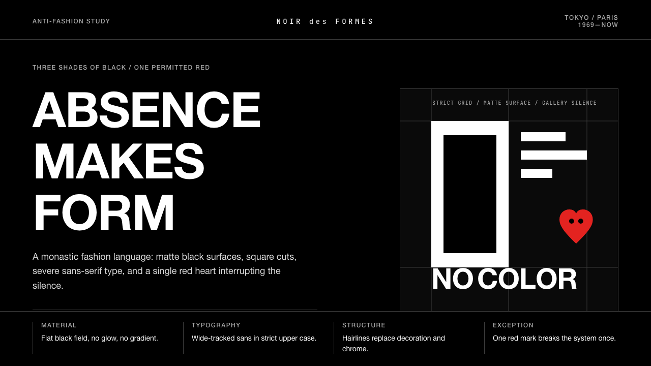 Comme des Garçons (Rei Kawakubo)Austerity becomes the event. Pure black, wide sans type, and one red heart br…
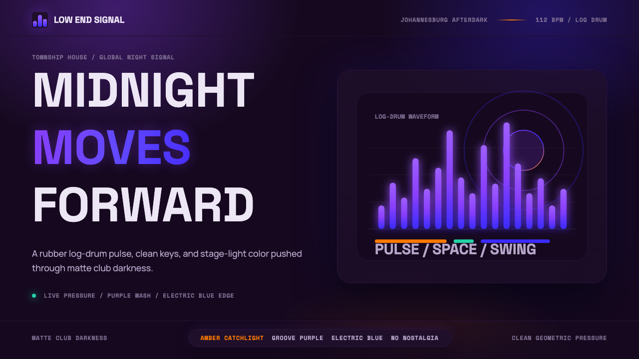 AmapianoClub darkness, fully awake. Purple-blue waveforms pulse through geometric typ…
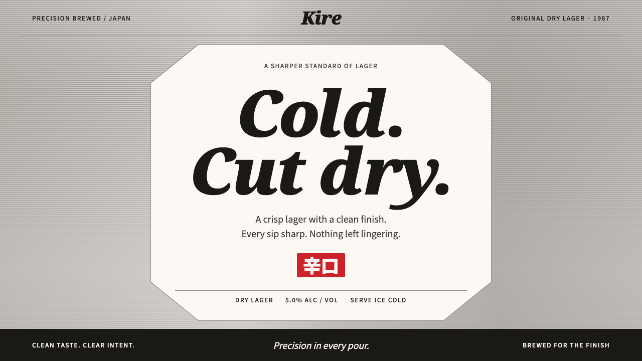 Asahi Super DryCold precision at a glance. Black italic type on a white octagon and pinstrip…
 Ikko TanakaCalm carries weight. One blue disc and hard-edged ink blocks anchor a greige…
 Joy Division — Unknown PleasuresRestraint becomes signal. Black field, tight Helvetica, and white pulsar line…
 2 Tone SkaContrast as manifesto. White Anton type locks into a near-black checkerboard…