What is Sheki Shebeke Stained Lattice?什么是 Sheki Shebeke Stained Lattice?
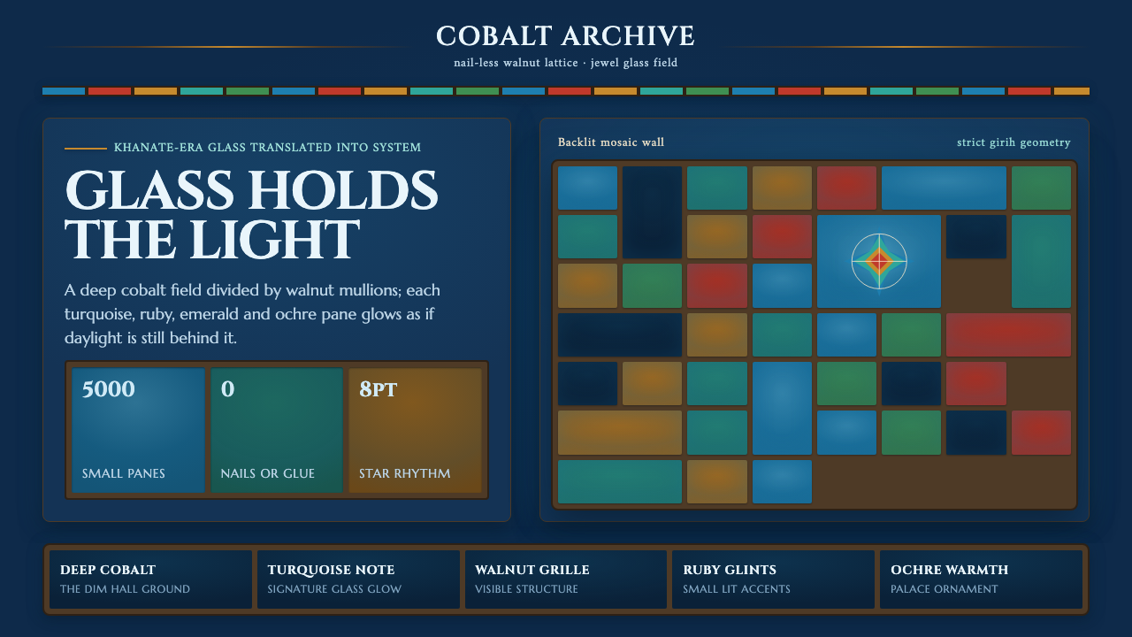
Sheki shebeke turns light into structure: jewel-colored glass held in dark walnut geometry, glowing like a precise mosaic inside a shadowed palace.舍基舍贝克把光变成结构:宝石色玻璃被深色胡桃木几何格栅托住,在幽暗宫殿中像一幅严整发光的马赛克。
Sheki Shebeke Stained Lattice in briefSheki Shebeke Stained Lattice 速览
Sheki shebeke, also known as shabaka, is the stained-lattice window craft associated with the Palace of the Shaki Khans in Sheki, Azerbaijan. Its defining image is not a painted pattern but a constructed one: many small pieces of colored glass are held inside a dark walnut grille, producing a luminous field of cobalt, turquoise, ruby, emerald, and ochre. The result is dense, geometric, and visibly handmade without becoming loose or rustic.舍基舍贝克,也常写作舍巴卡,是与阿塞拜疆舍基汗王宫相关的彩色玻璃格栅工艺。它的核心并非把纹样绘在表面,而是将大量小块彩色玻璃嵌入深色胡桃木格栅之中,形成钴蓝、绿松石、红宝石、翡翠绿与赭金交织的透光画面。它密集、几何、手工感鲜明,却绝不松散粗粝。
At the palace, some five thousand small panes of colored glass are set into walnut lattice assembled without nails or glue. That construction is central to the visual language. The wooden bars do not merely frame the glass; they give every colored cell a boundary, rhythm, and physical authority. Against dim interior halls, the panes appear illuminated from within, so color reads as captured daylight rather than surface decoration.在汗王宫中,约五千枚彩色玻璃小片被安置在不用钉子和胶水的胡桃木窗棂内。这样的构造本身就是视觉语言的一部分。木条不只是玻璃的边框,而是赋予每个色块边界、节律和实体感的骨架。面对幽暗的内殿,窗格仿佛从内部被点亮,色彩因此更像被捕获的日光,而不是涂在表面的装饰。
As an interface style, Sheki Shebeke Stained Lattice translates this backlit mosaic into a dark, highly ordered visual system. A deep cobalt glass field creates the surrounding darkness; turquoise acts as the signature note; ruby, emerald, and ochre arrive as smaller illuminated events. Fine walnut-toned lines divide the field into cells and evoke the strict geometry and Islamic star-like rhythm associated with Caucasian palace decoration.转化为界面风格后,舍基舍贝克花窗成为一套深色而高度有序的视觉系统:深钴蓝玻璃底面提供周围的暗场,绿松石承担标志性的主调,红宝石、翡翠绿与赭金作为较小的发光事件出现。细密的胡桃木色线条将画面切分为窗格,呼应南高加索伊斯兰宫殿装饰中严整的几何星形格律。

See the Sheki Shebeke Stained Lattice design system查看 Sheki Shebeke Stained Lattice 完整设计系统
Where does Sheki Shebeke Stained Lattice come from?Sheki Shebeke Stained Lattice 从何而来?
The craft belongs to the Khanate-period setting of eighteenth-century Sheki in the South Caucasus. Its most prominent surviving setting in the supplied material is the Palace of the Shaki Khans, dated approximately from 1762 to 1797. There, colored glass, dark walnut, and disciplined latticework are inseparable from the palace interior: the windows are designed to transform incoming light before it reaches the room.这门工艺属于十八世纪南高加索舍基的汗国时期语境。现有材料中最重要的实物场所是舍基汗王宫,年代约为1762至1797年。在这里,彩色玻璃、深色胡桃木与严谨格栅并非彼此独立的装饰;它们共同改变进入宫殿室内的光。
The Palace of the Shaki Khans gives shebeke its characteristic dramatic condition. Rather than presenting color on an open, neutral ground, the craft is experienced from a dim interior hall looking toward light. Cobalt and turquoise establish a cool, saturated atmosphere, while ruby, emerald, and ochre interrupt it as concentrated jewel tones. The dark grille ensures that the color never dissolves into a wash; every pane remains legible as part of a larger construction.舍基汗王宫赋予舍贝克最具戏剧性的观看条件。它不是把色彩陈列在开阔的中性底面上,而是让人从昏暗的内殿望向光源。钴蓝与绿松石建立冷冽、饱满的气氛,红宝石、翡翠绿与赭金则以集中的宝石色打断其中。深色木格使颜色不会融成一片光雾,每一块玻璃始终是整体结构中可辨认的一格。
Abbasgulu is identified as the palace architect in the source material and anchors the style in a specific architectural setting rather than an abstract decorative category. The supplied material also names Ashraf Rasulov and Tofig Rasulov as key figures associated with the theme. Together with the palace context, these names locate the visual system within a continuing craft identity, where patterned glass and walnut lattice are understood as joined elements rather than separate layers.材料将阿巴斯古鲁列为宫殿建筑师,使这一风格明确归属于具体建筑环境,而非抽象的装饰类别。阿什拉夫·拉苏洛夫与托菲格·拉苏洛夫也被列为与该主题相关的重要人物。连同宫殿本身,这些名字将视觉系统置于延续性的工艺身份之中:纹样玻璃与胡桃木格栅被视为彼此咬合的构件,而不是后期叠加的两个图层。
Its two named traditions are shebeke stained-lattice window craft and Caucasian Islamic palace decoration. That pairing matters for contemporary interpretation. The style should preserve both the intimacy of assembled small panes and the larger architectural order of the lattice. It is strongest when color, division, and light all appear mutually dependent, as they do in a window, rather than as independent decorative effects added after a layout is complete.该主题所列的两条传统是舍贝克彩色玻璃格栅工艺与高加索伊斯兰宫殿装饰。这种并置决定了当代转译应保留什么:既要有小块玻璃拼装而成的亲密感,也要有格栅统摄全局的建筑秩序。只有当色彩、分隔与光线彼此依存,如同一扇真正的花窗,这种风格才最有力量。
What defines the Sheki Shebeke Stained Lattice look?Sheki Shebeke Stained Lattice 的视觉特征是什么?
Backlit Jewel Color逆光宝石色
Color should look transmitted through glass, not brushed onto a flat surface. Deep cobalt establishes the principal field, turquoise provides the recognizable accent, and ruby, emerald, and ochre appear as selective panes of concentrated light. The palette works through contrast against darkness: a colored area should feel lit, contained, and precious rather than broadly washed across the composition.色彩应当像穿过玻璃透出来,而不是平铺在表面。深钴蓝构成主场,绿松石提供最具辨识度的强调,红宝石、翡翠绿与赭金则以少量、集中的发光窗格出现。色彩依靠与暗场的对照发挥作用:每一块颜色都应显得被光照亮、被结构收住,并带有珍贵感。
Walnut Lattice胡桃木格栅
Fine dark walnut bars are the style's governing structure. They divide color into intelligible cells and make the surface feel assembled rather than printed. The lattice should remain visible even where jewel tones are strongest, because its role is to hold visual tension between the glowing panes and the surrounding dark field.细密的深色胡桃木线条是这套风格的统摄结构。它将色彩分割成清晰的窗格,使画面像被组装而非被印刷。即使宝石色最强烈的区域,格栅也应保持可见,因为它负责在发光色块与周围暗场之间维持张力。
Strict Geometry严整几何
The composition follows a disciplined grid with the feeling of Islamic geometric star rhythm. Repetition is essential, but it should not become mechanical sameness. Small cells can vary in color and emphasis while the lattice preserves the larger order, allowing the whole composition to feel kaleidoscopic without losing control.构图应依附严谨网格,并带有伊斯兰几何星形节律的感受。重复不可或缺,但不应变成机械的同一。小窗格可以在色彩与强调上变化,而格栅必须维持更大的秩序,让整体如万花筒般丰富,却始终不失控制。
Dark Interior Field幽暗内殿底场
The dark background is not empty space; it recreates the dim interior from which the shebeke window is seen. It should feel cool, glass-like, and recessive, creating enough visual depth for luminous panes to emerge. A lighter ground weakens the central illusion because the style depends on the sensation that light is arriving through an opening.深色背景不是留空,而是重现观看舍贝克花窗时所在的幽暗内殿。它应当冷静、近似玻璃,并向后退,让发光窗格从中浮现。浅色底面会削弱核心幻觉,因为这种风格依赖于光正从一处开口穿入的感受。
Cellular Hierarchy窗格式层级
Information should be grouped as panes within a coherent grille. A prominent panel may glow in cobalt or turquoise, while secondary notes occupy quieter jewel cells or sit against the dark field. Hierarchy comes from containment, contrast, and placement, so individual elements appear related even when their content differs.信息应像同一窗棂中的不同玻璃格一样被组织。主要面板可以在钴蓝或绿松石中发亮,次要内容则置于较安静的宝石色小格,或停留在深色底场上。层级来自被框定的方式、对比与位置,因此即使内容不同,各元素仍显得彼此相关。
Crafted Precision工艺化精确
The no-nail, no-glue construction described for the palace should inform the visual attitude. Components ought to appear fitted together with care, with clean joins and deliberate boundaries. Avoid effects that make the interface feel liquid, inflated, or casually layered; this style is about light held securely inside a precise framework.宫殿花窗不用钉子与胶水的构造,应当影响整体的视觉态度。组件应显得经过细致咬合,连接清楚,边界有意为之。应避免让界面显得流动、膨胀或随意堆叠的效果;这套风格讲的是光被精确框架稳稳承接。

See the Sheki Shebeke Stained Lattice design system查看 Sheki Shebeke Stained Lattice 完整设计系统
Who shaped Sheki Shebeke Stained Lattice?谁塑造了 Sheki Shebeke Stained Lattice?
Abbasgulu is identified in the source material as the architect of the Palace of the Shaki Khans. His presence keeps the style tied to a palace-scale architectural setting, where lattice, colored glass, and interior light form one integrated experience rather than isolated ornaments.阿巴斯古鲁在材料中被列为舍基汗王宫的建筑师。他使这套风格始终关联于宫殿尺度的建筑语境:格栅、彩色玻璃与室内光线共同构成一个整体经验,而非彼此孤立的装饰。
Ashraf Rasulov is listed among the key figures for the Sheki Shebeke Stained Lattice theme. In this public account, the name helps situate the visual language within the named shebeke craft tradition, rather than reducing it to a generic jewel-tone pattern.阿什拉夫·拉苏洛夫被列为舍基舍贝克花窗主题的重要人物之一。在这份公共材料中,这个名字提示我们:该视觉语言属于被明确命名的舍贝克工艺传统,而不能被简化为泛泛的宝石色纹样。
Tofig Rasulov is also identified as a key figure in the supplied material. Alongside the palace and the named craft, this attribution reinforces the idea that shebeke is an authored, material practice whose visual effects arise from the relationship between glass, walnut lattice, and light.托菲格·拉苏洛夫同样被现有材料列为重要人物。与宫殿和被命名的工艺传统并置时,这一归属强调舍贝克是一种有作者、有材料性的实践:它的视觉效果来自玻璃、胡桃木格栅与光之间的关系。
How do you use Sheki Shebeke Stained Lattice today?今天怎么用 Sheki Shebeke Stained Lattice?
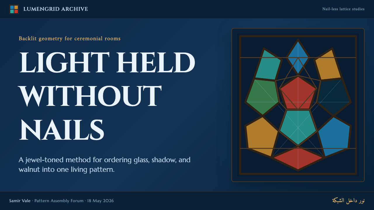
For presentation covers, treat the slide as a single backlit window. Let a dark cobalt field establish the atmosphere, then place the title within or beside a disciplined lattice zone. Turquoise can identify the principal idea, while a small ruby, emerald, or ochre pane provides a focused counterpoint. The cover should feel architectural and luminous, not like a dark background with scattered colorful decorations.用于演示文稿封面时,应将整页当作一扇逆光花窗。先以深钴蓝建立气氛,再让标题进入或贴近一个纪律明确的格栅区域。绿松石可标记核心概念,少量红宝石、翡翠绿或赭金窗格则提供聚焦的对照。封面应像一处发光的建筑构件,而不是深色背景上散落的彩色装饰。
For content and data slides, use the lattice as an information organizer. Group related statements, metrics, charts, or captions into pane-like regions separated by fine walnut lines. Data visuals should inherit the system's hierarchy: a selected series may glow as turquoise or cobalt glass, while supporting values recede into quieter cells. Keep the chart itself clean enough that the window logic supports reading instead of competing with it.用于内容页和数据页时,可把格栅视作信息组织器。相关论点、指标、图表与说明文字放入被细胡桃木线分隔的窗格区域。数据图形也应继承这种层级:被选中的系列可以像绿松石或钴蓝玻璃般发亮,辅助数值则退入更安静的格子。图表本身仍需足够干净,让花窗逻辑辅助阅读,而非与阅读争夺注意力。
For web interfaces, the style suits dashboards, analytical spaces, and pricing views that benefit from strong compartmentalization. A dark glass field can hold navigation, summaries, filters, and comparison panels as related cells. Make the signature turquoise reserved and purposeful, such as for the current state or key action, while other jewel colors distinguish meaningful categories rather than merely adding variety.用于网页界面时,这种风格适合需要强烈分区感的仪表板、分析工具与定价页面。深色玻璃底场可容纳导航、摘要、筛选和对比面板,使它们像彼此关联的窗格。绿松石应被保留给明确而有目的的场景,例如当前状态或关键操作;其他宝石色用于区分真正有意义的类别,而非单纯增加热闹感。
For editorial and marketing layouts, use a broad stained-glass panel as a scene-setting device and let the surrounding lattice guide pacing. Feature stories can pair dark text areas with glowing visual cells, while campaign pages can use jewel panes to frame benefits, proof points, or calls to action. The style is particularly effective when the message concerns craft, place, heritage, illumination, or carefully made systems.用于编辑与营销版面时,可用一块宽阔的彩窗面板建立场景,再让周围格栅引导阅读节奏。专题内容可以将深色文字区与发光视觉窗格并置,活动页面则可用宝石色格子框出卖点、凭证或行动号召。当信息涉及工艺、地域、传承、光线或精心构造的系统时,这种风格尤其有效。
The common mistake is to borrow the jewel palette while abandoning the lattice and the backlit condition. Unframed cobalt, turquoise, ruby, and emerald quickly become a generic luxury gradient language. Another mistake is making every cell equally bright. Shebeke works because dark structure contains selective light: preserve the walnut divisions, allow the deep field to remain present, and give only the most important panes their full glow.最常见的错误,是只借用宝石色色板,却放弃格栅和逆光条件。没有框定的钴蓝、绿松石、红宝石与翡翠绿,很快会沦为泛化的奢华渐变语言。另一个错误是让每一格都同样明亮。舍贝克之所以成立,是因为深色结构收住了选择性的光:保留胡桃木分隔,让深色底场真正存在,只让最重要的窗格获得完整光亮。
See the Sheki Shebeke Stained Lattice design system查看 Sheki Shebeke Stained Lattice 完整设计系统
Sheki Shebeke Stained Lattice — FAQSheki Shebeke Stained Lattice · 常见问题
Is Sheki shebeke simply stained glass?舍基舍贝克只是彩色玻璃吗?
No. Colored glass is essential, but the defining system is stained glass held inside a dark walnut lattice. The grille divides, supports, and orders every pane, while the dim interior and incoming light create the backlit effect. Remove the lattice and the style loses its most distinctive structural idea.不是。彩色玻璃固然重要,但决定性系统是被深色胡桃木格栅承托的彩色玻璃。格栅分隔、支撑并组织每一片玻璃,幽暗室内与进入的日光共同形成逆光效果。拿掉格栅,这种风格最独特的结构观念也就消失了。
Why does the style need such a dark surrounding field?为什么这种风格需要如此深的周围底场?
The dark field recalls the palace interior from which the windows are viewed. It makes cobalt, turquoise, ruby, emerald, and ochre appear transmitted by light rather than merely applied as color. A dark setting also gives the walnut lattice enough contrast to remain a visible structural presence.深色底场呼应了观看花窗时所在的宫殿内殿。它让钴蓝、绿松石、红宝石、翡翠绿与赭金看起来是被光线穿透,而不只是被涂上去的颜色。深色环境也让胡桃木格栅拥有足够对比,始终作为可见的结构存在。
Can all jewel colors be used prominently at once?所有宝石色都能同时大面积使用吗?
They can coexist, but not with equal visual force. The supplied system gives deep cobalt the role of field and turquoise the role of signature note, while ruby, emerald, and ochre work best as selected panes. If every color glows equally, the result loses the controlled kaleidoscopic quality of a structured window.它们可以共存,但不应拥有同等的视觉力度。现有系统将深钴蓝定位为底场,将绿松石定位为标志性主调,红宝石、翡翠绿与赭金最适合成为被选择出来的窗格。若每种颜色都同样强烈发光,整体就会失去结构花窗应有的受控万花筒感。
Which products benefit most from this style?哪些产品最适合这种风格?
It is especially effective for dashboards, analytical interfaces, presentation systems, editorial features, and heritage-oriented marketing where grouped information and a strong sense of atmosphere are useful. It is less suitable when the product needs an airy, neutral, or deliberately invisible visual language, because the lattice and jewel color create an unmistakably present identity.它尤其适合仪表板、分析型界面、演示系统、编辑专题,以及强调文化传承的营销内容,因为这些场景往往需要信息分组与鲜明氛围。若产品追求轻盈、中性或刻意隐身的视觉语言,它就不太合适;格栅与宝石色会形成非常明确的存在感。
Related design styles相关设计风格
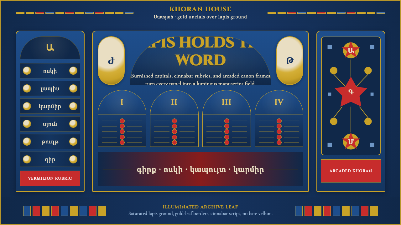 Armenian Manuscript FolkloreJewel-dense devotion. Lapis ground, gold uncials, and vermilion arcades fill…宝石般虔敬。青金石底、金色大写与朱砂拱廊填满画面。
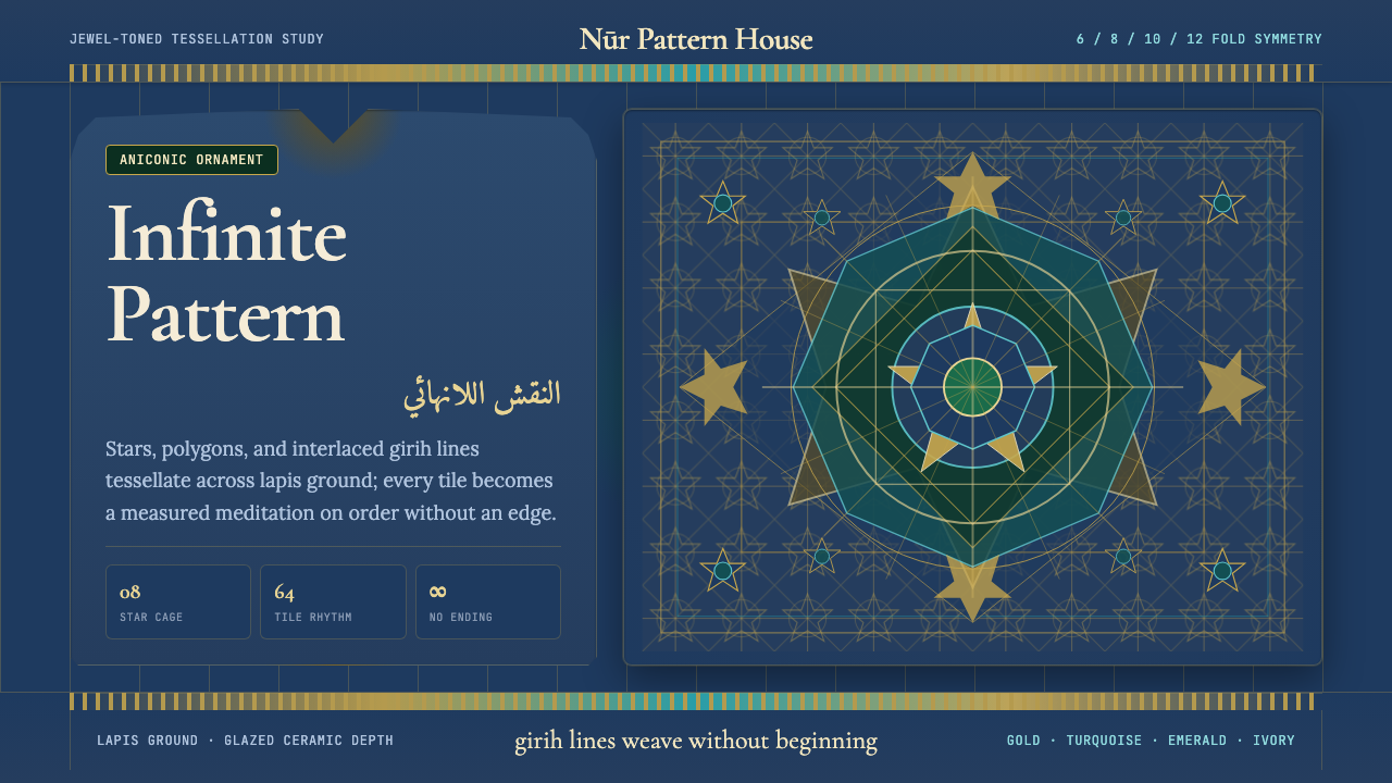 Islamic Geometric ArtInfinite order, fully tiled. Lapis ground with gold girih lines and turquoise…无限秩序,满幅铺陈。青金石底、金色girih线与绿松石星格。
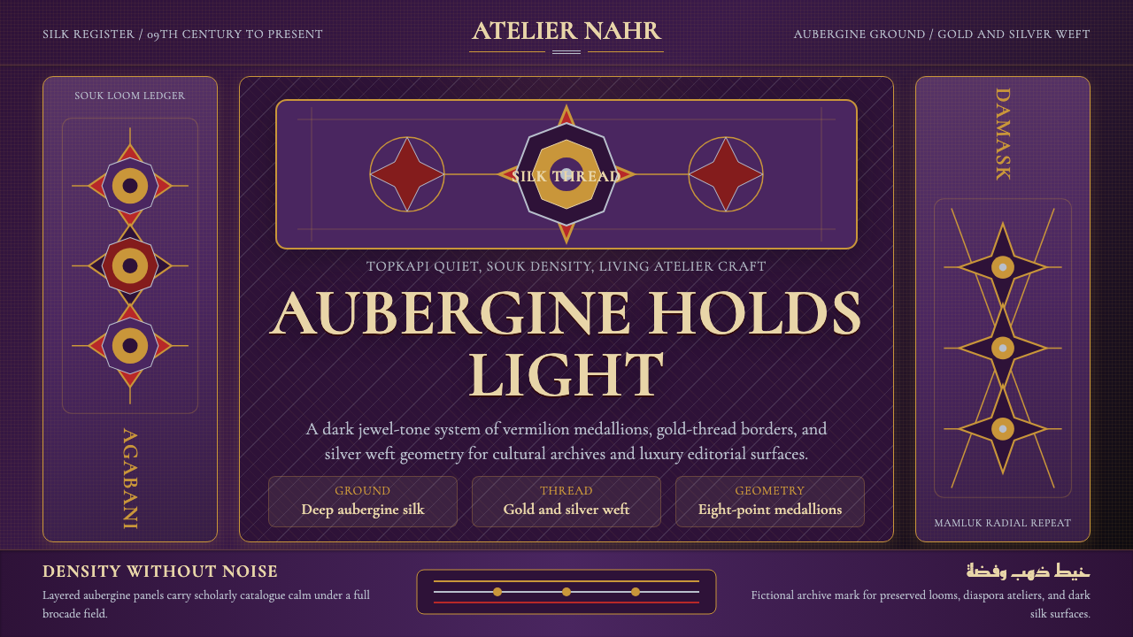 Syrian Damascene BrocadeDark silk shimmers. Aubergine ground, Cormorant SC, gold medallion grid.深色丝绸微光:茄紫底、Cormorant SC 与金色奖章网格。
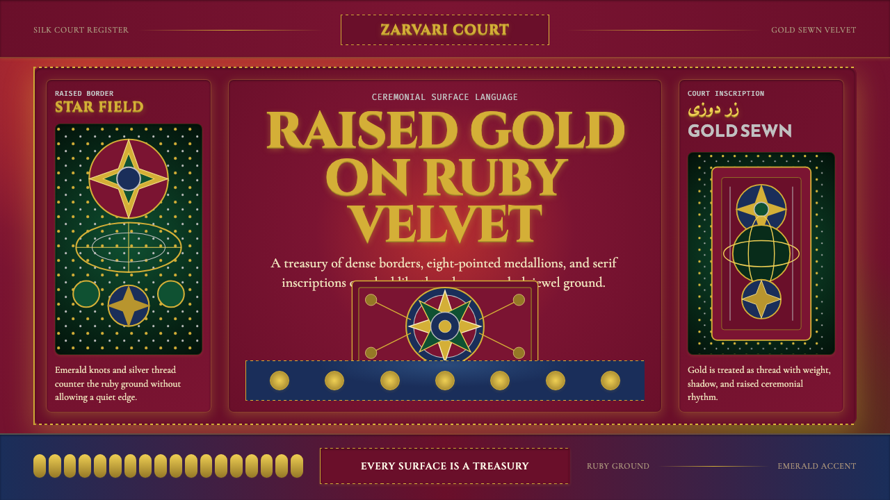 Uzbek Bukhara Gold ZardoziCourtly density. Ruby velvet, gold Cinzel type, and star medallions leave no…宫廷式密度。红宝石丝绒、金色Cinzel与星章拒绝留白。
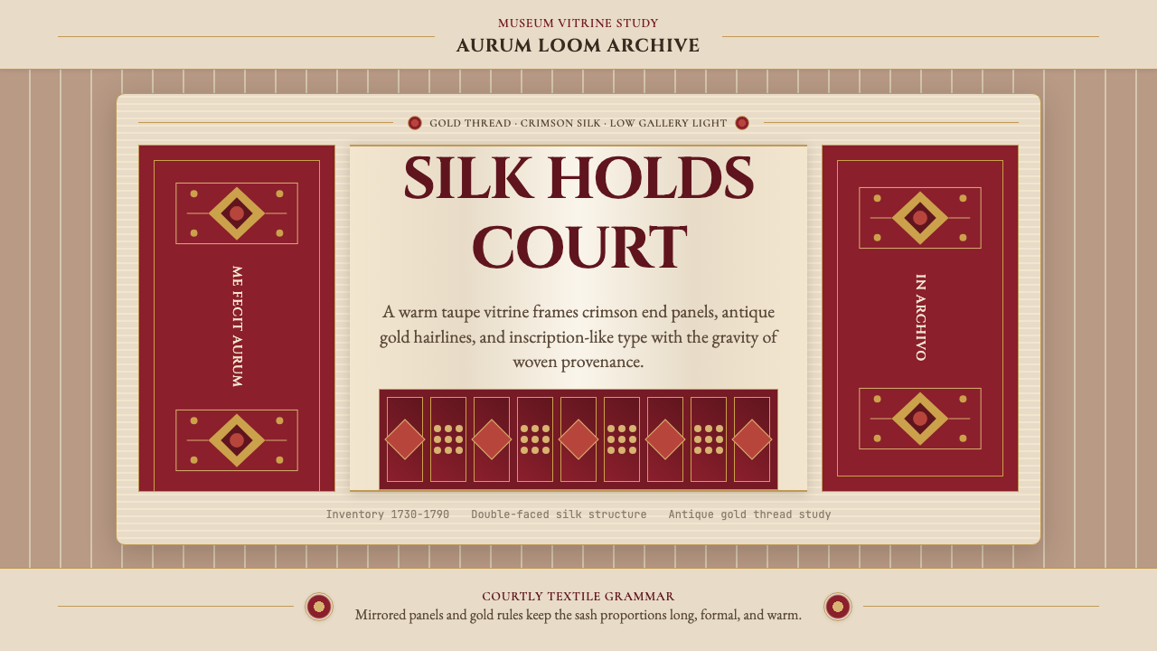 Belarusian Slutsk SashCourtly silk, vitrined. Taupe ground, crimson panels, Cinzel type, antique go…宫廷丝锦入展柜:赭褐底、深红端板、Cinzel 铭文与古金细线。
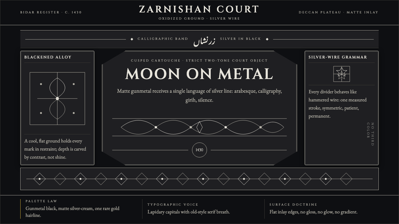 Bidri Deccan MetalworkCourtly darkness, tooled by silver. Cinzel caps and hairline arabesques cut g…宫廷般冷黑。Cinzel 大写与银色藤蔓线切入枪铁黑。