What is Jeff Koons?
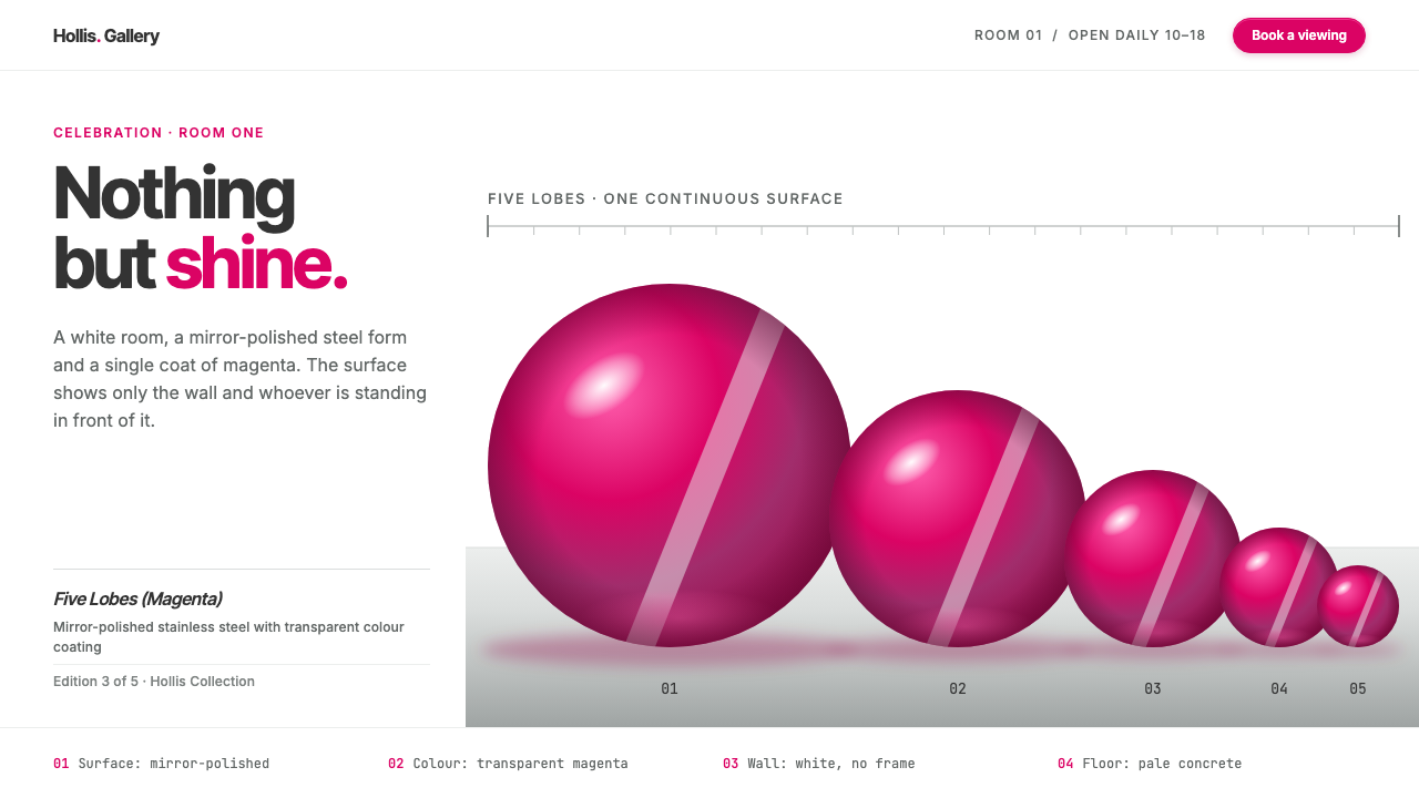
The Jeff Koons Balloon Dog style is one shine on one white wall: a mirror-finished magenta form, museum-label captions and an empty gallery around it.
Jeff Koons in brief
The Jeff Koons Balloon Dog style is a design language drawn from a single artwork: a party-store balloon twisted into a dog, then enlarged to more than three metres in mirror-polished stainless steel beneath a transparent magenta coat. The sculpture has no seams and no visible tool marks. All it does is reflect the white gallery around it and the person standing in front of it.
As a design system, it works in exactly the same way. A pure white page plays the part of the gallery wall. One saturated magenta plays the sculpture. Specular pinks and steel greys are used to model that colour like curved metal, with bright highlights and deep wine-coloured shadows suggesting volume. Type is set tight in Inter Tight, and supporting text is set in Inter in the format of a museum label.
The result is a look that is glossy but disciplined. It is about presence rather than ornament: one object, one colour, one clean space. It suits brands and projects that want to be seen as polished, confident and a little ironic, and it demonstrates how much impact a single saturated hue can have when it is surrounded by emptiness.

Where does Jeff Koons come from?
Jeff Koons is an American artist based in New York, and the Balloon Dog belongs to his Celebration series, which he began in 1994. The series is made up of large, glossy sculptures and paintings of party objects, and it took a long time to complete, with the Balloon Dog works produced between 1994 and 2000. There are five Balloon Dogs, one each in blue, magenta, yellow, orange and red, all made from mirror-polished stainless steel with a transparent colour coating.
The magenta Balloon Dog later entered the collection of François Pinault, the French collector, and it has been shown at the Palazzo Grassi in Venice and at the Palace of Versailles. Koons had already exhibited at Versailles in 2008, a moment that placed contemporary pop imagery inside one of the most ornate royal settings in Europe. The works have also had a high public profile in the market: a Christie's sale in 2013 was widely discussed. Collectors such as Eli Broad and Edythe Broad are among the names associated with Koons's work and its institutional reception.
Koons's art belongs to several overlapping labels. It is Neo-Pop, because it takes the language of popular culture and treats it with high seriousness. It is appropriation art, because the Balloon Dog is not invented but borrowed from an everyday object. And it is commodity art, because it asks what happens when something cheap and ephemeral is rendered in a costly, permanent material. His earlier work, such as the 1986 Rabbit in stainless steel, set the pattern: take an inflatable, make it heavy and shiny, and let the mirror do the talking.
That mirror finish is the key to why the work translates so well into design. A reflective surface is a surface that disappears and shows its surroundings, so the artwork's main visual effect is a field of colour whose edges melt into highlights. Designers can rebuild that logic with gradients that move from bright pink to deep wine, set on a white page with plenty of empty space. It is an unusually direct translation from sculpture to screen.
What defines the Jeff Koons look?
White Gallery Ground
The page is pure white, imitating the neutral walls of a gallery. It is not a background to be decorated but a space to be left empty, because the emptiness is what lets a single object feel important. Margins are generous, and elements are spaced far apart so that each one is seen on its own.
One Saturated Magenta
The system uses a single strong hue, a transparent-feeling magenta, as its hero colour. Everything else is neutral: white, dark grey and steel. The restriction is the point. When only one colour is allowed to be loud, it becomes the subject, and the page reads as a display case for it.
Mirror-Steel Gradients
Forms are modelled with specular pink highlights, mid-tone magenta and dark wine shadows, plus cool steel grey reflections at the edges. The gradients are curved and tightly controlled, imitating a polished convex surface. They should look like metal catching light rather than like a soft glow, so the highlights stay small and sharp.
Tight Inter Tight Headlines
Headlines are set in Inter Tight with reduced spacing between letters, which gives them a compact, confident, slightly commercial feel. The type is clean and neutral, a deliberate counterpart to the sculptural drama of the colour. It says that the object is the star and the text is only there to name it.
Museum-Label Captions
Supporting information is set in a small, plain text and arranged like an artwork label: title, year, material, and credit, one line each. This format brings a quiet institutional authority to the page, and it organises facts in a predictable order. It also adds humour, because a party balloon is being catalogued with the seriousness of a masterpiece.
Empty Floor and Clean Wall
Composition is minimal: one hero shape, often centred or placed with deliberate asymmetry, and a lot of untouched space. There are no borders, patterns or decorative textures. The emptiness works like a gallery floor, creating a sense that the viewer can walk around the object, and it allows reflections and soft floor shadows to feel believable.

Who shaped Jeff Koons?
The New York artist who began the Celebration series in 1994 and made the Balloon Dog in mirror-polished stainless steel, a leading figure of Neo-Pop and commodity art.
The French collector whose collection holds the magenta Balloon Dog, which has been shown in Venice at the Palazzo Grassi and at Versailles.
A collector and patron associated with Koons's work and its presence in major institutions.
A collector who, with Eli Broad, is among the names linked to the reception of Koons's sculptures.
How do you use Jeff Koons today?
On slides, the style is ideal for brand showcases, product reveals, art and design talks and any presentation that should feel like a gallery opening. A cover slide can show a single magenta form on a white field with the title in tight type and a museum-style caption underneath. Content slides should keep one idea per slide and leave the rest empty. For data, use dark grey type on white, and let one magenta bar or number carry the highlight.
In web interfaces, it suits portfolios, luxury and lifestyle brands, product pages for single hero items, and gallery or museum sites. A hero section with one glossy object, a short headline and a quiet label gives the page an immediate focal point. Buttons can use the magenta with subtle metallic gradients, while forms and navigation remain white and grey. Keep the layout spacious; crowding the page breaks the gallery illusion.
For editorial and marketing work, the style gives campaigns, exhibition posters, product launches and social cards a polished, ironic confidence. One reflective object, one colour and a caption in label form are enough. The tone should feel like an art world in-joke: serious on the surface, playful underneath, and always uncluttered.
The most common mistake is adding more colours. The system's power comes from one hue being loud against neutrals, and a second or third saturated colour turns the gallery into a party store. If extra colour is needed, use steel and grey tints derived from the reflections, not new hues.
A second mistake is making the gradients soft and foggy. Real mirror steel has crisp highlights and sharp transitions, and a blurry glow makes the object look like plastic or a lens flare. Keep the highlight small, the shadow dark and the edge clean. Finally, do not crowd the page with decoration; every added element weakens the single shine.

Jeff Koons — FAQ
What is the Jeff Koons Balloon Dog design style?
It is a gallery-minimal style drawn from Koons's mirror-polished sculpture: a pure white ground, one saturated magenta modelled with specular pink highlights and steel greys, tight Inter Tight headlines, and museum-label captions.
What is the Balloon Dog artwork?
It is part of Jeff Koons's Celebration series, begun in 1994: a party balloon twisted into a dog and enlarged to over three metres in mirror-polished stainless steel with a transparent colour coating. Five were made, in blue, magenta, yellow, orange and red.
Which art movements is Koons associated with?
His work is usually described as Neo-Pop, appropriation art and commodity art. It takes a humble everyday object, renders it in a luxurious permanent material, and asks viewers to reconsider the relationship between value, taste and popular culture.
Where does this style work best?
It suits brand showcases, portfolios, luxury or lifestyle product pages, gallery and museum sites, exhibition posters and design talks: anything that benefits from a single hero object, an empty space and a confident, slightly ironic tone.
What is the biggest mistake when using it?
Adding more colours or crowding the page. The style works because a single magenta is loud against neutrals and the surrounding space is empty. Extra hues, soft foggy gradients or decorative elements weaken the one shine the design is built around.
Related design styles
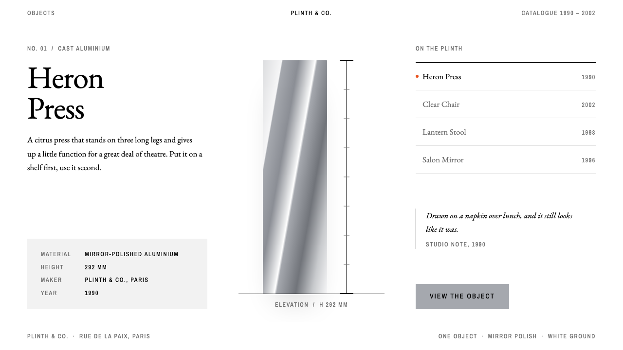 Philippe StarckOne object, room on every side. Mirror-aluminium grey, Garamond titles, one o…
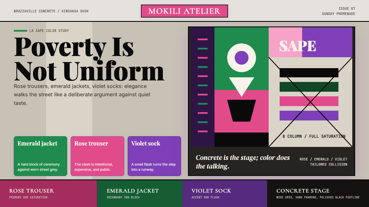 Congolese Sapeur (Kinshasa Suit)Defiant elegance. Rose, emerald, and violet clash on concrete in an asymmetri…
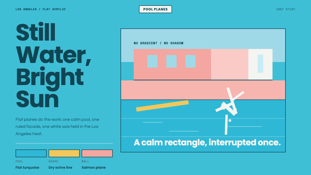 Hockney Pool BlueSerenity turns graphic. Turquoise planes, salmon edges, one white splash.
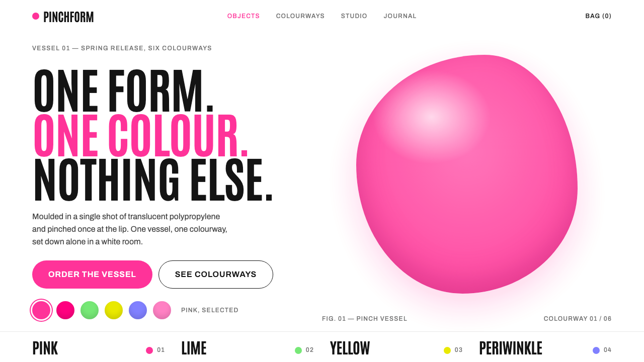 Karim RashidOne candy-coloured blob alone in a white room. Hot pink against tall condense…
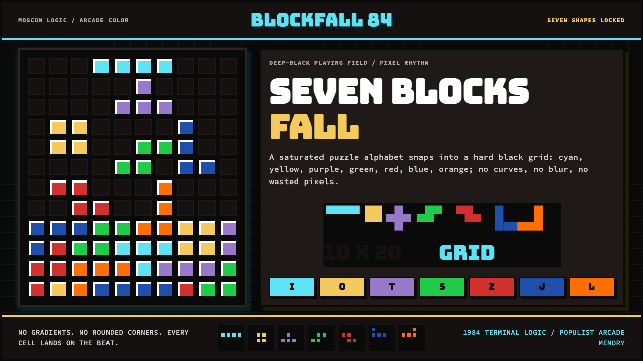 Tetris (1984)Arcade gravity, pixel exact. Black grid, Bungee type, seven saturated blocks.
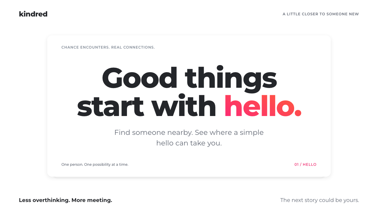 TinderConnection, made simple. White card layers, bold Montserrat, one pink-to-oran…