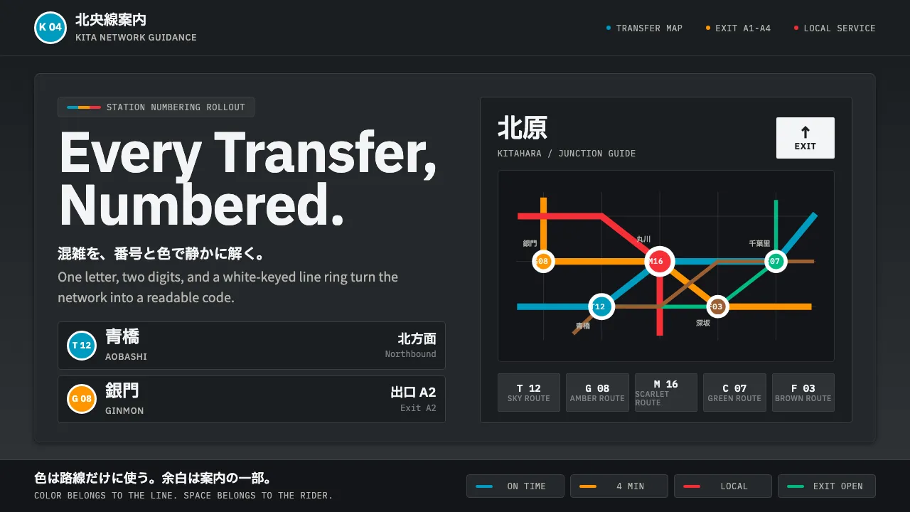
About Tokyo Metro Signage
Tokyo Metro Signage is the wayfinding grammar of the world's busiest subway, unified by the 2004 station-numbering rollout. Its world is the dark charcoal illuminated sign panel, carrying white-keyed colored rings — one Latin letter and number per line — and crisp bilingual type stacked kanji over romaji.
The mood is systematic, dense, and calm. A strict modular grid, generous negative space, and signal-clear pictograms tame the network's chaos. There is no ornament: every form is a code. Color belongs to the lines — Tozai blue, Ginza orange, Marunouchi scarlet — and nothing is colored for decoration.
- Origin
- Tokyo, Japan, East Asia
- Era
- 1990–2010 (2004 station-numbering rollout)
- Key figures
- Tokyo Metro design office · Adrian Frutiger · Shin Go type team
- Movements
- International Typographic Style · Systematic transit wayfinding
Tokyo Metro Signage design spec
Colors
Typography
The other 11 sections — buttons, cards, spacing, motion, techniques and more — open once you unlock. Download the DESIGN.md or send it to your AI in one click. Unlock once, yours forever.
Sign up nowStyles similar to Tokyo Metro Signage
Also inspired by architecture & places, with a close feel.
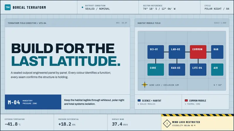 Arctic Terraform StationEvery colour carries a duty. Sky-blue panels, coded modules and hard seams enforce polar order.
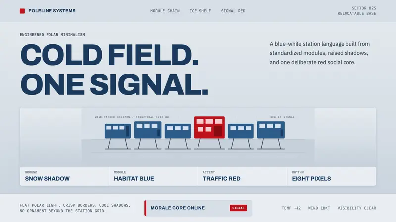 Antarctic StationCold precision, one red signal. Archivo modules ride a blue-white horizon grid.
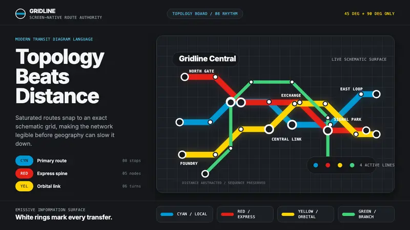 Transit Diagram (modern)Topology over geography. Cyan, red and yellow routes lock to 45-degree angles on black.
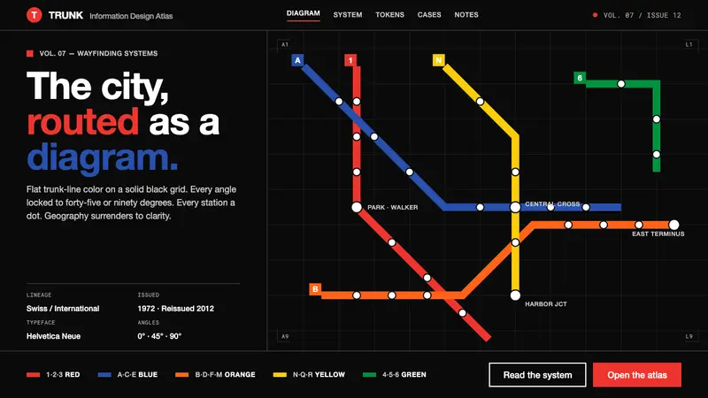 NYC Subway Vignelli (1972)The city as a circuit diagram. Flat trunk-line color on black, angles locked to 45° and 90°.