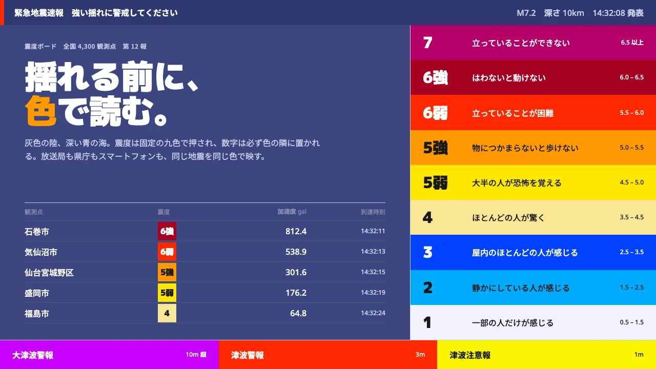
About JMA Shindo Map
Japan's shindo distribution map is read by millions of people in the seconds before the shaking arrives. Grey landmass, deep blue sea, intensity stamped on in patches from 震度1 to 震度7 — every colour fixed by the agency's own guideline so that a national broadcaster, a prefectural office and a phone app render the same event identically.
Nothing here is a stylistic choice. The numeral always sits beside the swatch, label text flips white or near-black per the table, and panels are rectangles pinned to the screen edge. Authority comes from each colour doing exactly one job.
- Origin
- Japan — nationwide, from the JMA site to NHK and commercial broadcast captions
- Era
- 1990s–2020 (shindo colour table revised July 2020; 1996 scale split into 5弱/5強/6弱/6強)
- Key figures
- Japan Meteorological Agency (気象庁) · NHK broadcast-unified warning graphics standard
- Movements
- government warning cartography · earthquake early warning (緊急地震速報) television graphics · public-safety information design
JMA Shindo Map design spec
Colors
Typography
The other 11 sections — buttons, cards, spacing, motion, techniques and more — open once you unlock. Download the DESIGN.md or send it to your AI in one click. Unlock once, yours forever.
Sign up nowStyles similar to JMA Shindo Map
Also inspired by science & nature, with a close feel.
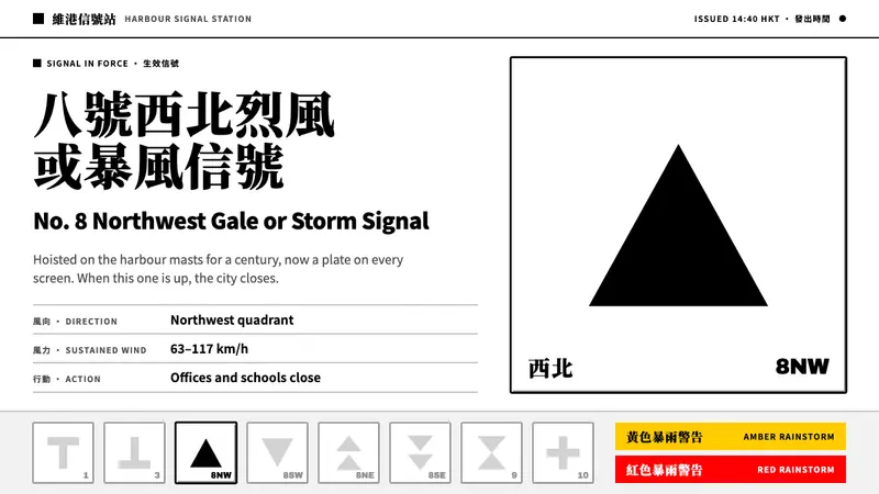 HK Typhoon SignalsOne signal, one verdict. Solid black glyphs on white bevelled plates, the rest of the ladder grey.
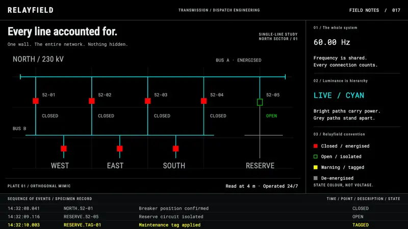 SCADA Grid WallboardColour is state, not decoration. Cyan buses and red closed breakers cut through pure black.
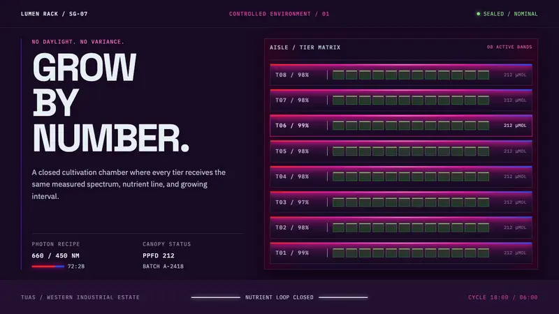 Vertical Farm TowerFood production without daylight. Magenta LED tiers cut through a near-black machine grid.
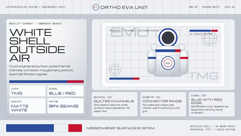 NASA EMU SpacesuitEngineered white, never warm. Quilt seams, blue ID stripes and worm red mark the shell.