About Tinder
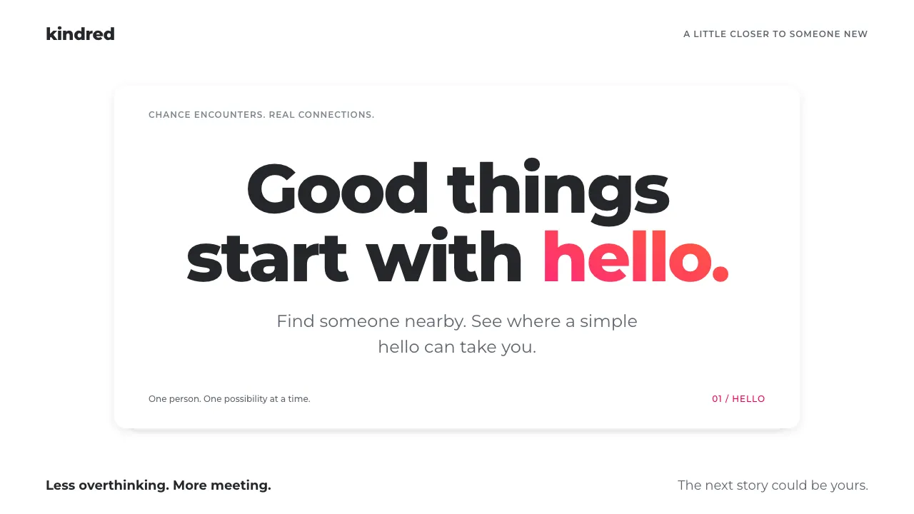
Tinder came out of Hatch Labs in Los Angeles in September 2012 and reduced dating to one gesture: swipe right to like, left to pass. The screen is a stack of full-bleed photo cards on plain white, each with a name and age set in bold white over a dark gradient.
The 2017 redesign dropped the wordmark and kept the flame, filled with a pink-to-orange gradient. That gradient is used sparingly, on the logo, the action buttons and the "It's a Match!" screen. Everywhere else the photographs carry the page.
- Origin
- West Hollywood / Los Angeles, USA
- Era
- 2012 launched; swipe deck signature 2013; gradient flame identity 2017–present
- Key figures
- Sean Rad · Justin Mateen · Jonathan Badeen
- Movements
- Gesture-first mobile interfaces · 2010s card-stack UI · Location-based mobile dating
Tinder design spec
Colors
Background
Surface
Primary
Secondary
Accent
Text
Typography
MontserratHeadings
JetBrains MonoMono
Unlock for 1 credit
The other 11 sections — buttons, cards, spacing, motion, techniques and more — open once you unlock. Download the DESIGN.md or send it to your AI in one click. Unlock once, yours forever.
Sign up nowHave an account? Sign in
Styles similar to Tinder
Also inspired by brands & products, with a close feel.
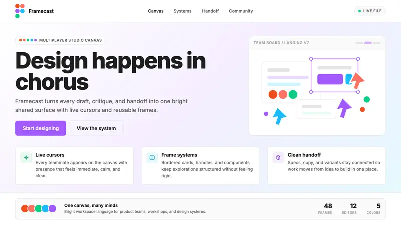 Figma 2024A brand that looks like its canvas. Five dots scatter like cursors, soft cards, purple pill CTAs.
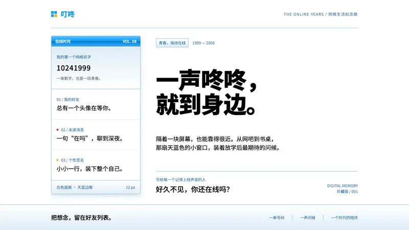 Tencent QQFriendship in a little blue frame. Glossy sky-blue chrome, white panes, tiny red signals.
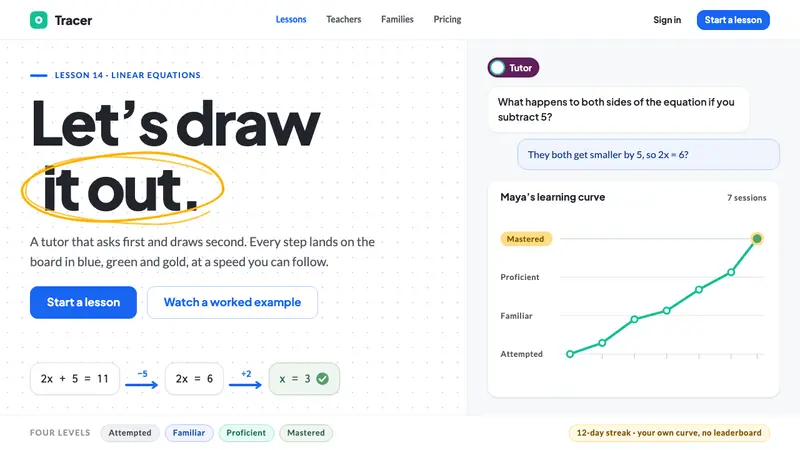 AI Tutor ClassroomA tutor that draws before it talks. White board, blue and gold marker strokes, one eggplant chip.
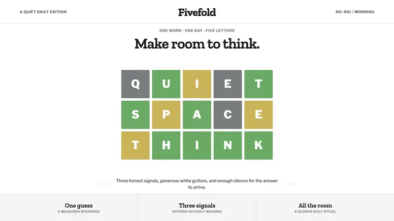 Wordle (2021)Quiet becomes addictive. Olive green, dusty gold, and gray score a strict grid on cool white.