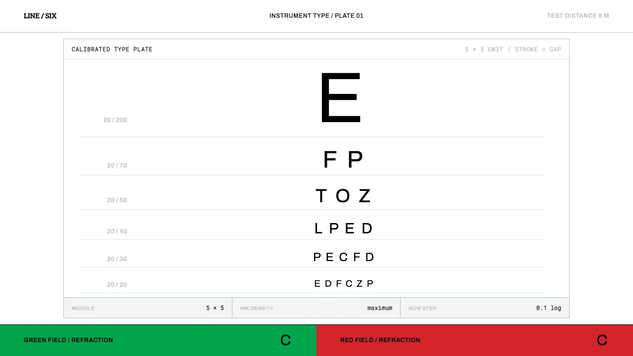
About Snellen Eye Chart
Herman Snellen published his chart in Utrecht in 1862 and, without meaning to, wrote one of the strictest type specifications in history. Each optotype sits on a 5×5 grid where stroke width equals the white gap and both equal one fifth of the letter height. At six metres the 20/20 line stands 8.73 mm tall and every stroke subtends exactly one arcminute.
Nothing on the chart is decoration. The white between the rows is measured space, the surface holds a luminance spec, and the letters come from a closed set of nine. Design in this system means treating layout as instrumentation: black ink, white card, and numbers you could check with a ruler.
- Origin
- Utrecht, Netherlands — then global clinical practice
- Era
- 1862 first published in Utrecht; letterforms standardised 1868–1959; BS 4274-1 revision 2003
- Key figures
- Herman Snellen · John Green · Louise Sloan
- Movements
- Clinical ophthalmology · Egyptian slab display typography · Standardised visual-acuity measurement
Snellen Eye Chart design spec
Colors
Typography
The other 11 sections — buttons, cards, spacing, motion, techniques and more — open once you unlock. Download the DESIGN.md or send it to your AI in one click. Unlock once, yours forever.
Sign up nowStyles similar to Snellen Eye Chart
Also inspired by print & type, with a close feel.
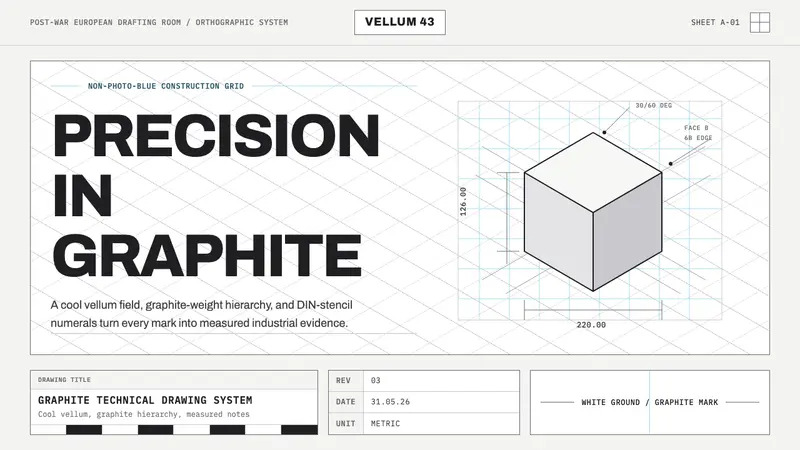 Graphite Technical DrawingDrafting-room precision. Non-photo-blue grid and graphite DIN lettering do the work.
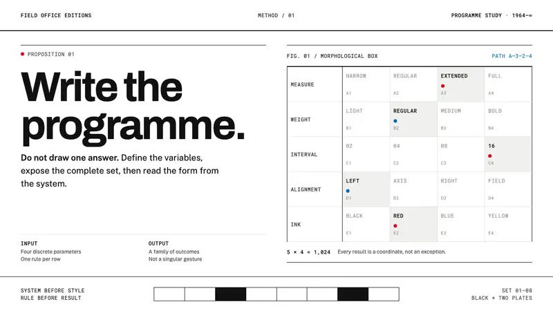 Karl Gerstner ProgrammesDesign becomes a programme. Black hairlines and a strict matrix turn parameters into form.
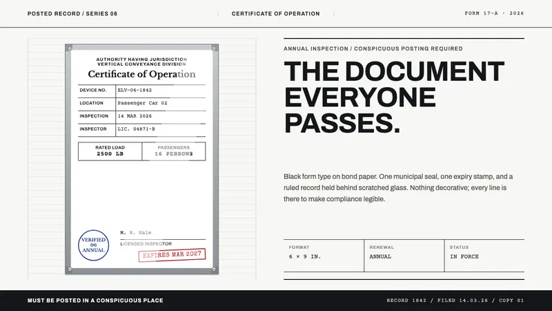 Elevator CertificateCompliance made visible. Black ruled type, aluminium framing, one blue seal and one red stamp.
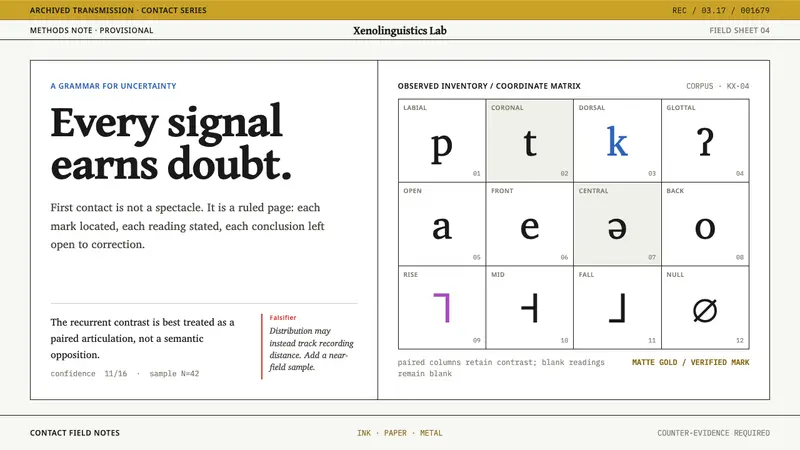 Xenolinguistics LabEvidence before spectacle. IPA-style ruled cells and a red falsification margin hold every signal.