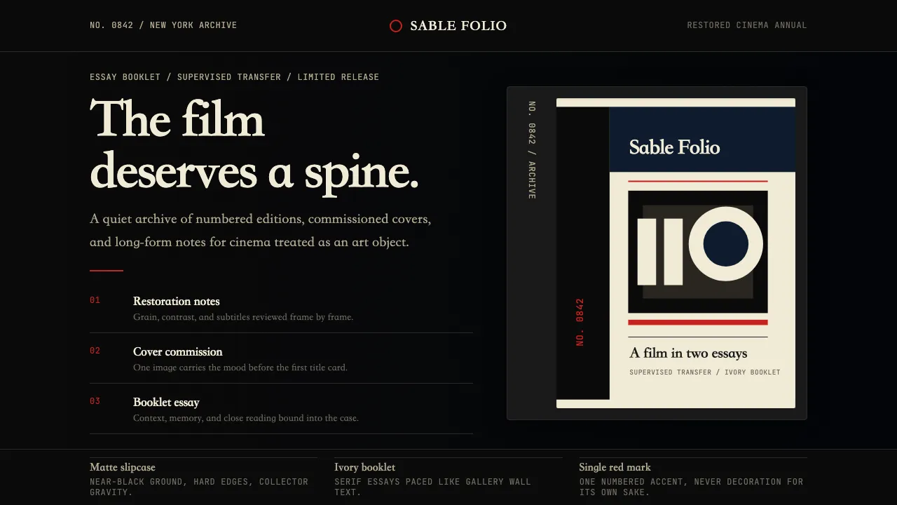
About Criterion Collection
The Criterion Collection is the gold standard of prestige home video — every release numbered, every cover commissioned, every transfer supervised. Since 1984, its matte-black slipcases and Mrs. Eaves serif typography have signaled cinephile seriousness: museum-grade care applied to cinema as art object. The visual system is restrained, dark, and deeply editorial — ivory cream type on near-black, a single red accent used sparingly, and illustration-first covers that treat each film as a gallery piece.
- Origin
- New York City, United States
- Era
- 1984 founded; current visual identity ~2010–present
- Key figures
- Robert Stein · Peter Becker · Eric Skillman · Sarah Habibi
- Movements
- Arthouse home-video · Collector-cinema tradition · Archive/restoration culture
Criterion Collection design spec
Colors
Background
Surface
Primary
Secondary
Accent
Text
Typography
Mrs. EavesHeadings
JetBrains MonoMono
Unlock for 1 credit
The other 11 sections — buttons, cards, spacing, motion, techniques and more — open once you unlock. Download the DESIGN.md or send it to your AI in one click. Unlock once, yours forever.
Sign up nowHave an account? Sign in
Styles similar to Criterion Collection
Also inspired by brands & products, with a close feel.
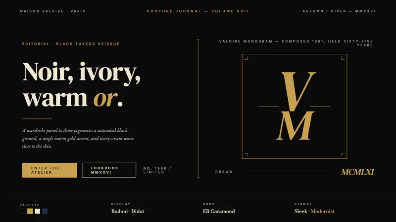 Yves Saint Laurent (YSL)Couture chiaroscuro. Saturated black ground, warm gold accent, Didot serif at billboard scale.
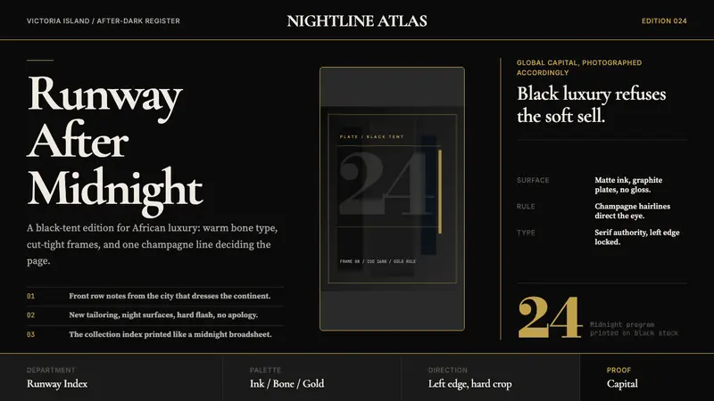 Lagos Fashion WeekBlack luxury speaks plainly. Matte ink, bone serif, and one gold hairline set the pace.
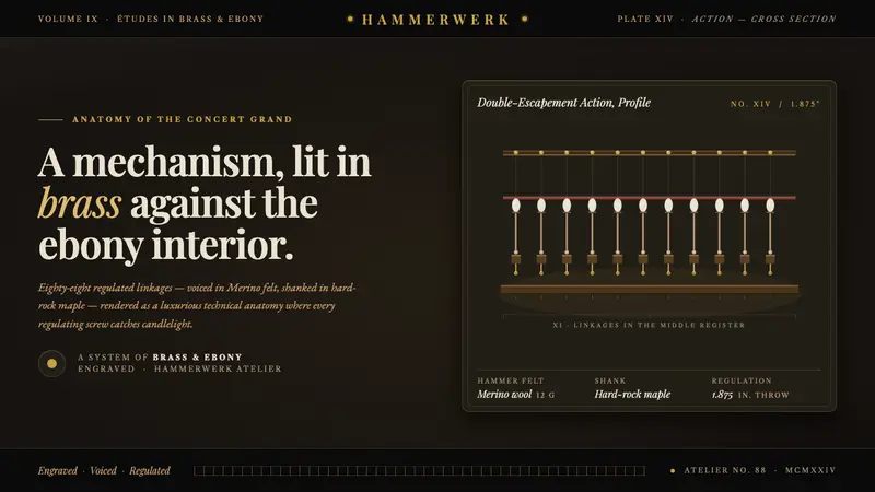 Grand Piano ActionMechanism as luxury. Brass screws and felt hammers lit out of ebony gloom, set in Playfair serif.
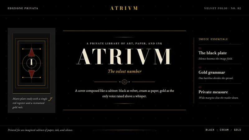 FMR (Franco Maria Ricci)Opulence held in silence. Velvet black, Bodoni serifs, and warm gold hairlines.