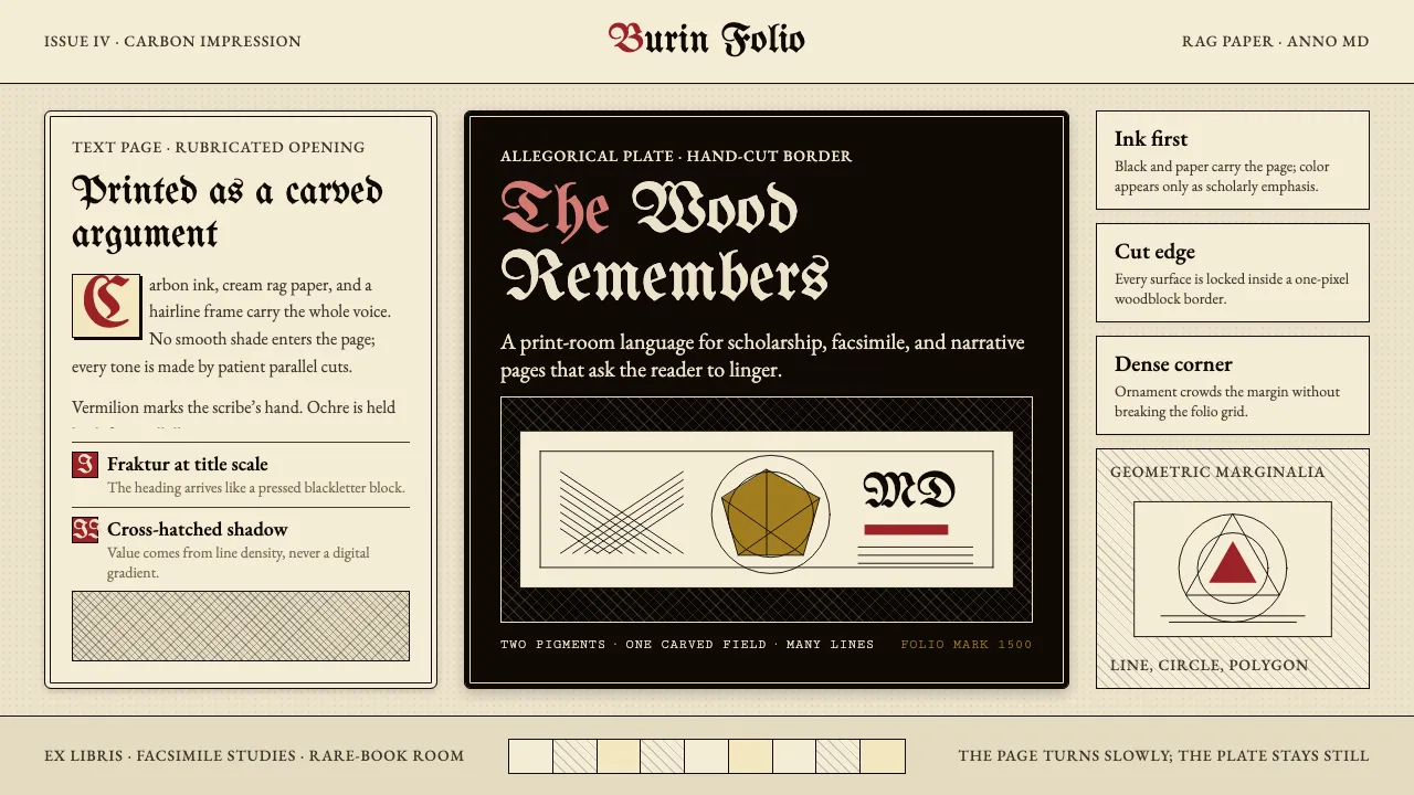
About Dürer Woodcut
Between 1498 and 1514 Albrecht Dürer pushed the woodblock further than anyone before — cross-hatching so dense it approached the tonal range of copperplate engraving. Carbon-black ink on cream rag paper; Schwabacher blackletter on the text page; allegorical objects crowding every corner: compass, hourglass, polyhedron, skull.
This system carries that discipline into screen work. Two pigments (ink and paper) do most of the labour, with vermilion rubrication and gold-ochre illumination reserved for emphasis. Every tone is built from parallel lines, every edge is a hand-cut hairline, every heading is set in Fraktur. The wood remembers everything.
- Origin
- Nuremberg, Germany; Venice sojourns 1494–95 and 1505–07
- Era
- 1490–1528 (Dürer's working life); peak 1498 Apocalypse through 1514 Melencolia I
- Key figures
- Albrecht Dürer · Hans Holbein the Younger · Hans Baldung Grien · Anton Koberger
- Movements
- Northern Renaissance · German woodcut tradition · early printed-book revolution
Dürer Woodcut design spec
Colors
Typography
The other 11 sections — buttons, cards, spacing, motion, techniques and more — open once you unlock. Download the DESIGN.md or send it to your AI in one click. Unlock once, yours forever.
Sign up nowStyles similar to Dürer Woodcut
Also inspired by art & artists, with a close feel.
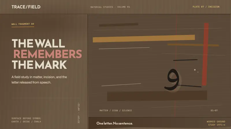 Hurufiyya MovementThe wall carries the meaning. Ochre scars and one off-axis letter break a field of dark earth.
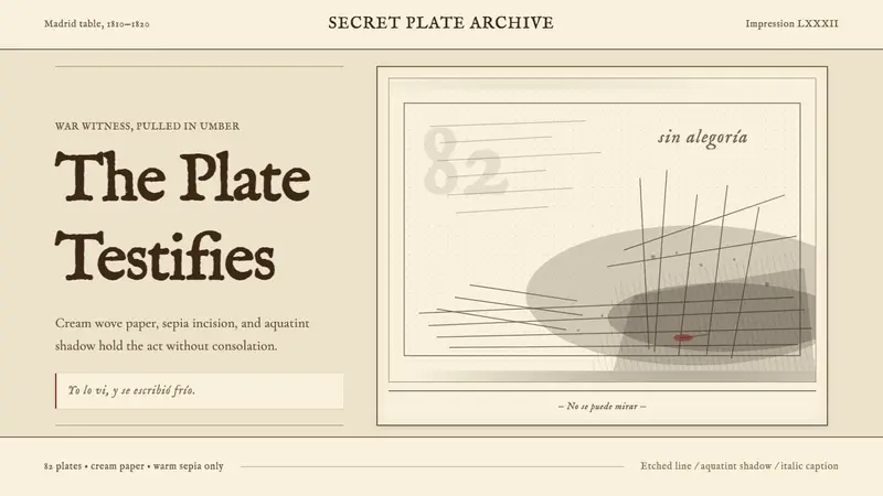 Goya — Disasters of WarWitness without ornament. Cream paper, umber line, aquatint shadow, italic caption.
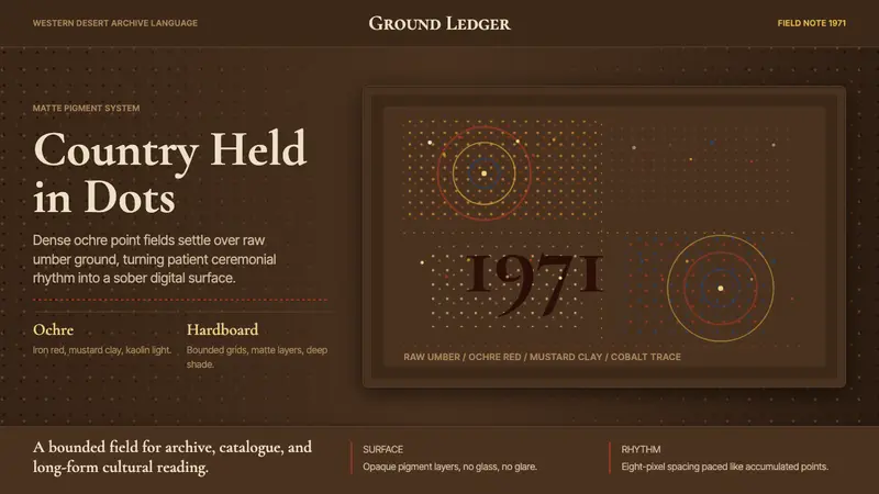 Aboriginal Dot Painting (Papunya 1971)Ochre memory, held steady. Raw umber ground, Cormorant type, disciplined dot-fields.
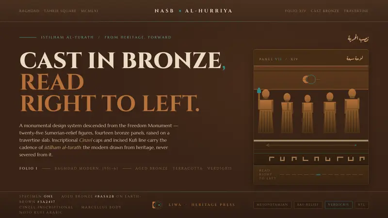 Jewad Selim Baghdad ModernCast in bronze, read right to left. Aged-bronze grounds, incised Kufi line, verdigris accents.