招牌配方
Kraft-Paper Background Grain
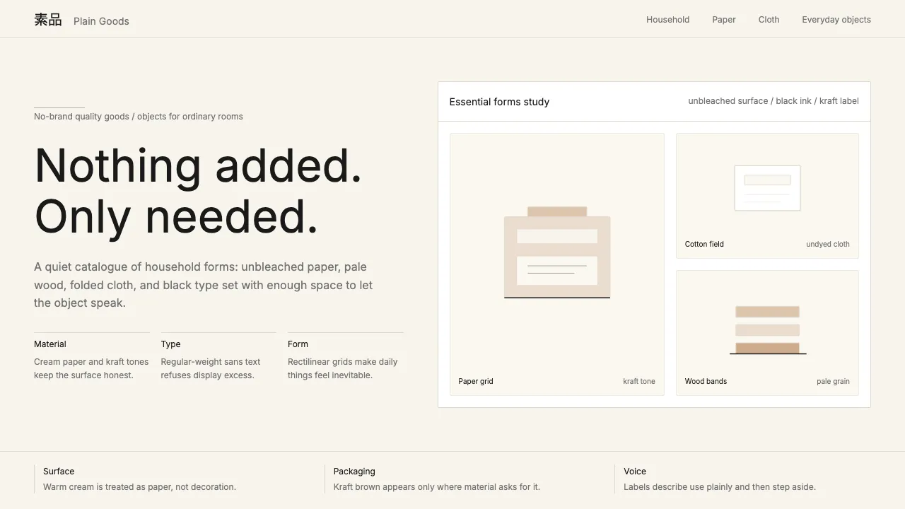
MUJI's signature material quality comes from a subtle kraft-paper texture overlaid on the warm cream background. This creates the tactile impression of recycled paper packaging — the brand's most recognizable material.
.muji-surface {
background-color: #F8F4ED;
position: relative;
}
.muji-surface::after {
content: '';
position: absolute;
inset: 0;
background-image: url("data:image/svg+xml,%3Csvg width='200' height='200' xmlns='http://www.w3.org/2000/svg'%3E%3Cfilter id='n'%3E%3CfeTurbulence type='fractalNoise' baseFrequency='0.65' numOctaves='4' stitchTiles='stitch'/%3E%3C/filter%3E%3Crect width='100%25' height='100%25' filter='url(%23n)' opacity='0.03'/%3E%3C/svg%3E");
pointer-events: none;
mix-blend-mode: multiply;
}
Underline-Only Input Field
MUJI's form inputs strip away the conventional bordered rectangle, leaving only a bottom border — an editorial, Japanese-print-inspired approach that treats the input as a line on a page rather than a box.
.muji-input {
width: 100%;
padding: 8px 0;
border: none;
border-bottom: 1px solid #e0d8cc;
background: transparent;
color: #1A1A1A;
font-family: 'Inter', 'Hiragino Sans', sans-serif;
font-size: 0.875rem;
line-height: 1.6;
outline: none;
transition: border-color 200ms ease;
border-radius: 0;
-webkit-appearance: none;
}
.muji-input:focus {
border-bottom-color: #1A1A1A;
}
.muji-input::placeholder {
color: #999999;
}
Regular-Weight Heading
MUJI's anti-display typography technique: headings at regular weight (400) rather than bold, creating a quiet, editorial hierarchy that refuses to shout. The heading distinguishes itself through size and spacing alone, not weight.
.muji-heading {
font-family: 'Inter', 'Hiragino Sans', sans-serif;
font-weight: 400;
color: #1A1A1A;
letter-spacing: 0;
line-height: 1.25;
margin-bottom: 1em;
}
.muji-heading--xl { font-size: 3rem; line-height: 1.1; }
.muji-heading--lg { font-size: 2rem; line-height: 1.15; }
.muji-heading--md { font-size: 1.5rem; }
.muji-heading--sm { font-size: 1.125rem; }