招牌配方
Multi-cursor dot accents
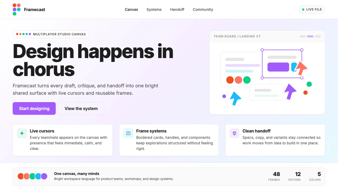
Floating colored dots positioned absolutely near hero text or images, mimicking the look of multiplayer cursors on a shared canvas. Each dot uses one of the five brand colors.
.cursor-dot {
position: absolute;
width: 12px;
height: 12px;
border-radius: 50%;
pointer-events: none;
animation: cursor-float 6s ease-in-out infinite;
}
.cursor-dot--red { background: #F24E1E; }
.cursor-dot--orange { background: #FF7262; }
.cursor-dot--green { background: #0ACF83; }
.cursor-dot--blue { background: #1ABCFE; }
.cursor-dot--purple { background: #A259FF; }
@keyframes cursor-float {
0%, 100% { transform: translate(0, 0); }
25% { transform: translate(8px, -6px); }
50% { transform: translate(-4px, 4px); }
75% { transform: translate(6px, 8px); }
}
Frame-within-frame cards
Cards styled to look like Figma selection frames — thin borders, a small "frame label" tag in the top-left corner, and selection-handle dots at corners on hover.
.frame-card {
position: relative;
background: #FFFFFF;
border: 1px solid #E5E5E5;
border-radius: 10px;
padding: 24px;
transition: box-shadow 200ms ease, transform 200ms ease;
}
.frame-card:hover {
box-shadow: 0 4px 8px rgba(0,0,0,0.08);
transform: translateY(-1px);
}
.frame-card::before {
content: attr(data-label);
position: absolute;
top: -10px;
left: 12px;
font-size: 11px;
font-weight: 500;
color: #A259FF;
background: #FFFFFF;
padding: 0 4px;
letter-spacing: 0.02em;
}
Purple-glow focus ring
A distinctive focus state using Figma purple with a soft outer glow, consistent across all interactive elements.
.interactive:focus-visible {
outline: none;
box-shadow: 0 0 0 2px #FFFFFF, 0 0 0 4px #A259FF, 0 0 0 6px rgba(162,89,255,0.15);
border-radius: inherit;
}