招牌配方
Primary-color block accent
A full-width section break using a saturated primary color as background, inverting text to white or cream. Used to punctuate page rhythm with bold Bauhaus energy.
.block-accent {
background-color: #d50000;
color: #f4ecd8;
padding: 64px 0;
text-transform: lowercase;
letter-spacing: 0.08em;
font-family: 'Josefin Sans', sans-serif;
font-weight: 700;
}
Hard-offset shadow press
Interactive elements use a hard shadow that compresses on hover/active, creating a tactile "press" without any blur or soft gradient. The element translates toward its shadow.
.shadow-press {
box-shadow: 4px 4px 0 #1a1610;
transition: box-shadow 100ms ease-out, transform 100ms ease-out;
}
.shadow-press:hover {
box-shadow: 2px 2px 0 #1a1610;
transform: translate(2px, 2px);
}
.shadow-press:active {
box-shadow: 0 0 0 #1a1610;
transform: translate(4px, 4px);
}
Geometric shape badge
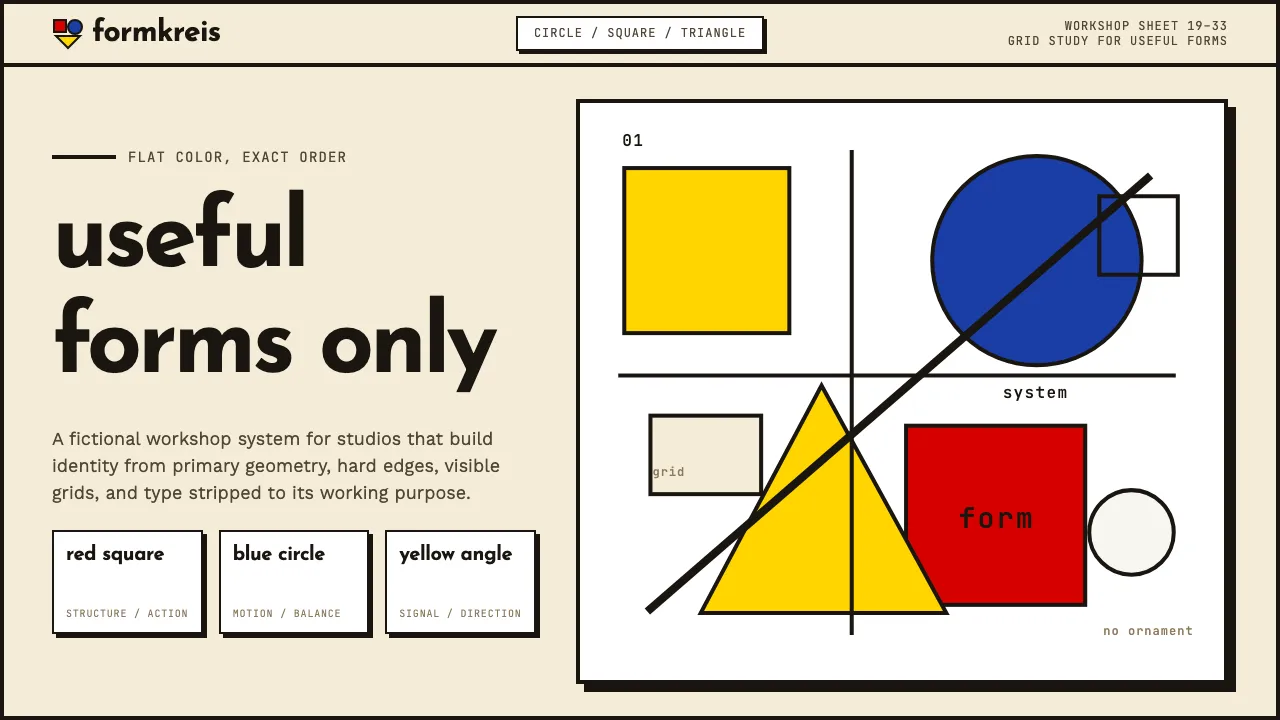
A decorative element using Kandinsky's color-shape associations: yellow triangle, red square, blue circle — used as tags, status badges, or section markers.
.badge-circle {
width: 32px;
height: 32px;
border-radius: 9999px;
background-color: #1a3da6;
border: 2px solid #1a1610;
}
.badge-square {
width: 32px;
height: 32px;
border-radius: 0;
background-color: #d50000;
border: 2px solid #1a1610;
}
.badge-triangle {
width: 0;
height: 0;
border-left: 16px solid transparent;
border-right: 16px solid transparent;
border-bottom: 28px solid #ffd500;
}