招牌配方
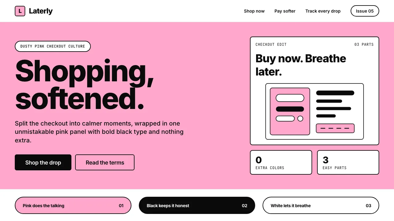
Full-bleed pink hero panel
Klarna's signature layout move: a full-width solid pink panel that anchors the page and contains the primary headline and CTA. No gradient, no texture, no image overlay — just #FFA8CD edge to edge.
.hero-panel {
background-color: #FFA8CD;
width: 100%;
padding: 96px 0;
display: flex;
align-items: center;
justify-content: center;
}
.hero-panel h1 {
color: #0A0A0A;
font-family: 'Inter', sans-serif;
font-weight: 800;
font-size: clamp(2.5rem, 6vw, 6rem);
letter-spacing: -0.03em;
text-align: center;
max-width: 900px;
}
Black ghost button with pink fill hover
The secondary CTA pattern — a bold black-bordered button that floods with pink on hover, creating a satisfying two-step visual hierarchy alongside the primary pink-filled button.
.btn-ghost {
background: transparent;
color: #0A0A0A;
border: 2px solid #0A0A0A;
border-radius: 6px;
padding: 12px 24px;
font-family: 'Inter', sans-serif;
font-weight: 600;
font-size: 1rem;
cursor: pointer;
transition: all 200ms cubic-bezier(0.4, 0, 0.2, 1);
}
.btn-ghost:hover {
background: #FFA8CD;
border-color: #FFA8CD;
color: #0A0A0A;
}
Pink-on-white card grid
Product or feature cards on a pink background — white cards with no shadow, using the pink surround as the only depth cue. The editorial fashion-magazine layout feel comes from generous padding and minimal content density.
.card-grid {
background: #FFA8CD;
padding: 96px 24px;
display: grid;
grid-template-columns: repeat(auto-fit, minmax(300px, 1fr));
gap: 24px;
max-width: 1280px;
margin: 0 auto;
}
.card-grid .card {
background: #FFFFFF;
border-radius: 8px;
padding: 32px;
border: none;
box-shadow: none;
transition: transform 200ms cubic-bezier(0.4, 0, 0.2, 1);
}
.card-grid .card:hover {
transform: translateY(-2px);
}